Draw Like Lichtenstein Using Computer Graphic Software

My take on Lichtenstein

Nothing as Difficult as Simplicity
When I was very young, I was ever intrigued by an illustration of a coffee cup on a tin of cocoa that languished on our kitchen shelf. There was nothing subtle and delicate about it – the cup, that is – but it was rendered in thick outlines and filled with bright colour. The steam that rose from the cup was not the delicate sfumato of Leonardo da Vinci, but rendered in thick, rope-like lines and filled with cross-shadings that I know today as “hatching”. Later on in life, I became acquainted with the work of Ray Lichtenstein (1923-1997), the “pop” artist who drew themes and references for his work from objects in everyday life and I finally understood the origin of the coffee cup.
Pop art derives its subjects from consumer culture; images of men and women in fast cars and planes, playing ball on beaches, and many pictures of simply things; electric cords, dishes, gloves. Unlike other pop artists - Andy Warhol and Claes Oldenburg - Lichtenstein did not incorporate “found” objects into his paintings; he drew his references from the comic book art that proliferated in the 1950s and 1960s. Today, his works are recognisable instantly, his style an indelible signary of the twentieth century; modernistic themes created with flat, bright planes of colour, rendered more subtle with hatchings and dots. Given my fascination with the artist, it was inevitable that I was going to try to imitate his “simple” style. Of course, my earlier outpourings made great linings for the wastepaper basket. Now (much) older and wiser, I know that there is nothing as difficult to enunciate as simplicity. There are three chief difficulties in imitating Lichtenstein. First, the precise outlines of his subjects and objects leave no, repeat no, margin for error. One wobble of the brush or pen, and your drawing has had it. Next, those flat planes of colour are very difficult to enunciate, even with an uber-modern medium like acrylic paint. It is not for nothing that beginner painters learn by copying the more vapid landscapes of William Turner or whatever happens to be on the nearest biscuit tin. Finally, those hatchings and dot shadings that look so simple - well, remember what I said about simplicity? In short, rendering the most simple Lichtenstein requires the patience of Job.
The Plain Pi
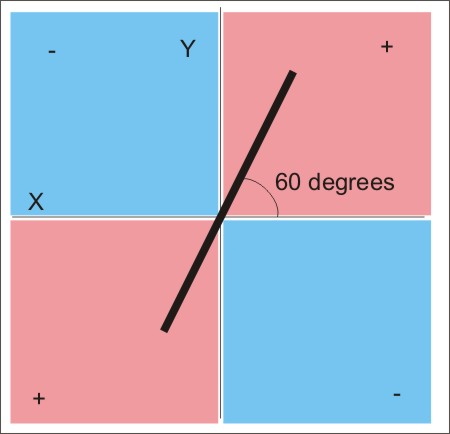
To begin with, there are those hatchings or “diagonals” as Lichtenstein called them. They have to be in balance with the remainder of the image. Too thick, and they will dominate the image. Too thin, and they run the risk of getting lost in the details of the overall picture. On analysing numerous Lichtenstein images, I found that those defining diagonals are always the same thickness and running in the same direction; at 60 degrees from the horizontal through the “positive” quadrants of the plane pi, like a thread of purpose running through the entire picture. It was as if he had laid down the diagonals first (maybe he had?) and built the remainder of the image against this backdrop. Next, the artist always placed his diagonals where they unified the image, rather than fragmenting it into different planes. This was when computer drawing software came to my rescue.
There are many computer graphic programs out there, most notably Adobe Illustrator. These packages vary slightly in ability but tend to have similar attributes. Many of these capabilities provide aid to desperados like me in imitating the drawings of Lichtenstein - I actually use Corel Draw. In general, the drawing boards are laid out with number scales on top and at one side, with guidelines that you can “pull” into place to create a grid. There are tools with which you can lay down ready-made squares and rectangles, circles and ellipses, objects that can be “scaled”, shrunken or stretched against one another. There are “Bézier” or freehand drawing tools that can draw lines and enclosed marquees, with nodes for curve editing. All enclosed areas can be filled with colour and pattern, while lines can be modified for thickness. All drawn items can be copied and pasted, grouped and stacked, cut and trimmed. Once created, items can be stored as a “library”, and reused and modified to create other images.
The Defining Diagonals
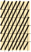
My first task was to create a “generic” pattern of diagonals. I soon discovered that if you lay down a diagonal on a rectangle, where the rectangle is twice the length as the breadth, with the rectangle “standing” on the shorter end, the diagonal runs at 60 degrees. Working with a scale that you find comfortable, lay out a grid of rectangles on an area of your page. Now, you are ready to begin laying down your diagonals. The freehand tool is ideal for this. You simply place the crosshairs where you want to begin your line, drag it to where you want to finish and click. Using the copy and paste facility – your lines must be identical – lay the diagonals across the grid. In every instance, the starting point will be the lower-left corner of each outside rectangle to the upper-right corner of the outside rectangle on the same diagonal. Your end result should look similar to this.
Getting it right....
The Ben Day Background
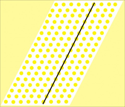
Next, I wanted to create the backdrop for my coffee cup. In many of his images, Lichtenstein used a “Ben Day” background, that is, a semishaded background of spots. It was named after Benjamin Day Jr, the nineteenth-century printer who invented it. In 1961, Lichtenstein began to translate these dots in painting canvases. After much experimentation, he created his dot patterns by rubbing paint onto surfaces through paper stencils that had been punched industrially. What is more, since the artist laid his out patterns with the arrays of dots in a positive direction, 60 degrees from the horizontal, your newly-created diagonal line has another use.
My next task was to lay down a “tile” of dots on a polka grid, but before that I had to create my "master" dot. Drawing software offers the user tools for drawing standard geometrical shapes, like circles, which are normally created from the ellipse tool on the drawing menu. Place the crosshairs on the page, and press the control key while moving the mouse at the same time.Draw your circle in the way I described above. Decide what colour (initially) you want your dots to be. I wanted mine yellow, so I filled the “master” dot by selecting it and, since Lichtenstein always used solid, bright and unsubtle colours in his images, I choose the brightest yellow on the CMYK palette. Incidentally, colour palettes are standard in all drawing packages. Also, remove the outline of the dot and with your “master” complete, you are now ready to create your polka dot tile.
Take one of your 60-degree diagonals and place grid lines at regular intervals along on the drawing board. Select the dot and either copy or duplicate it – duplication is best. A new dot will appear immediately beside the master. Select and move it onto the first grid intersectiont. Now, duplicate the second dot. A new dot should appear on the next grid intersection. Work from left to right until you have a single line of dots on your grid. Now, select the line of dots and duplicate it. A new line of dots should appear, so move it swiftly down to the next row of the grid. Working downwards, duplicate the row until your grid is complete. At this point, create a white tile using the rectangle tool and place behind the array of dots, leaving a half-width of square all around the edges. Remove any outline from the tile and group the tile and the dots together. You have now completed your “master” polka dot tile, one that can be duplicated many times over to create backgrounds. You can change the colour of the dots by selecting them all and using a new colour.

The Final Countdown
You have now reached the penultimate part of the creation. In the original Coffee Cup, there is a tear-shaped segment of “diagonal” unifying the cup and clouds of steam. First, draw a “tear” using the Bézier tool. Weld it to your pattern of polka dots so that the “negative” shape reveals the backdrop of diagonals when placed on top. Alternatively, weld the tear to the diagonals to create a “positive” shape that you can place over your backdrop of diagonals.
Using the Bézier tool, create all of the shapes that you need to finish your image. How much you actually draw depends on your skills, of course, but I managed to cobble together a respectable cup and saucer – and curl of steam – creating shapes using both the Bézier tool and the ellipse drawing tool. At this stage, it is not a good idea to make any refinements to the image. Assemble all of the components against your polka dot backdrop. Scale and rescale everything until it looks “right”. Your image can be as like or unlike a genuine Lichtenstein as you want it to be; trying to capture the “essence” of the artist. Notice the echoing shapes, for example, the three “tears” over the coffee, one of which draws up the colour of the highlighted liquid in the cup. Notice the diagonal pattern reflected in the saucer, and the three ellipses; the cup rim, the liquid and the saucer itself.
Although pleased with my first effort, I am far from satisfied. There are his more subtle techniques to learn, for example, many more subtle shading and hatching techniques, not to mention becoming a much better illustrator. I have a feeling that my sojourn into the world of Lichtenstein has just begun - and it is all thanks to computer drawing software.
Source
Lichtenstein Posters by Jurgen Doring and Claude von der Osten, Prestel Publishing Ltd, London, Munich and New York


