Pastel Workshops - How To Paint Landscape

Dartmoor From Shapley Common

Before beginning a pastel landscape, it's important to take a good, long look at your reference photos and sketches, to see if there is anything you would change about the composition. It's best to decide what to put in and what to leave out at this stage, rather than to try and alter things once your painting is underway.
You then need to decide on lighting, composition and general style of the work. My article on basic composition might help if you are unsure - click here.
once again, the best way to start pastel work is to begin with the underpainting. In this case, I wanted to emphasise the huge expanse of Dartmoor sky, so this was the obvious place to start. I used four different shades of blue, ranging from vivid blue-violet at the top and fading to blue green nearest the horizon. If you get stuck my article Pastel Workshops - How to Paint Sky gives you all the information you need to know.
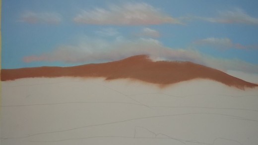
It's vital at this stage to really push the pigment into the tooth of the paper, so that you can add further layers over. I just use my hand balled into a fist for this, as this is going to be a large finished piece and there's quite an expanse of sky.
Next, add the clouds. I started putting these in using pale salmon, then pale yellow grey. Again, push these into the tooth well, and then add white highlights and lilac-grey shadows. Don't be too heavy with your highlights and shadows; a little goes a long way.
The next area to tackle is the very distant hills to the far right of the painting. Very pale lilac-grey is the colour used, as this gives the illusion of distance. Again, push the pigment firmly into the paper. As this is a small area you could use a paper stump to do this with, although, I still tend to use fingers; the edge of your pinkie is very useful for fine lines!
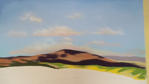
From this point on it's a matter of working your way down the page. There's very little detail in this painting, so the work can be completed in sweeps of bold pastel. The main hill in the painting was executed in a pink-biscuit shade, with a greyer-biscuit over for highlights, then the deep purple that makes up most of the shadow in the finished piece. The paper used in this painting is Clarefontaine pastelmat, which really grabs the pigment allowing you to work layer over layer.
If you find your layers are getting muddy, simply take them off with a paintbrush and begin again.
Book Your Workshop With Georgina
- Georgina Writes Stuff
Come and learn this vibrant, tactile medium in the studio overlooking Dartmoor. Places limited to five per workshop, to allow individual tuition. Tea/coffee/biscuits/cake and all materials provided. Wear something old. See you there!
The fields in the mid section were painted with the biscuit-grey that I used as a highlight on the main hill, then the green and yellow were over painted, and a deep grey green was dotted about here and there to suggest hedgerows. the same grey-green was used en bloc to the left side of the work to suggest fields in deep shadow.
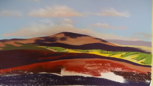
The fields in deep shadow were painted with deep purple as a base layer, with a darker burgundy over and rust for highlights. The red field was painted with rust as a base layer, with the biscuit-grey for highlights and the deep burgundy for shadow.
The rocks just catching the sun in the foreground were painted with lilac-grey, using the edge of the pastel that had first been ground into a wedge shape by rubbing it on a spare piece of Pastelmat. Again the shadows were painted using deep burgundy and the same pastel was used on its edge to suggest cracks in the rocks. Don't go mad with this, though otherwise the work looks too contrived.
The finished piece is large (800 X 600MM - 26 X 34" framed) and very striking, due to the bold colours used. However, you could switch to paler shades to create a softer piece, or you could alter the direction of light or areas of highlight to completely change the mood of the work. You could add detail, lots of detail, every frond of bracken and blade of grass if you wish. just pick up your pastels and play.
Using a limited palette of colours creates cohesion within the work. Where colours are repeated in the painting they act as a reference to other parts, so that the painting hangs together as a whole.
Related

Pastel Workshops - How To Paint Snow

What is Pastel? The History of Oil Pastel and Chalk Pastel.

3 Ways To Frame A Pastel Or Oil Pastel Painting

From Cotman to Monet, Bridges, Aqueducts, and Roman Aqueducts in Art, Paintings, and Photography

Inexpensive, versatile oil pastels for sketching and fine art