It's always good to have different income stream options on sites like this.
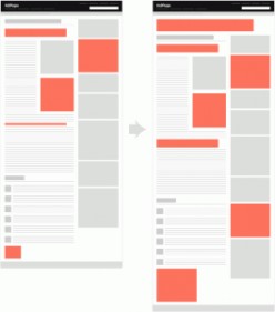
However, I find the HubPages layout messy. There is a lot there that isn't necessary, even if I make my options minimal. This deters me as a HubPages creator and reader.
For instance, there already is the option to contact the Hub creator, so the Ask a Question box is unnecessary and makes things cluttered. The reader can simply ask a question in the Comments section, and again there is already a link to contact the creator.
The Forum section also takes up a lot of room, and this needs to be minimized or placed elsewhere. This also keeps readers from sticking to our own Hubs, by encouraging them to go elsewhere.
The Tags are important, but need to be minimized with the drop-down feature.
The Recommendations section should be on related Hubs with the option to put a couple of our own in there.
I find with layout improvements, I would be more inclined to create more Hubs and read others' Hubs more.
Thanks!
 0
0 0
0