- HubPages»
- Home and Garden»
- Home Decorating»
- Interior Design & Decor
How to Mix Fabrics For A Custom Look in Home Décor in 5 Easy Steps

5 Easy Decorator's Tips for Mixing Fabrics with Different Colors, Patterns & Textures
We've put together five easy-to-follow guidelines and lots of pictures to make it easy for you to achieve an expertly put-together room that expresses your personal style and is worthy of appearing in your favorite decorating magazine.
Many people are good at mixing one pattern with a solid but are afraid of adding more. Yet, adding even one more color, print or pattern can make the difference between a so-so room and one that is interesting, polished, and pulled together.
Those brave enough to venture beyond the two-fabric combo will often rely on retail home décor fabrics printed in the same colors and sold as coordinates. However, these fabrics are usually overly matched and the result is formulaic cookie-cutter decorating that can be boring and leaves little room (pun intended) for individual expression.
You will also find some links to some great (way-below-wholesale and warehouse priced) buys on fabulous to-the-trade only fabrics and wallpapers to get those creative juices flowing and inspire your own unique style of home décor!
1. Inspiration is Primary
A fabulous designer fabric is often the starting point of a great interior decorating scheme and a room that is welcoming -- that just "feels right."
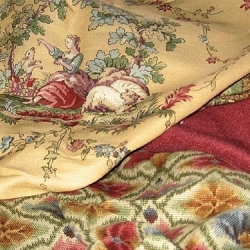
Begin by choosing a fabric in a pattern or color you love. Names to look for include Brunschwig & Fils, Clarence House, Schumacher, Scalamandré, Stroheim & Romann, Lee Jofa or other premier design houses. Try to find a design or pattern in at least three colors, such as the floral shown here.
This will be your inspirational starting point and the most prominent design element in your room. (If you prefer to use a wallpaper for your interior decor's starting point, just substitute the wallpaper for the primary fabric and choose a fourth coordinate according to the following guidelines.)
2. Choose Coordinates

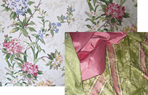
Once you have your main decorating fabric, select two or more fabrics, each having one or more of the colors in your inspiration fabric. Try to vary the fabrics so that contrast, texture, scale, sheen, and pattern vary.
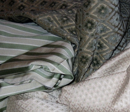
• Contrast: Overall color of one fabric should be light, one medium, and one dark.
• Texture: Choose fabrics with different textures, such as a smooth silk and a woven linen.
• Scale: Vary the size of the patterns by including one large, one medium, and one smaller pattern or solid. For example, you might choose a large floral like the one above, a medium size plaid or stripe in coordinating colors, and a small embroidered pattern or a solid in a textured matte linen or cotton to complement the sheen in the chintz.
• Sheen: Mix shiny and matte fabrics.
• Patterns: Mix curvy and linear patterns, such as a floral or a toile and a check or plaid, with a solid. Or choose a third pattern.

Note: Most of these tips will also apply to decorating with a single color scheme.
In fact, following these simple guidelines will add interest and will keep a monotone from becoming monotonous.
3. Experiment to Create Different Looks

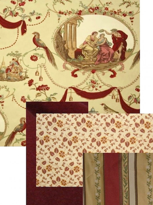
Here we’ve combined our inspiration print with a coordinating silk taffeta for draperies and a bedskirt, an aubusson chenille for the duvet cover (trimmed in a heavy ivory or gold cording) and the small brocade print for a side chair or bench at the foot of the bed. Pillows made from a combination of the fabrics would finish the bedding (trim the main print with a ruffle of the silk taffeta, the small print with a ruffle of the main fabric or the tassel trim from the window treatments, and the aubusson chenille with an ivory or light beige rope cording, and so on.) A tassel trim for the window treatments and elaborate tiebacks would complete the look and tie the colors together. Optional: Long bullion fringe around the side chair or bench.

Play around with different swatches until you find a grouping that balances color, scale, and pattern and is pleasing to you. You can do this with actual swatches if available, or you can request jpegs from on-line sellers whose fabrics you are interested in, download them, adjust the size of pictures for scale, and see how they look together on your computer screen.

Home decorating should be fun, so play around with different fabrics and be sure to check the swatches with different lighting too. A fabric that looks great in a softly lit room at night, for example, may look garish to you during a sun-flooded afternoon.
Remember, too, that colors will look different depending on what other colors are adjacent to them, so be sure to look at your swatches against wall, floor, and furniture colors.
4. Decide What Goes Where?
Once you have decided on your home decorating fabrics, plan where they will be used. Do not use all of the fabrics in one area of the room. Spread them around to create balance.
For example, if you use your inspiration fabric for draperies in your living room, you might use the same fabric for a couple of throw pillows for the sofa, and possibly as welting or upholstery for a chair. Then your second fabric could be used to upholster the sofa, make a cornice for the window treatments, and as welting or upholstery for another chair, and a square topper to drape over a round table covered in a to-the-floor cloth made from the third fabric, which can also be used as a trim on the window treatments and on a lampshade.
5. Put it All Together
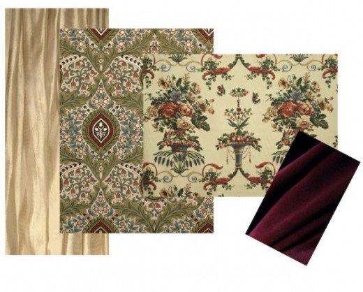
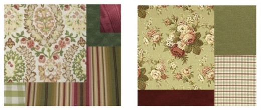
Two Home Décor Fabrics = Two Interior Decorating Looks By Changing the Third Coordinate

Don't forget that your walls and floorcoverings are additional areas for color and pattern and be sure to consider them, as well as the style and scale of your furniture, when planning your room. Remember, these are guidelines, not rules, and there are exceptions, including some in the pictures we've included in this lens to inspire you. Have fun!
What a Difference One Fabric Makes
The following question refers to the two photos above.
Which of the above combination of fabrics do you like better? Why?
Which Trim Would You Choose?
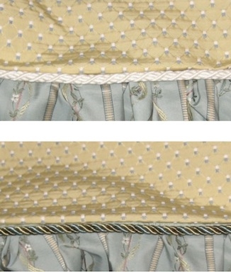
Both of these trims coordinate with the two fabrics shown. Which do you prefer?
Which trim would you choose?

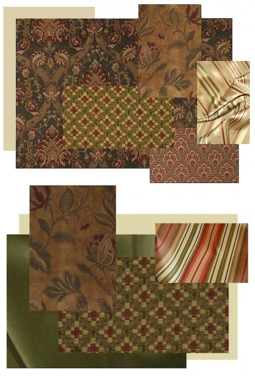
Some Additional Inspiration
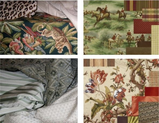
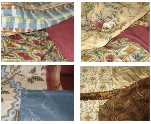
More Sample Boards: For a Casual Country Look
Handy Reference for Country Style Pattern Mixing

Variations on a Tuscan Theme
For a More Urban(e) Look...
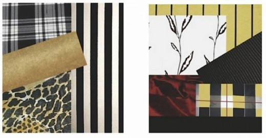
Or a Casual Elegance...
For 100s More Inspiration Fabrics

Visit Restoration Fabrics & Trims
Specialists in Period Sensitive Decorating at Budget Sensitive Prices
_________________________________________________________________
Subscribe to Our Blog
Historic Period Interior Design and Home Décor
Like Interior Decorating Tips and/or Old Houses? Want to See More Coordinating Fabric Boards?

We're So Glad You Stopped By!