- HubPages»
- Technology»
- Computers & Software»
- Computer Software»
- Office Software Suites»
- Microsoft Office
Using Excel’s Scattered Diagram Charts in Finding Trends between Two Sets of Data.

Using Excel to Find Trends
There may be times in which you may have to track two different types of data to see if there is a positive, negative, or neutral trend between them. For instance, you may want to see if downtime of a machine is costing you in production or maybe there is a product you are selling and you want to know if more advertising is needed. Basically, you may have to analyze two different sets of data or variables to see if there is a trend. The easiest way to do this is to use Excel’s built in Scatter Diagram chart.
A scatter diagram is a graphical representation of the relationship between two distinct sets of data. It maps out points of two different types of variables in which gives you a quick insight on the relationship between the two. So, when you plot data on this chart, you are then able to see if the relationship between these two sets of data either has a positive, negative, or no relationship at all. With that said, the following diagram is an example of a scatter diagram:
Figure 1: Example of a Scatter Diagram
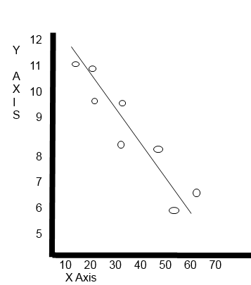
The ovals in the diagram represent plots of the two sets of data. The Y-Axis is the measurement of one variable and the X-Axis is the measurement of the second variable. The line between the ovals is called a trendline. The trendline in this diagram is moving downwards which tells us that the data sets relationship in this example have a negative impact on each other. If the trendline was moving upwards, then it would have been a positive relationship. Finally, if the trendline was a straight line across, then these two variables (sets of data) would show no effect on each other whatsoever $6.
So, now I am going to show you how to create a scatter diagram in Excel. First of all I decided to use a fictitious scenario. So the following is the scenario:
The executive board of XYZ restaurants would like to know if the amount of commercials that are aired everyday on cable TV is having any effect on the amount of customers eating at their restaurants. So, they have decided to track the amount of commercials aired within the last two and half months and compared it to the amount of customers that have dined at their establishments.
So, with the above scenario in place we have two separate sets of data that we need to compare to see what type of trend they have on each other. With that said, below is our worksheet so far:
Figure 2: Excel Worksheet With Data

Now that we have the data, we will have to highlight cells B1 – C11. By doing this, we can get all the needed data plus labels to help create the scatter chart. So, after you highlight the appropriate cells your work sheet should look like this.
Figure 3: Highlighting Data

Now we are ready to create the initial Scatter chart. To do so, you will have to click the “Insert,” tab on the top tool bar and then click the Scatter Diagram button. The following graphics show you how to do this:
Figure 4: Create the Scatter Chart

Figure 5: Creating the Scatter Chart

Figure 6: Creating a Scatter Chart

So, by following the above figures, you should have a Scatter Diagram that has all your data plotted. One set of data is plotted using the Y-Axis of the chart and the other is using the X-Axis. However, this chart is incomplete. It is missing the trendline and labels for the X and Y axis. So to add that, you will need to select “Layout 3,” in the tool bar tab labeled “Chart Layout.” The following graphic shows you how to do this:
Figure 7: Adding the Trendline

Figure 8: Adding the Trendline

So, now you have your trendline and by viewing the chart, you can see that the line moves in an upward motion which means that the relationship between these two data sets is a positive one. Meaning, that the more commercials aired the more customers comes to XYZ’s restaurants.
The final thing to do to make the chart look presentable is to add the labels to the X and Y Axis. Remember that the first set of data (under column B) will actually be plotted on the X-Axis which is the numbers that go across the bottom and the data within the C column is the Y-Axis which goes from up to down. To change the label just click inside the chart where is it written “Axis Title.” After you have labeled the chart, your worksheet should look like the next graphic without the text comments:
Figure 9: Adding the Axis Labels

In conclusion, the Scatter diagram (chart) is a good tool if you need to see if there are specific trends between two sets of data. Using this Excel chart is quick and easy and gives you the answer you need quickly without having to go through tons of data to figure it out yourself.


