Graphic artist: Klaus Voorman

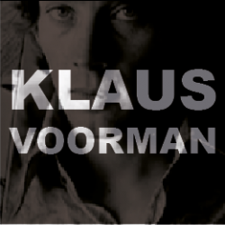
Klaus Voorman
You might think that you don't know this designer's work. Or you might think that the name sound slightly familiar. But I'm willing to bet that there's good chance that you own - or have owned in the past - some of his artwork.
If you haven't, then I imagine that some of it is familiar to you.
You see, he was one of the most influential people in the arts and entertainment work in the latter half of the last century - and he hasn't stopped yet.
As you can guess from his name, he was born in Germany into a creative Berlin family. He studied graphic design and it was in October 1960 that was the beginning of this huge career. The twenty-two year old had had a row with his girlfriend one evening and wandered into club - the sort of place he would never normally venture into but after the argument, he needed a beer.Klaus was very into music - mostly jazz - but despite being a jazz aficionado, his attention was drawn to the five-piece rock & roll band who were playing on stage.
Eventually, he became their lifelong friend.This event took place in Hamburg and the group were from Liverpool.
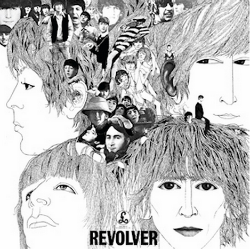
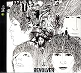
This is probably his best-known piece of artwork, created six years after that fateful meeting in 1960s Hamburg. (I suspect that after all, you are familiar with his work).Voorman, as a trained graphic designer, understood that design means so much more that 'making things look good' - graphic design is marketing.
This album cover was designed when the Beatles were at the height of their fame but were also trying to get away just a little from the Beatlemania hysteria they had experienced in the past, especially during their 1964 tour of the USA.It unmistakably shows the Beatles but this time - and for the first time - in a creative and considered way, rather that a mop-headed boy band for screaming young girls. It added an 'artiness' and levity to their music.
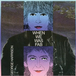
What's interesting is that Voorman used the drawing of George Harrison twenty two years later for Harrison's second solo single. But he added a twist.
By adding a new drawing of George, he introduced a new dimension. The new drawing shows George as a forty five year old man, rather than a young lad in his twenties. A sparkling touch is the way that the older George is looking at his younger self with an expression of slight amusement. The older man is more 'alive' - more realistic.
The older man seems to be acknowledging that his younger life had created the man today, but yet with a slightly sardonic - and typical Liverpool-cheeky - grin.
Note the shaded torso that has been added to the younger image - can you see how the collar forms the letter R in which the record title is enclosed? Is this too an homage to Revolver?
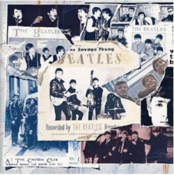
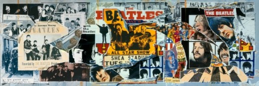
Fast forward seven years and Klaus was creating artwork for the Beatles again; this time for the Anthology series.He developed the idea of using old album covers, photographs and posters to demonstrate the extent of the group's work and their longevity.
You'll remember that there were three items in the Anthology series. Since he designed the Revolver cover all those years ago, Klus had created artwork for many other bands and was also a well-respected bass player himself who had played with all the top musicians of the day.Something I love about the Anthology covers is the way that, when they are placed side by side, they create one large piece of artwork. See below.


© 2014 Jackie Jackson


