Guidelines in Art Production
The Importance of Guiding the Viewer's Attention
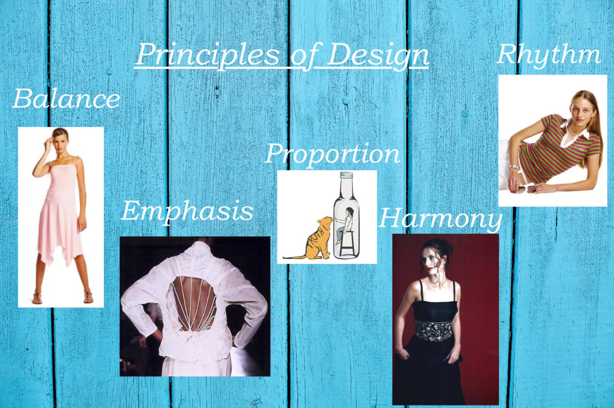
Laying out the composition of a painting, picture or page requires understanding how the eye of the viewer can be guided. The viewer's attention will naturally be drawn toward something of interest. The job of the artist is to control the viewer's eye in communicating a message or feeling through visusal imagery. The following basic design principles will help the artist hold, guide and control the viewers eye.
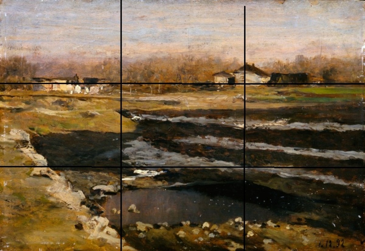
Proportions: All the great masters, including Da Vinci and Rembrandt, composed their paintings according to the golden mean and other proportional configurations. The space within the matrix must be divided according to some sort of mathematical consideration based on the dimensions of the outer edges. Squares, triangles, and circles can serve as underlying elements within the composition, the triangle being the most powerful.
Composition: The artist must establish a center of interest. Next, he must establish dominant and subordinates images. One image must reign supremely. The most classic placement of an image and the easiest for attracting attention, is to center it. However, this is the least creative solution.
Active and Passive Design Elements: Know why each design element is to be used. Edges, values, and patterns should all have a purpose. It is best to start with a premise and stick with it. Be consistent with your design elements. Don't build a bicycle with lawn mower parts.
Repetition: Repeat lines or images for emphasis. Variations of repetitions will attract attention. Vary rhythms and patterns slightly to create more interest and excitement.
Line: The use of lines show movement and direction. They should work within the space. Line things up by having the lines make sense. They need to relate to something in the picture. For instance, a horizontal line can be used to create a feeling of repose. Vertical lines add to the vertical direction of the picture. A diagonal line is considered very dynamic. Diagonal lines can lead the eye to vertical elements. Straight lines and curved lines show different types of movement and can work together.
Shape: Use shapes according to their internal direction. The shapes should relate to each other in harmonious ways and be pleasing to the eye.
Value: The use of tonal shading indicates the weight of objects and reveals their heaviness or lightness. The use of value can also provide gradation or contrast within the composition. Lights and darks equal shadows and highlights. Painters focus either on the highlighted areas or the shadow areas, not both. For example, Rembrandt focused on the details in the shadows only.
Texture: Create interest by activating the tactile sense memory.
Color: The science of color is used in all artwork. Try to find information on color and become a colorist. (Norman Rockwell was an excellent colorist.)
White or Open Space: Blank or open space should work within the movement of the piece, whether vertical, horizontal or diagonal.
To keep the viewers attention on the art piece and the area of emphasis:
1. Do not stair step the eye off the picture or page.
2. Do not ribbon the space by repeating a design element with no interest in between. Stripes are boring.
3. Do not divide attention, as it is the artist's job to reveal where the emphasis is. Two equally interesting areas will confuse the viewer and cause him to look back and forth.
4. Corner design or decorations should be avoided unless one corner is the area of interest or focus, or emphasis.
5. Negative / Positive space must be considered carefully and integrated with visual balance.
Side Notes:
* Knowing the basic rules of composition layout allows an artist to break them.
* Intuition can be useful after one is exposed to the principles on a conscious level. However, one cannot just guess, contrary to popular opinion. Knowledge of concrete design principles "programs" the intuition.
* A slick presentation is one that is "well cared for." This term relates to all finished pieces, whether graphic art presentations, gallery ready paintings, or illustrations, etc.
* It is frustrating to the artist if he does not have a framework in which to put his creative ideas. Freedom within an active or inactive grid is the key.
* Composition guidelines are based on what is pleasing to the eye so that your viewer will be enticed into looking: not merely glancing, but rather, gazing.
* A graphic designer must know why he has made every decision. He/She will have to justify them to his/her client. (The graphic designer must be ready to start from scratch, if the client does not agree with the choices and design decisions he/she made.)
* Keep in mind that too much design freedom makes the challenge of creativity and imagination more difficult. Focus on one design element, such as line, shape or negative/positive to start with and build from there.
* Words can help a graphic designer come up with ideas. For example, lets say the assignment is Halloween themed images. A designer can come up with a list of words, such as dark, dingy, scary, witches, black cats, dusk, windy and howling to spark his imagination. Answering What, When, Who, Where and Why will also fuel a designer's creativity and imagination.
Being aware of these basic guidelines will enable you to look at a blank canvas, page, or illustration board to begin seeing possibilities. Your rectangular matrix is a playground to experiment, manipulate and organize any image or idea you wish. Now, go create a sight to be seen!


