- HubPages»
- Arts and Design»
- Drawing»
- Drawing Tutorials
Drawing With A Muted Palette
#32 of 100

What is a Muted Palette?
Well, a palette is what colors you have available to draw with. A friend of mine on http://www.wetcanvas.com bought some Derwent Drawing Pencils and Derwent Graphitint pencils because I used them and loved them and another friend from the UK raved about them and did great things. She got very frustrated with them because the light blue in the Derwent Drawing Pencils wasn't bright enough for her skies and she didn't have the bright yellow she wanted, so has been using Derwent Inktense or Prismacolor Col-Erase pencils with them every time she draws.
This led me to remember something about how I drew for years, and why all the various grays in my first Prismacolor set tended to be long and go unused while all the greens and blues wore down so fast it was as if I was smoking them. I like summer landscapes and undersea reefs, so those greens and blues wear down quick. But for some subjects, you need a lot of browns and grays.
Like animals. Or rainy days. Or gray things or brown things or olive drab things. Sometimes even bright things look muted because of the color of the light that's on them. Eventually I did learn to use all the grayish violets and brownish oranges and rust colors and brown-yellows well, and that made a lot more of my realistic drawings look more natural than when I did them with the basic six kid colors.
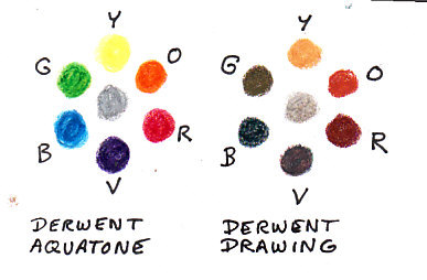
Even an eight color set of Crayolas has a black and a brown in it besides the spectrum six Primary and Secondary Colors that you get in basic color theory. But here it is again if you forgot it or slept through that bit in grade school. I'm going to show the color wheel for a brights palette using Derwent Aquatone and another one using a muted palette of Derwent Drawing Pencils to start with.
Bright Palette and Muted Palette
Soft Nature Colors
We are so used to the acid-bright colors of everything from highlighters to windbreakers and notebooks that it's easy to forget that most of the natural world is Brown and Green. Some nature subjects do need the bright palette of the Derwent Aquatones -- tropical reef fish, tropical birds, many tropical flowers, and many garden hybrid flowers all demand colors like Opera Pink or Quinacridone Red, Phthalo Blue and Green, Dioxazine Violet, Cadmium Yellow. The super bright pigments are sometimes from mineral sources like semiprecious gems and more often from chemists creating interesting compounds that stain and give artists bright colors to work from.
Dyes created from coal tar came along in the 19th century and were welcomed for their brilliance. They're still often used for fabrics and other uses even though they fade rapidly. Many are nontoxic and used for children's art supplies because children love bright colors and parents usually store their productions in the dark if they save them for sentimental reasons. Few works made with children's supplies wind up in museums -- and they give curators a headache when they do because they need extreme protection from light.
Later on, truer lightfast very bright colors came into being during the late 19th and 20th centuries and there's still a creative explosion among colourmen to come up with some hue that no other company has. Daniel Smith has over 200 different watercolors, it costs about a thousand dollars to get everything they produce including duochrome colors that change if you look at them from a different angle and interference colors made with coated mica particles that shimmer and change color between complements. A yellow-violet isn't always a mixture today.
All of these are fun and have their place -- but that isn't in every drawing.
Derwent Drawing Pencils were a staple for decades with only six colors -- a very opaque soft white, a very opaque soft black like a grease pencil, Brown Ochre (gold), Venetian Red (orangy reddish), Terra Cotta (brighter lighter orangy red) and Chocolate (a strong medium brown). One of the best big cat drawings of my life was done with just those six pencils and a Non-Photo Blue Prismacolor that I picked up at work in the days when pasteup involved actual rubber cement and scissors. To this day, copiers don't pick up Non-Photo Blue so you can mark up with it and not have it show when it's copied. But scanners will read it as light blue so you have to treat it a bit different and erase the lines in Photoshop before printing.
I didn't actually need the blue sky behind the cheetah's head, but it helped push him forward and I managed to mix a lovely green color in his eyes with the Non-Photo Blue and Yellow Ochre and a bit of the Chocolate to darken it. I no longer have that painting but I'll never forget how realistic it came out.
Most mammals are some shade of brown or gray, be that yellowish, reddish, or bluish gray.
Neutral colors and muted colors are created by mixtures of all three primaries balanced just right for the strength of the pigment.
There's a wonderful art instruction book on color theory and mixing paint titled "Blue and Yellow Don't Make Green." They do in theory, but theory breaks down when actual pigments come into it because the blue may be a bit purplish and the yellow may be a bit reddish. When that happens, blue and yellow also mix in some red and you get brown or even gray. Maybe if you're lucky something like an olive green, but not the bright screaming green of the Aquatone sample. More like something in the Derwent Drawing Pencil sample at best.
The Munsell system goes breaking down the tertiary colors that sit between the primaries and secondaries or wander inward to pick up a little of their complement and become muted. Munsell space is three dimensional and also has a value scale from lightest (white) to darkest (black) so you can use it to describe any color you actually see, like robin's egg blue or that faded gray-blue that the knee of old blue jeans gets, or some indeterminate muddy color that happened by accident in the corner of the palette but turned out perfect for the muddy puddle color on a rural lane.
You can easily mix neutral colors from brights. Just bring in a little of the color opposite it on the color wheel. Darkening is tricky -- if you add black to yellow with anything that mixes, you get a pretty good green because most black pigments are bluish and dark. So the best way I've found to darken yellow and still keep it reading as yellow is to add a bit of brown that already leans toward yellow -- go from the darkest pure yellow into gold and shade down into dark brown before getting to black.
The color of the light affects how bright colors are too. Sunlight shows all the bright colors very true. This particular netbook shows very true color, and it's derived by a completely different color mixing system involving red, blue and green. The green is a light yellowish acid green that turns yellow if a little red comes into it to balance it out. Black or absence of light deepens anything. This is also how your TV or any monitor works.
But we're talking about drawing so let's leave pixels of light out of it along with inks that mix in your printer in Cyan, Magenta and Yellow. Cyan is a greenish light blue, Magenta is a purplish bright red, the yellow's very balanced in CMYK and K stands for BlacK because for some reason they didn't want to call printers' color separations CMYB. Maybe because B looks like you mean Blue.
In both color wheels the lightest color is at the top and the darkest at the bottom. Yellow has the shortest value range of any pure secondary or primary. Blue or violet have the longest value range -- they come the closest to black. Usually blacks lean toward deep violet so the color wheel is prettier with a very dark violet to remind you of that. Munsell space has this as a slant running through all the little colored balls and it's interesting. That's the "masstone" of the pigments available. The color the ground pigment is without getting mixed with some white or thinned out so that white paper shows through it.
Most of the actual colors you get in colored pencils are not pure-pigment masstones. They're mixtures of two or more pigments to get exactly that hue and value. Thus the gold may have several earth tone pigments in it and some bright yellow to get it to just that shade of gold. Or a particular type of yellow ochre is exactly the next gold, so the manufacturer used it in that pencil. Pigments are ground fine and suspended in a wax based binder that may have other ingredients like clay or gum arabic. All watercolor pencils have some watersoluble gum arabic involved to let you do the sketch and wash thing, like pan watercolors.
Manufacturers keep their binder recipes proprietary and secret, which is why every different brand of colored pencil has its own texture, hardness and translucency or opacity. Derwent Drawing Pencils are very opaque and work great on black paper to get dramatic effects, or on various colored papers or tinted grounds. It's one of the things I like about them -- that white is the softest, most opaque white I can use for drawing on black or for highlights on brown or gray or colored paper. That made the first six colors indispensible in combination with Prismacolors where the white and black weren't as opaque.
Scene From Imagination
Examples of Color Tricks with Muted Palette
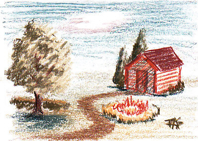
I sketched this little scene of a back yard in imagination. It's got a bit of squared off hedge, light coming from the right, a blue sky with one cloud floating in it, a cheery red garden shed and one little round formal planting with a zigzag path going around it. I just started with the tree and started adding things as I made it up, making sure I had one reddish object next to some green trees.
Notice how those evergreens next to the red garden shed look a lot greener than the tree standing by itself off to the left and the hedge. That's not all which of the greens I used to do it -- I used the same ones and some areas of the tree on the left also have a bit of blue over the green. The shadows are all in Ink Blue, which I used lightly over Solway Blue in the sky and then burnished a bit with White.
Yellow also reinforces red. In the little formal planting, I used Wheat with some Mars Orange to make a very bright little planting, that warm patch comes forward in the picture much more than the tree on the left. It's about on a line with the tree and bit of hedge. I didn't do anything with the horizon but it crept up a bit too far on the page, the composition on this one isn't that great. But it does show what happens when you put muted complements next to each other instead of over each other.
They zing.
That effect can burn your eyes if you did it with the super bright colors of the Aquatones. Same with that yellow and orange planting -- it would be searing. If I redrew this in the bright colors it would look overdone like a children's book illustration. It would also be hard to look at it for any length of time. Using the muted palette of Derwent Drawing Pencils, I managed to convey brightness without actually having any bright colored pencils in the set.
The scan did fade out some of the brightest values, so the horizon goes to white both at the back of the yard and at the base of the sky.
One of the things this little drawing rests on is that the values are as strong as if I'd sketched them in graphite. You can see what's in it easily even with the lightest values faded out by the scan. Let's look at it in grayscale.
Grayscale
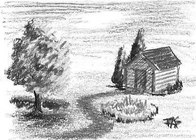
Value can make a muted palette, bright palette or monochrome drawing make sense.
Strong values are what makes any drawing come out right. In the grayscale version you can still see what everything is. There's still some contrast between the shed and the evergreens behind it, the tree's foliage still shows light coming from the right and it's still a bright summer day with the light coming from pretty high in the sky and shadows very short -- and very strong, another indicator that it's a bright summer day.
You can assume the grass is green or burnt brown, that the tree is probably green unless this is fall and that the path is probably brown dirt. People imagine color in a grayscale drawing, usually fairly accurately when it's a familiar subject. The shed might be red, blue or green but it's still clearly a garden shed with no window and not big enough to be anyone's house except in an emergency.
When you get the values right, the colors will take care of themselves.
If everything in the drawing is in soft muted nature colors, it reads true because even if the blue of the sky isn't that bright, it's still blue compared to the greens and the reds. If you used a brighter blue but kept all the rest the same, that may work or it might be too much -- you'd have to experiment.
With very dark colors like Ink Blue, the solution is to treat it like a graphite pencil. Go lighter, sketch looser, and then if you like, go over it with the white to smooth it and make the color a little more intense. White tends to blur and intensify light applications into a lighter value of the pigment's true color. It's not so opaque that it won't mix with its own breed of pencil, it just comes up good and strong on colored paper.
If I'd been looking at a real yard or a good photo reference the yard would have come out a lot more realistic. That's something else to remember -- drawing from imagination is a very difficult skill, even for all my years of practice it takes having a lot of practice with that specific subject to have any good shot at it. Doing it more than once helps, either from references or repeated attempts and then look at the real one and then try again, you'll notice different things.
I hope this article has encouraged you to try using the grays, browns, olive greens, blue-grays, golds and rust colors in your colored pencils set. Reevaluate them and try some of those colors by themselves as monochrome. See how effects like putting complements next to each other can look good and draw focus without becoming Op Art when you use muted hues -- even in this sketch's imperfect composition, the shed and its evergreens are a strong focal point by placement and by that complementary juxtaposition.
But if I'd done it in Aquatone you'd have a hard time managing to look at it for long without getting a headache.
Enjoy. They're great fun and will extend your range of cool things to draw -- and your realism when those cool things aren't colored like a Playskool set.
