Tips for a Successful Powerpoint Presentation


If I had a dollar for every Powerpoint presentation I have watched, given, created, or helped create I would be living very comfortably right now instead of eeking out an existence at a temporary office job. I don't pretend to be the world's leading Powerpoint expert. But I will say that most of my presentations were met with compliments. And a certain graduate school professor even adopted one of my techniques after observing it in his class. At first he tried to dock my grade for it. After I explained it to him, my grade was not docked, and very soon after, tada! He used it himself. I am going to share some of the tips I picked up in class and by practice. They will help any presenter to give an successful Powerpoint presentation.
Knowing is Half the Battle
Knowledge is Power-point
I suppose you could give a purely entertaining presentaion. Your recent family vacation perhaps? For the sake of this article we will stick to the professional and educational sort. The purpose of your presentation is to educate your audience about something. Keep this in the front of your mind. Everything you do should contribute to conveying your knowledge to the audience in a way that they will understand and remember it. This is not the time to show off your animation skills or comedic talent. Keep things of that sort to a minimum. You want to be entertaining to a degree but leave the brilliant cinematography to Hollywood. Think simple. Your primary goal is to educate and inform without boring your audience to death. Kowledge first. Entertainment second. A few fun facts thrown in, a well placed and acceptable joke, an antecdote. Those are all fine. In fact they are great ideas and good ways to keep your audience engaged. Just rememeber this is a presentaion, not a stand-up routine or infomercial. You are educating and informing, not selling shammies!
Know Your Stuff
You have enough to worry about with all that slide changing, potential technical glitches, and all those people you are standing in front of. You don't want to to add to that by not knowing what you are talking about. It is very noticeable to the audience if you know your stuff or not. You should be comfortable enough with your material that you are not reading from notes or staring at your slides desperately trying to remember what to say. I have had classes that did not allow notes and forbade you to turn around and look at a single slide. If I could do that, so can you. It should feel as if you are having a conversation with your audience. You should be so confident about what is on those slides that a mere glance to be sure it is the right one is all it will take to proceed. How do you achieve this? Practice! Know your material well enough that even if you forget the exact words you were going to say, you can still tell your audience something informative and they will be none the wiser.
Know your equipment
As a graduate student I had the luxury of access to presentation rooms and equipment. I was able to practice as if giving the presentation. Most people are not that lucky. At the very least, arrive early enough that you can check out the equipment and the layout of the room. If you are going to be the one operating the projector, take a minute to practice. If someone else is changing slides for you, work out some sort of a cue. Nothing is more distracting than the presenter saying "next slide" every few minutes. You want the audience to pay attention to what you are saying, not your communication with the mysterious man behind the curtain.
Know Your Audience
Keep in mind who you are speaking to. Are they colleagues? The general public? Students? This makes a huge difference in how you present, both in content and visuals. Certain cases might require you to be more professional, others offer more creative flexibilty. REmember, you want to be taken seriously but you don't want to be arrogant or boring. You could easily lose the general public if you don't include some entertainment value. A group of professionals will see right through you if you try to grandstand your way through a topic you just learned yesterday. Put yourself in your audience's shoes and tailor the presentation to what you would want to see. Combine that with what you want them to learn, and you should be right on point.
It's All About Looks
Dress The Part
This also relies on you knowing your audience. Presenting in front of fellow students did not require business dress, but I certainly was not going to walk up there in jeans and a t-shirt so faded you can't tell if its black, blue, or gray. It is disrespectful to your audience to look like you just rolled out of bed, or like you are on the way to a nightclub. But you don't want them to feel uncomfortable by you looking over dressed or stuffy. Think about what they will be wearing and dress up a notch. And e sre you are comfortable. This is not the tiem to try out new clothes. If you do have to buy soemthing new, wear it once first. You do not need any wardrobe malfunctions or distractions from an itchy new sweater.
Keep It Simple, Not Boring
You do not want to lose your audience in animation, crazy colors, wacky fonts, or any other distracting features. I know it is temmpting with all that Powerpoint has to offer, but it will only hurt you. Do you want the audience to be talking about the cool way your slides moved around, or what a great presentation you gave? You want them to respect you for your brains not your technical ability. Unless of course, that is the topic. The look of your slides should be consistent in color scheme and layout. I am not saying they need to be identical. Do not make them nearly identical. People will zone out and stop looking at them. But too many changes in color, font size, and style is going to be distracting. Pick colors that are interesting and font sizes and styles that are easy to read. You want it to be interesting to look at, yet easy on the eyes. The audience does not want to be blinded by hot pink backgrounds or distracted by words they are struggling to read, or practially put into a seizure with ever changing colors and layouts. Blue seems to be a popular choice. So find something else that suits you better. Royal purple? Teal? Anything along those lines is more unique but still tame. If you have a rather lenglthy presenation, you can use color to break it into sections. I reccomend it. Keep the colors consistent within the the sections and choose colors that compliment each other. Shades of blue or green perhaps. Don't jump from blue to yellow to red. Be sure font sizes and styles are easily readable even from the back of the room. Stay away from fancy scripts, animation, and 3-D effects, or at least keep them to a minimum. Experiment with a few color schemes and fonts until you find one that works. Think about presentations that you have watched. What did they look like? What did you like or dislike about them? Why reinvent the wheel if it has already been invented?
Keep Words to a Minimum
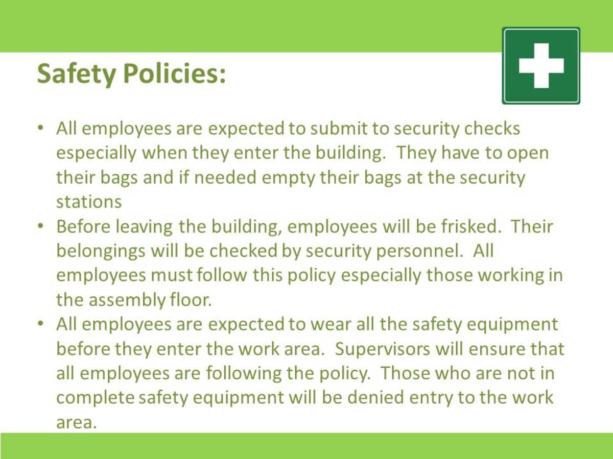
Nothing is worse than watching a presentation with slides full of text and a presenter that simply reads each one. Do not stand up there and read off slides! I will also argue that the extreme opposite end of the spectrum, pictures and no words, is just as bad. Some people need to read for the information to sink in or have a hard time picking out the main points themselves. You don't want those who are bad note takers or learn by reading (those nerds that read their textbooks) to walk out of the presentation not remembering anything. You want a perfect balance of text, pictures, and figures. Keep the text to a minimum of a few bulletpoints or phrases that highlight the main points you are making at that moment. You should read them to the audience. You do not want the audience to struggle to read and listen at the same time. But work them into the flow of your presentation. Mention each one as you make that point, or use them to give a summary at the end. Also be sure to check your spelling and grammar! You do not have to follow grammar rules to the letter. Bulletpoints are rarely even complete sentences. But avoid any flat out error. Use apostrpohes corretly. Watch your there and their. You do not want someone so distracted by a misspelled word or grammar faux pas that they miss what you are saying. Mistakes like these will also take away from your credibility as a presenter.
A Picture is Worth a Thousand Words
Don't merely show figures and pictures USE them. If you are giving a presentation that lends itself to figures (graphs, pie charts, maps) by all means include them. Be sure they are simple, easy to read, and clearly illustrate your point. Explain the figure to your audience by summarizing and pointing out a main point or two. Don't go overboard. The figure should do half the talking for you. If it doesn't then you need to make some adjustments. Go ahead and use pictures and illustrations. It is a visual presentation afterall. They will keep your audience engaged. But do it in a way that lends to your preseantation. The illustration should directly relate to what you are saying at that moment, and add to it. One trick I have used is use a photo that related to a main point or example I was giving. That way the audience had something visual to go with my words, and I used it as a reminder of what I was supposed to say. As with the rest of your presentation, consider your audience. You can get away with something a little cute with the general public or students. In a business setting, stay strictly professonal. Be sure you choose images that are engaging but not distracting. Something overly cute or shocking will cause too much of an audience reaction and disrupt the flow of your presentation. If you want to throw in something a little funny or cute to wake the audience up, do it at a transition point between sections. Even this photo should lend to the presentation and be suited to your audience. Information first, entertainment second.
Powerpoint is FUN!
Enjoy Yourself
Giving a presentation is not always the most thrilling thing. Some people love getting up in front of an audience, others hate it. The same goes for presentation topics. You might absolutely love your topic, or you could be presenting as a job requirement or as a way to promote a project you are trying to get off the ground. Love or hate the topic, or the presenting of it, have fun with it. Find something about it that you actually like. Whether it is the satisfaction of wowing your coworkers and bosses or getting that extra funding. Think about that as you design and give your presentaion. If it is a topic that bores you to death, find an interesting fact, news item, or story about it. It will get you interested about the topic and win over audience members that might not be interested either. I am sure not everyone at that business conference is excited to be inside listening to you on a sunny day. Well, make then excited. Heck. I had a math teacher actually get me to enjoy algebra becuase she went out of her way to use real life examples when teaching. None of this two trains and when will they meet nonsense. The more interested you are in your topic, the more the audience will be, and the more you will enjoy presenting it. And forget about screwing up. It is senseless worry. Be prepared, follow my tips, and you will be fine. Something might very well go wrong. You have heard of Murphy's Law, haven't you? And when it does. So what? Stuff happens. And if you bomb, consider it a learning experience. It can only get better, right? Life is too short to ruin it with worry. Enjoy youself!


