Histograms and frequency density. How to draw a histogram from a frequency table.

A histogram is can be drawn if the data you have is continuous and the groups are of unequal width. A histogram looks a bit like a bar chart except that the y-axis represents the frequency density. So the first thing to calculate when drawing a histogram is the frequency density. To calculate the frequency density you divide the frequency by the width of each group (class width). Make sure that you divide the numbers in this order otherwise you will not get the frequency density:
Frequency Density = Frequency ÷ Class Width
Another important thing to remember about a histogram is that the area of each bar is the frequency. So if the histogram is already drawn then the frequency of each group can be found by multiply the length and width of each rectangle.
Example
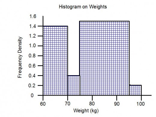
The frequency table shows the weight of 47 people. Draw a histogram.
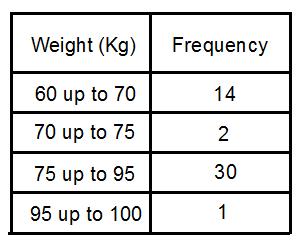
The first step in drawing a histogram is to calculate the frequency densities.
To work these out divide the frequency by the class width.
For the 60kg to 70kg group the frequency density is:
14 ÷ 10 = 1.4
For the 70kg to 75kg group the frequency density is:
2 ÷ 5 = 0.4
For the 75kg to 95kg group the frequency density is:
30 ÷ 20 = 1.5
For the 95kg to 100kg group the frequency density is:
1 ÷ 5 = 0.2
Once these are calculated you can draw your scales. The highest frequency density is 1.5 so you need to go from 0 up to 1.5 on the y – axis and along the x axis go from 60kg up to 100kg. All you need to do now is draw the bars for each group. As you can see from the histogram the area of the 75 to 95 bar is the biggest, so this group contains the most people. The 95kg to 100kg bar is the smallest in area so this group contains the least people.
So that is everything you need to know about drawing a histogram. The key point is to remember that you need to work out the frequency density which is found by dividing the frequency by the group width.