Review: Masterful Color by Arlene Steinberg
Book Image

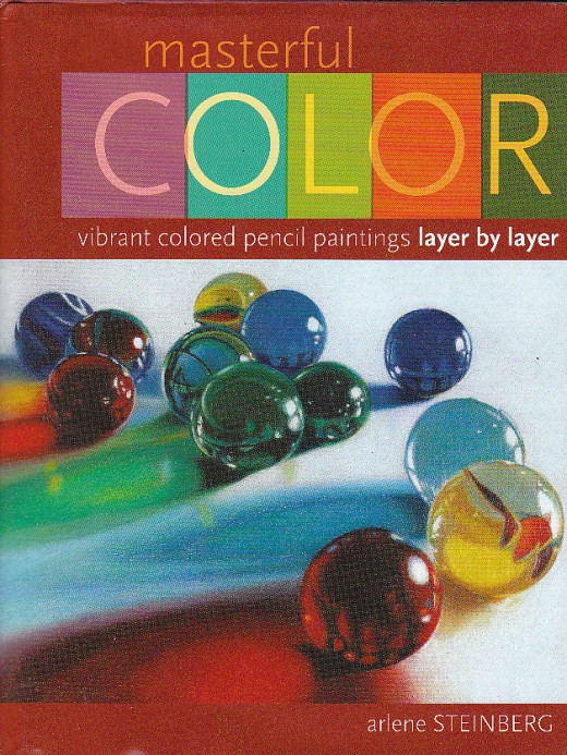
A review of Masterful Color by Arlene Steinberg
Masterful Color by Arlene Steinberg is the latest of at least a dozen excellent how-to books I own on colored pencil realism. I've got several of Gary Greene's volumes, several of Bet Borgeson's volumes, Painting Light with Colored Pencil by Cecile Baird, Colored Pencil Solutions, Colored Pencil Explorations, the Encyclopedia of Colored Pencil Techniques, and more. A good chunk of my art book shelf is dedicated to colored pencil books. Yet this one did something rare and wonderful. It changed the way I look at Prismacolor painting.
I've been using colored pencils since 1971 and started with Prismacolors. I've been a professional artist and sold colored pencil realism pieces for three-figure prices. Yet when a new book appears that takes everything I know and turns it inside out, transforming everything I create after using it, that book is pure joy.
I wasn't a beginner. But I do remember what it was like first learning how to use a photo reference or how to mix color, how to make sure an artwork has strong values or a good composition. All of the beginner material I was familiar with is presented well in Masterful Color, so well that if this had been my first and only colored pencil book I would've learned everything a lot faster.
Way back in 1971 when I bought my first set of 72 Prismacolors, a little pamphlet came with it that had examples of works by professional artists, both fine artists and illustrators, as well as a color chart and a few pages of techniques. Its cover had a wonderful landscape with a reflecting lake, trees, mountains and clouds, very rich in detail and as realistic as any nature poster or oil painting in an art museum. I fell in love with the idea of doing colored pencil realism and struggled with years to learn burnishing, shading, all the coloring skills needed to create that kind of natural effect.
Yet while I was good at color mixing and very good at using a large palette to create any color I wanted, I didn't see half of the possibilities that Arlene Steinberg goes into in her detailed, step by step demonstrations and excellent theory essays. Her artwork ranges from large colored pencil paintings to more manageable sized projects like the 5" x 7" still life of marbles, "I thought I'd lost them," that appears on the front cover.
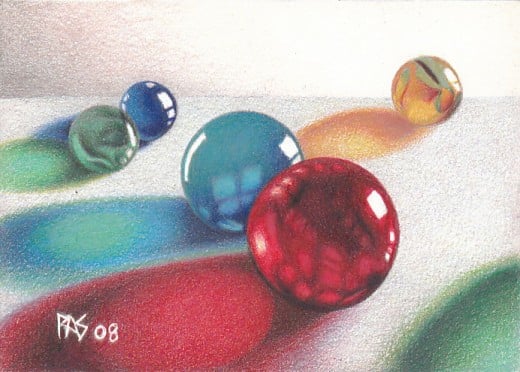
This is the exercise that inspired me, and because I'm used to using photo references that I don't have permission for and changing them so radically that I'm not doing someone else's copyrighted work, I simply used her reference and laid out my own arrangement of the marbles for the illustration of this article -- Robert's Marbles is my version.
The effect this artwork has in person is something I would not have believed till I finished. It goes beyond photorealism. Her methods of complementary underpainting and meticulous layering, varying pressure and a constantly sharp point on Prismacolor Premier and Premier Lightfast pencils results in realism truer than photography.
In that long-ago Prismacolor booklet, the author explained that translucent Prismacolors when layered have a luminescence similar to oil painting. Light bounces through the transparent layers at different angles to enrich the surface color and make it more vibrant.
What Arlene Steinberg has done is make this rich luminous effect easy even for a beginner. Clear line drawings are printed in the final pages for all of her projects, so if you're not skilled in freehand drawing you can trace and recreate her art exactly for your exercises. She's listed each of the colors by name and recommended the right paper for the effect -- Rising Stonehenge.
If you buy this book, I recommend you also purchase white Rising Stonehenge paper in a sheet or pad and Prismacolor Premier or Premier Lightfast pencils. You can either get large sets and have all the colors she uses, or choose a project and purchase the pencils needed for that project, but they are all Prismacolors -- Premier, Lightfast and Verithin. It's the special qualities of the Prismacolor core formula and the soft Rising Stonehenge paper that allow as many layers as needed to create this hyper-realism effect.
I used to try to shorten the number of layers I used on colored pencil painting so as to complete it faster. Arlene Steinberg's methods are easy but they are not fast. This is a slow, careful and meticulous approach to colored pencil painting that's perfect for the sort of serious hobbyist who likes creating fine resolution cross stitch paintings, or other massively complex work in simple steps with good materials, carefully. The title is apt. It is a mastercrafter's approach to colored pencil painting.
Counterintuitive, the first layers of any work done with a complementary underpainting will look crazy, and sometimes look very bad. But patient layering will gradually bring the color up toward the true colors of your objects like watching a Polaroid develop itself, until at the end your painting has a brilliance that could not be achieved any other way.
While the complementary pigment particles aren't obviously visible, their presence makes all the colors dance the way colors do when you look at red holly berries on green leaves at Christmastime. That vibrating feeling is there. Objects shaded carefully to give them form and light will have a liveliness to them that isn't there if you were to just carefully color the line drawings with the final colors.
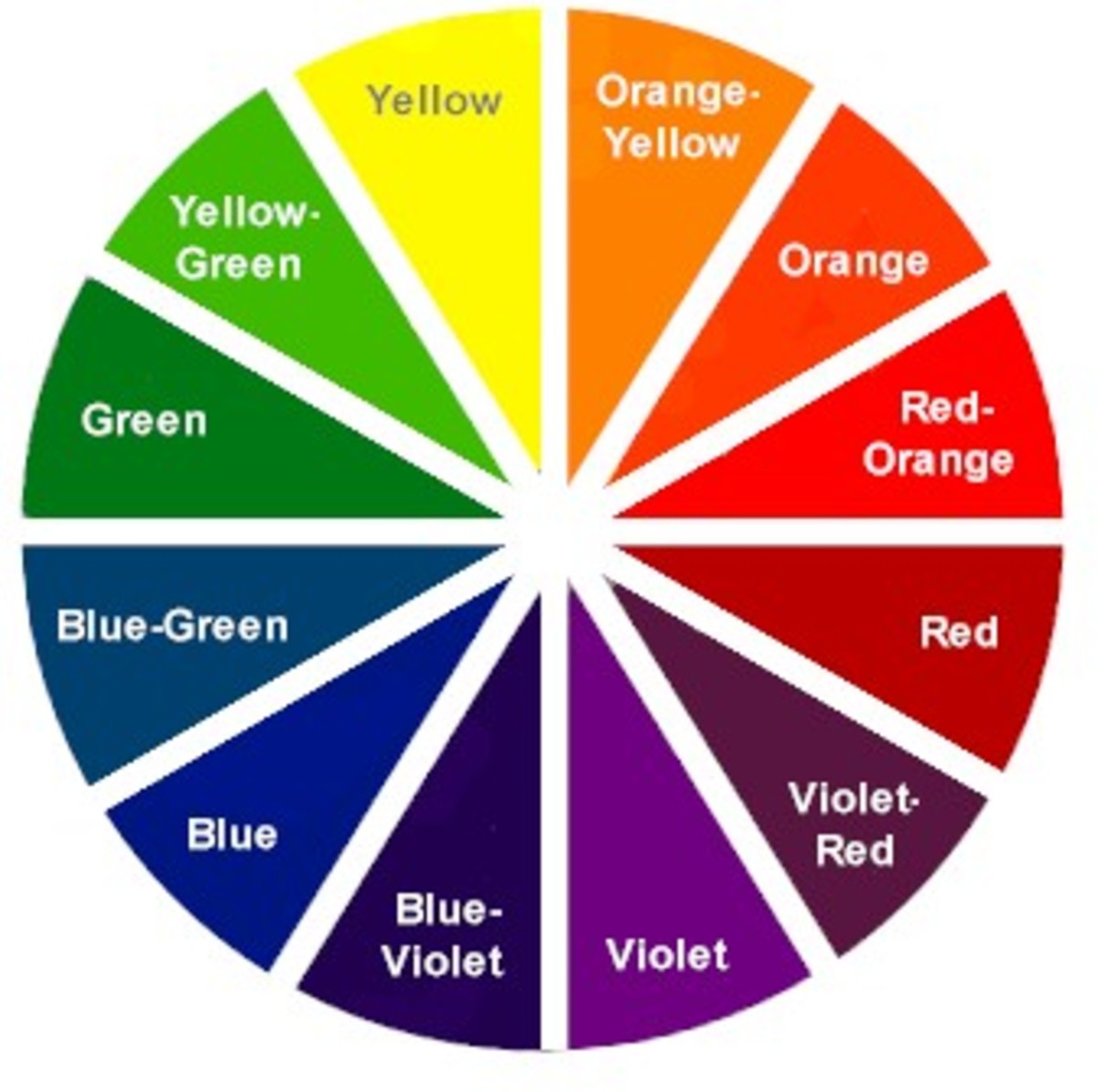
Ms. Steinberg includes a color swatch chart in the back of the book for each Prismacolor used by name and color number, and a color swatch comparison chart for underpainting complements by color groups. This allowed me to apply her techniques easily to subjects that weren't in her book, things I drew from life like my subsequent marbles still lifes.
I had forgotten what Prismacolors can do, and grown too used to my time-saving shortcuts to remember what happens if you fill a black area with layers of complementary dark colors and don't use the black at all to build it. Arlene Steinberg brought me back to my first love in this medium and reminded me why Prismacolors are still the ones I've bought the most replacements for over the years.
I will be testing the techniques with other brands of colored pencils as well, since I've only tried one other brand so far, and post the results of those tests in secondary capsules to this hub. But you can count on the best results using the brands she recommends.
The book is a kick-start to experienced colored pencil artists, amateur or professional, and so well structured that I would recommend it to a raw beginner who can't draw a straight line. You can get good results with her projects as a beginner by carefully following instructions and using tracings till you learn to draw well freehand.
Each skill needed in basic drawing is explained in a concise, easily understood way with excellent exercises and demonstrations, many of which make goodlooking small pieces even in themselves. Something like the tomato or the pears will make a good small addition to any country-themed décor, or could be framed and matted to a bright accent in a modern décor.
This book is one of the best. Check it out from the library, buy it online or pester your local bookstore to order yours if they've run out -- it's selling well and has only been in print since around April 2008 if I recall right.
My art using the Steinberg techniques


