The Psychology of Colour

How colour influences interiors and mood.
White light is composed of many colours. If you remember from science class way back when, white light is composed of many colours that can be seen when a beam of light is passed through a prism. The colours of the rainbow separate because each colour has a different wavelength: red has the longest wavelength and the slowest frequency, violet has the shortest wavelength and the fastest frequency.
The notion that light is energy and that different colours therefore have different energy is central to practises such as feng shui and colour therapy which aim to use colour in many ways to enhance well being.
So while we may all agree that colour can have a strong effect on perceptions, feelings and interactions not everyone will agree what those effects are. Different colours can have different meanings in different cultures.
Some people feel warm colours like orange are cosy others may say oppressive, some may say red is vibrant others say garish.
Different colours evoke different memories and therefore emotions in individuals so when choosing colours you have to go with your gut.
This hub aims to look at the ‘Psychology' of colour in very loose way probably better called ‘popular connotations of colour' but that is not very catchy!
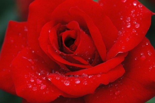
Red
Perhaps the warmest of warm colours red is considered a very passionate colour the colour of love hearts, romantic roses and blood!! It is the colour newborn infants immature eyes are most drawn to. It is an emotionally intense colour, strong, bold and brave. It is used to denote determination, desire and courage. Red can be considered confrontational and intimidating but is also well know to stimulate appetite as it makes food particularly meat look appetising.
Red is a good choice for anyone who wants to bring heat, intensity and passion to their surroundings. But you don't have to use it lavishly
Where
It works well in the boudoir and dining rooms. If you're favourite room cannot cope with your favourite colour (it is the strongest advancing colour), consider related shades such as pinks or terracotta. It is often considered the most powerful colour in an interior designer's palette.
Red
Yellow
Yellow is a powerful eye fatiguing colour. It is uncompromisingly happy, raising the spirits and projecting energy, liveliness, joy and comfort and intellect. Just think of the effect of a warm sunny bright day. It is the brightest colour in the spectrum, so not surprisingly it is know to speed up the metabolism and cause insomnia.
It can make rooms light and vibrant, whether you choose the most pure yellow you can find or warmer shades of saffron, deep ochre or cooler tints of lemon or pale butter you will fill the room with sunshine.
Where
Works well in poorly lit rooms or hallways. Consider warmer shades (think egg yolk ochre or butter) for north facing rooms. They receive quite a cold light from the sun and could do with a boost of warmth.
yellow

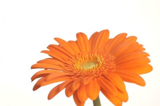
Orange
Almost as warm and advancing as red, orange radiates enthusiasm, cheerfulness, affordability, stimulation and creativity. It imbues natural warmth and is also thought to stimulate appetite.
Where
It works well in living rooms and family rooms.
Orange
Blue
Blue is easy on the eyes. It is uplifting and relaxing at the same time, thinks blue sky. It is often thought of as a cold colour but the tranquillity of pale blue can imbue a sense of space and peace. It is also considered to have depth, stability and professionalism, think of all the blue/navy uniforms you have seen. It is relaxing, has honour and trust but can also be considered passive and cold. Blue is thought to be a natural appetite suppressant.
Where
It is good in bedrooms and bathrooms perhaps not in dining rooms unless you wish to eat less!!
Blue in nature

Green
Think nature, green is mother natures Hallmark, signifying life, freshness and harmony. ‘Going green' these days implies a return to natural processes and a greater respect for natures balances. Green is therefore considered durable reliable honest safe harmonious and fresh. Lighter shades will bring the notion of newness like spring buds. Calmer shades such as sage and olive bring an easygoing calm to an area. Green is thought to have a calming effect on the central nervous system and even help vision as it is gentle on the eyes.
Where
Use lighter shades in bedrooms, offices, living rooms and bathrooms. Use mid tones for kitchens and living rooms.
Shades of green

Usefull links
- xlphotoart Home - xlphotoart
if you like the photo art displayed in this hub please visit xlphotoart to view more work by this photographer (Christian Obrien) - 4096 Color Wheel Version 2.1
fun colour wheel. 4096 Color Wheel Version 2.1 by Jemima Pereira. Free for any use. Save this page and the image. (IE users also need a blank gif.) ... - -:: Welcome to the Feng Shui Society ::-
Find details of Accredited Feng Shui Society Consultants in your area, browse the latest courses and events, learn how feng shui can help you in your home office, or life. - Colour Therapy Healing - The Colour Therapy and Colour information resource
Colour Therapy Healing.com, the best source of information about Colour Therapy, including the Chakras, colour treatment, colour history, what colour is and more...
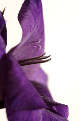
Purple
Purple is the colour of magic and royalty, wealth, passion and power. It is also considered artistic, feminine and romantic. It is said to stimulate creativity. From deep regal purple to soft mauve this colour offers many decorating possibilities. Violet has the shortest wavelength and children are said to respond well to violet.
Where to use
Works well in dining rooms, bedrooms and libraries.
Purple
Brown
Brown is considered solid and reliable, casual, earthy, stable and reassuring and perhaps..... boring?
Where to use
It works well in lighter shades in bedrooms bathrooms kitchens and conservatories
Brown
Black
Black can have a range of negative associations linked with evil, depression and mourning. Black is also the colour of authority, (think judge's robes), elegance, sophistication, formality and power and mystery ( think magicians robes).
Although not strictly a colour touches of pure black (it is more an absence of and colour or light) can be used to accent or set off other colours in the room
Where to use
It works well to define spaces and as an accent colour Too much use can be considered morbid and draining. The classic combination of black and white can be used to create clean simple lines however overuse can seem very masculine and functional.
Black

Grey
Grey is considered conservative traditional intelligent and serious. Used artiscally it can be very stylish and unexpected
Where
Works well in bathrooms living rooms and kitchens
White
White reflects light and is therefore an excellent base colour. It is associated with cleanliness purity sophistication and simplicity, peace and innocence.
It can be used to add space but can be very uninviting and cold.
Where to use
It works well in every room and can be very useful. When deciding a colour scheme for a new home or space it can be a good idea to start with a white base as you watch how light falls around your home/office etc and see how rooms are actually used over time.
White in nature