How Groupon Attracts Customers: sales countdown and other pressure techniques highlighted

Introduction
Groupon started in 2008, and now has over 7000 employees (1) and deals in 43 different countries. The company rebuffed Google's offer to buy it for $6 BILLION dollars in 2010, believing it is worth even more. It may be bringing in up to 2 BILLION revenue in 2010. It seem to be the next "biggest thing", so much so it has spawned several competitors, such as LivingSocial.
How did it become so successful just by offering discounts? Let us look at such a deal offered by Groupon, and see how it works to entice you to click "buy".
Offer for San Francisco on July 2, 2011

Groupon's offer is specifically designed to entice you to click, by designing things in a certain "visual order". Let us discuss the sections one at a time.
First thing you see is that huge photo of enticing Japanese food, in a close-up. Then your eyes are attracted to the Buy! button to the left due to the contrast.
Buy! Button

The BUY! button is featured prominently, with high contrast to the rest of the page, in order to direct your eyes from the photo of that delicious Japanese food. The price, the original price, the discount, and the amount you saved is featured prominently.
In general, Groupon offers are AT LEAST 50% off, giving you impression of substantial savings.
If you are still doubtful about the deal, the countdown clock gives you that extra psychological push of urgency...
Countdown Clock

The countdown clock below the price gives you sense of urgency... You must take advantage of this offer before it expires, or you'll never see it again!
Right below the clock, you get "also bought" counter, in case you are wondering who else likes this deal...
Bought Counter
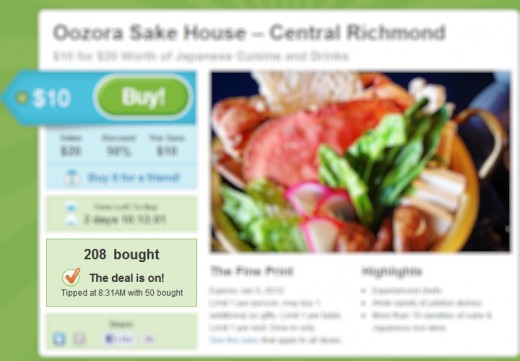
This many people had already bought it, you can't go wrong if you buy now!
Also, you won't be the only cheapskate who bought into this deal!
What if you still won't buy? Then Groupon tries to guilt-trip you by making you 'share' the deal with other people... or buy it for a friend.
Gift and Share
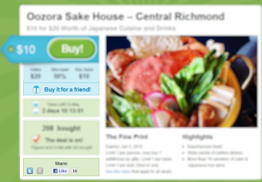
Don't just buy it for yourself, buy it for a friend too!
If you won't buy the deal for yourself, at least tell them about it via all these buttons below!
What Have You Learned?
Groupon have used the following techniques in their offer:
Visual Order Is Important
Present a good big picture, and next to it a big BUY! button They need a good contrast from the rest of the page. Note the blue button is a good contrast from the light background, and same with the photo of the food.
Also note how the button "sticks out" from the table itself, further emphasizing it visually.
Emphasize the Savings over and over
Savings amount, percent off, value is repeated in the subtitle, next to the price, and so on.
Countdown Clock adds urgency to "tip over" the hesitant
Almost every infomercial special offer has "limited time offer!" countdown clock. Groupon is no exception.
Bought Counter tells prospective buyers they are not alone
Home Shopping Network is first with "sold counter" on TV, and Groupon had taken the lesson to heart. The more quantity sold, the more likely people will buy the item, as prospective buyers use the number to rationalize their own buying decision.
Gift / Guilt-Trip Button
Don't just buy it for oneself, buy it for a friend! Even if you don't like Japanese food, you can let someone else redeem it!
Share-the-Deal Buttons
Even if the prospective customer don't need the deal and do not want to gift it to someone, he or she may know someone who does!
Keeping it Simple
The fine print is kept to a minimum... Not limited to special dishes or such.
Conclusion
While these techniques are rather obvious, it is difficult to execute properly, and all in one offer with limited space on the page. Groupon is successful because it was able to combine all these elements into a cohesive whole design and apply it to variety of offers, and the techniques they used can be applied to your offer as well.


