- HubPages»
- Home and Garden»
- Home Decorating»
- Interior Design & Decor
Thom Filicia Style

Interior Designer Extraordinaire
Thom Filicia, from Queer Eye and Dress My Nest fame, is a designer for today who combines classic lines with modern twists. His look combines classic lines, organic textures and neutral color schemes which inspire calm and exude sophistication.
Though he's well known for his residential jobs, he is also an outstanding designer of commercial spaces and enjoys a roster of celebrity along side "every day" clients. His spaces are infinitely comfortable and impart the perfect balance between masculine and feminine. There's nothing trendy about a Thom Filicia space, it's just good design that will be just as beautiful in five years as it is today.
If you're looking for design inspiration for your own home, you'd do well to follow Thom's lead. It's not nearly as hard as you might imagine. I'm going to break down the look so that you, too can enjoy a beautiful, timeless interior.
How to Get Thom Filicia Style
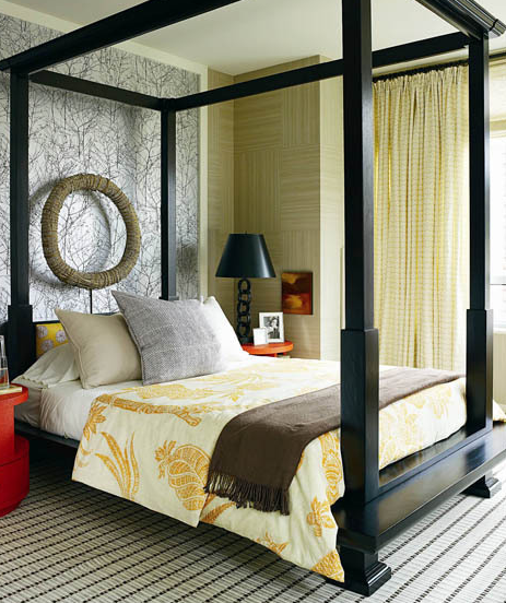
Thom's signature look is saturated in neutral color and organic, comfortable materials that combine to create a wide expansive feeling. His rooms are casual yet polished and say, "C'mon in" with a big smile. If that sounds like your style then read on.
If you want to recreate the look, you should first design an envelope of soothing, organic color. Paint names such as oatmeal, putty, ecru, cream, storm, cloud and cafe au lait are all good starting points.
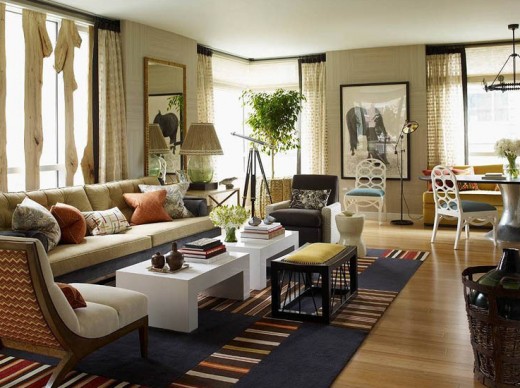
Take a look at the first picture on the right. Let's break it down into it's basic components starting with:

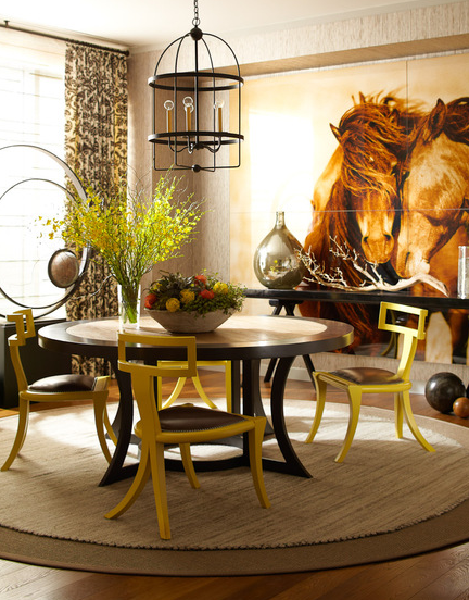
Color: Thom has chosen a warm color scheme starting with pale beige walls which he's covered in grass cloth paper. What he's done to add even more appeal to the wallpaper is cut it into squares and run the pattern in two different directions like a parquet floor. The contrasted textures add contrast and interest. (You could get this same look for a lot less money by painting the wall in squares and using a brush to achieve a "linen" look - just make sure to run the brush across on one square and up and down on the next). The curtains are the same color as the walls but introduce a new texture. This contributes to making the room seem even bigger than it is because your eye perceives the same colors as being part of a whole and yet adds in another layer of texture.
Filicia starts with neutral furniture in taupe, beige and brown (which is a great starting point as you can always change the entire look of your room with accessories). The natural tone of the hardwood flooring is also central to the scheme. It adds warmth which is cooled by the blue area rug. The colors of the rug are then sprinkled around the room as accents of curry, pumpkin and water which adds a subtle tension because blue and orange are complimentary colors on the color wheel - meaning they are exact opposites. That's why the white tables are extremely important because they give the eye a place to rest.
Symmetry: This is at heart, a symmetrical scheme.
The couch is balanced by even numbers of pillows, and weighted on
either side with accent chairs. Two coffee tables balance both sides of
the (extra long) couch and for interest one bench is placed in the
middle of the two tables.
Scale: Be sure to vary the
scale, or size of the items in your room. In Thom's living room scheme,
the upholstered armchair is balanced by a wood frame slipper chair
(meaning no arms) and the weighty couch is contrasted by the small bench
directly opposite. If you study the room, I'm sure you'll see some
more variances in scale.
Texture: Texture is central to Filicia's overall design. Here again, you'll want to think in terms of tactile contrasts. He adds in a lot of very subtle textures that contribute a visual depth to the room.
Contrast: This is what will give a room visual tension, which in small amounts adds infinitely to the rooms interest and appeal. Think in terms of:
- dark and light
- substantial and delicate
- rough and smooth
- high and low
Repetition: Notice the white lacquered coffee tables are repeated on the dinning chairs? The detailing of the bench is suggested in the wicker basket and caning of the slipper chair. The green of the Ficus tree is picked up in the table lamp, over sized bottle (in the wicker basket) and flower arrangements. Repetition is central to good design.
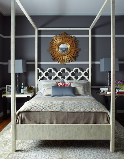
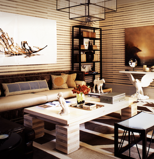
You'll see that these principal ideas are central in the other rooms as well. Take a few minutes to study each room and see if you can pin point where he uses each of the five points I've mentioned above. Being able to spot the design concepts, helps you to understand what makes good design and then you're well on your way to creating your own, signature masterpiece.
Article by Anne Alexander Sieder all rights reserved. For hardcore interior design fans, check out my blog www.prettyhaus.com.


