How to create responsive navigation menu using HTML CSS jQuery

Getting Started
Today i will teach you how to create responsive navigation bar using HTML, CSS, and jQuery, for a responsive design i used CSS media query properties, and for a slide down the menu i used jQuery.
First i have to tell you, how you can use jquery in your Web page:
- You can download jQuery from www.jquery.com and paste your downloaded file into your webpage directory
- You can use CDN (Content Delivery Network) just set this address into head section
CDN jQuery Source
<script src="https://ajax.googleapis.com/ajax/libs/jquery/1.12.0/jquery.min.js"></script>
	<!---- jQuery CDN used, Just copy the link into your head section ----->
HTML Structure
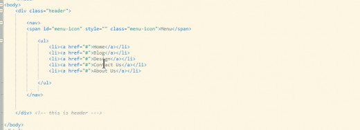
First i am going to create html structure, in this html structure, i used nav element which is HTML 5 element and i also added ul element and li elements but in the nav element i also created span element.
Our HTML code will look like this
HTML Structure
CSS (Cascading Style Sheet)
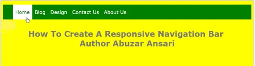
After creating the html structure, CSS style can be used in head section or can be used as external css file, It's time to do css to make our navigation bar look cool, after finishing my css i have got this result.
CSS Style Code
CSS Media Query Responsive Design
For a responsive design we use media query, i have set max-width: 480px that mean if the screen size is lower than 480px. then which CSS we applied into media query will executes, Responsive design is very important and very needy in this field according to the latest survery youth spend their daily 2.8 hour time using smart phone like android or windows phone and they spend 2.4 time on laptop or desktop, So first design for mobile.
If we don't apply media query properties so our HTML page or navigation bar look odd on 480px screen size, so the better design better functionality we use jQuery and CSS media query.
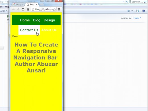
WIthout CSS Media Query
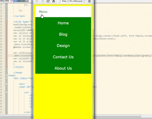
After Applying CSS Media Query
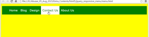
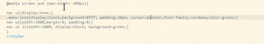
After using media query, i have got good look, in media query i set ul element display properties to none, because if we re-size the browser screen to 480px so the navigation bar will not visible because of we have set this properties. It is visible if the screen size is larger than 480px.
If you look to the main CSS not media query, .menu-icon display properties set to none, this element is not visible yet, so we will make this element visible in our media query screen 480px, so that mean if screen size is 480px or lesser so this element will be visible and navigation bar will be invisible and we will apply jquery on .menu-icon element so if the user click on it, our navigation bar slide down then slide up.
Media Query CSS
After Applying CSS Media Query
Getting Started With jQuery
Now we have created responsive navigation bar by using html, css and css media query, now i am going to apply jquery on this navigation bar so if the user click on the Menu, so it slide down and click on again it slide up, by using jQuery we can create this action or functionality, Jquery is a javascript library, you can use jquery as CDN (Content Delivery Network) Just copy the code and paste it into your webpage head section, which i have written on above. If you are using it, make sure you are always connected to your internet connection, internet is required.
You can download jquery from the official website.
Jquery code to be written between script tags,
Full HTML CSS JqueryCode
<!DOCTYPE HTML>
<html lang="en-US">
<head>
<meta charset="UTF-8">
<title>Responsive Menu</title>
<script src="https://ajax.googleapis.com/ajax/libs/jquery/1.12.0/jquery.min.js"></script>
<!---- jQuery CDN used, Just copy the link into your head section ----->
<script type="text/javascript">
$(document).ready(function(){
$("#menu-icon").click(function(){
$("ul").slideToggle(1000);
});
});
</script>
<style type="text/css">
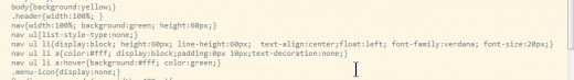
body{background:yellow;}
.header{width:100%; }
nav{width:100%; background:green; height:60px;}
nav ul{list-style-type:none;}
nav ul li{display:block; height:60px; line-height:60px; text-align:center;float:left; font-family:verdana; font-size:20px;}
nav ul li a{color:#fff; display:block;padding:0px 10px;text-decoration:none;}
nav ul li a:hover{background:#fff; color:green;}
.menu-icon{display:none;}
@media screen and (max-width: 480px){
nav ul{display:none;}
.menu-icon{display:block;background:#fff; padding:20px; cursor:pointer;font-family:verdana;color:green;}
nav ul{width:100%;margin:0; padding:0;}
nav ul li{width:100%; display:block; background:green;}
}
</style>
</head>
<body>
<div class="header">
<nav>
<span id="menu-icon" style="" class="menu-icon">Menu</span>
<ul>
<li><a href="#">Home</a></li>
<li><a href="#">Blog</a></li>
<li><a href="#">Design</a></li>
<li><a href="#">Contact Us</a></li>
<li><a href="#">About Us</a></li>
</ul>
</nav>
</div> <!-- this is header --->
</body>
</html>")


