Adobe InDesign Graphic Design Tips and Tricks
When I started working with graphic design software I most frequently used Quark XPress as my layout and pagination program. Although it was not an Adobe product, I used it along with Adobe Photoshop, Adobe Illustrator and Adobe Acrobat. I then went to a design conference, and I was introduced to the beginning stages of Adobe InDesign and it was love at first sight. The seamless interaction with the other Adobe products, the intuitive layout features were all I needed to make the switch. At first it was a clunky move, the features I was most familiar with in Quark weren’t missing in Adobe InDesign, they were just in a different place within the software. Now I have been working with the program for some time, I am not only less clunky, but have a few tricks up my sleeve. If you do not already have Adobe Indesign, or the other Adobe products, you can download a 30-day trial for free. Be aware that they allow you to download the entire contents of the software, not just a portion, so the downloads will take up a lot of space on your computer.
I utilize InDesign for any print design projects because it is built for pre-press and color management. I have run across a lot of people that have designed in several different programs, and although some I may just not be fond of, others are truly not the best choice for print production. InDesign, as I said it set up for pre-press; it works seamlessly with Adobe Acrobat and Distiller to create a Portable Document Format (PDF). As many people know, a PDF is the most accessible format to view on any operating system and has solved a lot of cross platform problems. However, just because it is a PDF does not mean that it is “print ready”. InDesign allows the creator to embed their fonts so that when the document is printed, it will not be missing fonts. When a document is missing fonts, they primarily default to the nearest font available, making a mess of your document. Larger printers sometimes cannot recognize another font to default to, and the characters will blow out, meaning it will become symbols and shapes.
That aside, I have come across a few tips and tricks for Adobe InDesign that have allowed me to be more efficient on specific projects. I currently lay out not only advertisements and marketing material, but also multiple publications. These range from newspapers, to tabloids to full glossy magazines. I work a lot on the pasteboard (the white space around the document) saving small blurbs of verbiage, photographs or even just to rearrange a page. The pasteboard is proportionate to what size document you are working on, however, it is still originally only about a quarter of the size of the project. As much as I have looked and researched, there is not a simple button to press to make the pasteboard larger. There is a trick to render this problem though:
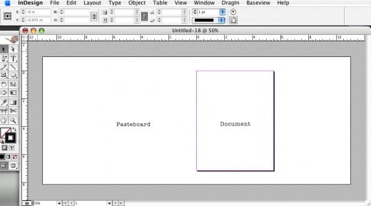
Go to “file” -> “new” -> “project”
Put a size that is larger than the size of the project you are actually going to work on; ex: the actual project size is 8.5”x11” and you want a wider pasteboard put 16”x11”. (the sizes will automatically convert to picas, but you can type in “16in” into the any of the fields, and it will be the correct conversion)
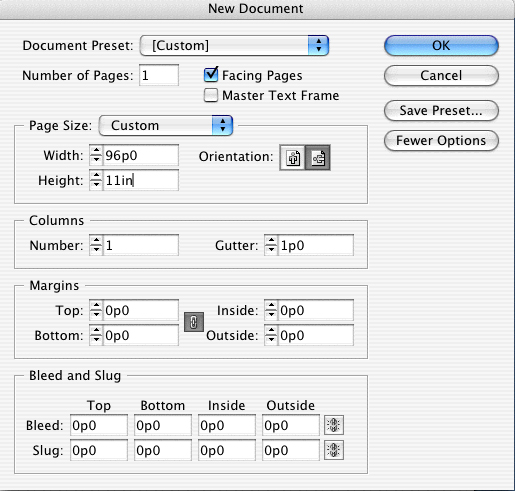
Now go to “file” -> “document setup” and change your width back to the original 8.5” inches.
Go to “file” -> “save as” -> and save your document.
Close the document, and close the program completely (on a PC “File” -> “close”, on a Mac, right click the icon on the dock and select “quit”.
Launch InDesign.
What you have done here is saved your settings for the pasteboard for future projects. Now when you go to open a project, you will have an extended pasteboard.
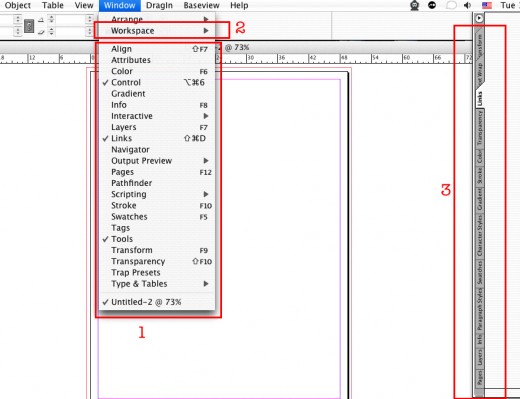
Another method to increasing efficiency in Adobe InDesign is to create a custom workspace. I have found that there a specific formatting windows that I use on a regular basis, and it is just quicker for me to keep them on my screen in a fly out while I’m working, as opposed to closing and reopening.
Go through all of the windows and choose which ones you want to show and which ones you want to show. This will also work with character palettes; you can click and drag the tab to the fly out menu and it will automatically add it to your workspace. Once you have your workspace how you want it, to “window” -> “workspace” -> “save workspace”. Name your workspace with a name that is relevant to your needs, and “save”. When you want to load this workspace: go to the same dropdown from “window” and choose the workspace you need. This is also helpful if you need different workspaces for different projects.
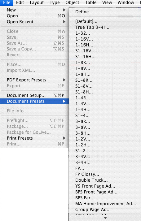
With print material, there are several different sizes that projects can be, especially when you are working with print advertising. You can save your own size presets, and if needed you can also export them and have others import the sizes very easily. To create a new document preset (document size) in Adobe InDesign, go to “file” -> “Document Presets” -> “define”. You will be prompted with a screen that will show you the current presets that you already have loaded, and a few more options.
“Cancel” is to cancel the action that you have started without saving.
“New” is to add a new preset to your preferences.
“Edit” is to make changes to an already saved preset when it is selected.
“Delete” is to delete a selected preset that is already loaded.
“Load” is to load a preset from one computer to another as long as they are both using Adobe InDesign.
“Save” will save all changes made to your document presets.
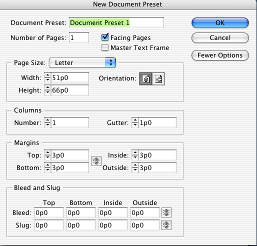
To add a new document preset select the “new” button and this screen will appear:
Give your preset a name that is relevant to your needs, and fill out the rest of the information in the preset. Hit “OK” and your preset has been loaded.
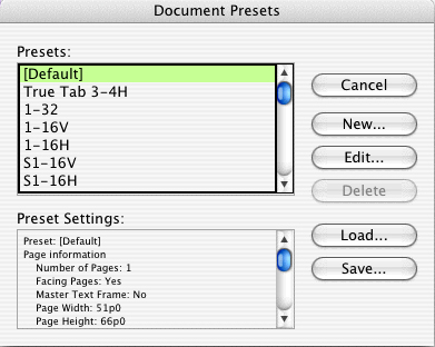
A lot of times in a work environment with multiple people working on the same projects on different machines, it is helpful to share presets. To do this, you can go to the screen when you added a new preset, and select the presets that you want to share. Once you have selected them, choose “save”, and this will save a “group” of presets for you to be able to share.
If you are on the receiving end of the document presets, you will need to load the presets into your preferences. Go back to the same screen that you saved your export, make sure all presets are not selected, and choose “load”. Browse for where you saved the presets that were sent to you, select them, and save. You now have all of the loaded presets in your on preferences to be able to reference and access.
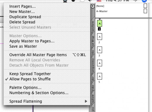
I lay out multiple publications on a regular basis, and I use “master pages” to assist with the layouts that I create. I use the master pages for any content that I need to appear on every page of the publication, such as page number, company name and publication name. To do this I create a new document, go to “window” click to view “pages” and add it to the workspace. From the top triangle that pops out with more options: choose “new master”, and a screen will pop up that looks like the following:

Name your master a relevant name that fits your needs such as “left page” or “right page” and select “ok”. On that master add the information that you require on the pages that need the repeating information. From there, click the master page in your “pages” window and drag it onto the pages that require the master.

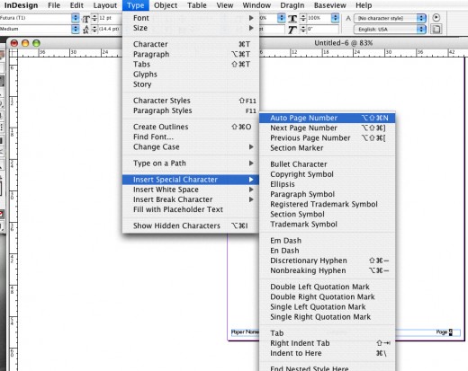
When you are laying out publication you primarily need page number on every page. You don’t want to have to label each page individually, that is inefficient and leaves room for a lot of error. There is a way for the document to do this for you:
Select the master page that you want to put the automatic page numbers on in from your “pages” fly out. Select the page number that you want to replace, or insert the curser where you want the automatic page number to be placed.
Go to “type” -> “Insert special character” -> “Auto Page Number”. This will place the letter you named your master on your master in the place of the page number, which will appear as the correct page numbers in your document. If you have a master for both left pages and right pages, you will need to apply the auto page number option to both masters.
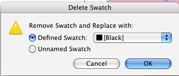
I have run into several situations where I need to delete a color out of a document, such as a business card design, or even an advertisement design. Whether I need to change the color, or delete color completely out of the document, I use the replace option in my swatch palette. Select the swatch that you used in the document that you want to delete, and select the garbage icon at the bottom of the swatch palette. When you select to delete you will be prompted with a screen asking you what color you want to replace the swatch with in the document.
From there you can replace the color with black, to delete the color out of the document, or you can replace it with another color in your swatch palette.
The eyedropper tool is a great tool for several projects, and is mostly used to match color from an image to use in Adobe InDesign. You can also use this tool to match text formats as well, such as headlines, cut lines and inset text. Select the text that you want to match to other text and select the eyedropper tool. Click on the text that you want to match, and the text that is selected will change to match what you have chosen.
Although this is an incredibly small portion of what Adobe InDesign can do, these tips can help make projects go a little more smoothly and more efficiently. The program is so powerful that you will find yourself learning new techniques and tricks as you work on a daily basis. If you have not used Adobe InDesign yet, be sure to download the 30-day free trial, it will definitely be worth your time.


