Creating an Artist Website That's Professional

Think Clean
Once you, the artist, feels ready to create a website to exhibit your art, you should always keep in mind the people who will have the greatest impact on your career - the gallery owner, the curator, the college admissions board, the art juror. You want your website to be accessible, organized, easily viewable and you want to make your art look the best it can look.
A few things to think about when designing your website so that it will look clean:
• Choose a URL that you'll want to keep forever. One of the first things a potential visitor to your site will notice is your URL. You don't want to turn them away with a URL like www.myartrocks.com. You also don't want a URL that's too specific like www.portraitpaintingsbyme.com. Even if your specialty is painting portraits, you'll likely try other things in the future and your art may change. To avoid having to create new websites with new URLs, stick with something simple and professional like simply your name. Some good examples are www.first-last.com, www.artbyfirstlast.com, www.firstlastart.com. Personally, I prefer the first of the three, as it establishes you as a brand, meaning that your name is synonymous with art, and it needs no explanation. It says that you are well-known. (Even if you're new to the art world, it gives the art world confidence in you and your art.) It also allows you freedom when your art expands.
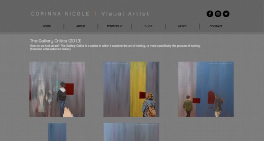
• Keep your background neutral. Typically, when art is exhibited in a gallery or museum, it's on a white, off-white, or grey wall, and if your art is framed and matted, the mat is usually a shade of white, grey or black. In other words, artwork looks best when presented on a neutral background. So your website should strive to present your art the way it might look when displayed in an exhibition. Splashes of bright color are fine, but the background directly behind your art should be neutral.
• Music and flash animations are distracting if they're not part of the actual artwork. In general, music will make your site cheesy. Yes, there's generally soft music playing at the opening reception at a gallery, but when it comes to your website, let your art make all the noise. Also, save the flashy stuff, like buttons that constantly move, or stars falling gently down your site. All of that does nothing other than distract the viewer from actually looking at your art. Unless you are a flash animation artist or you create art using music, I'd recommend keeping both off of your website.
• Take good pictures of your art. When you document your art, you want the picture to look as close to the original art as possible. Unless you're someone who documents artists' art for a living, taking good pictures of your art is not necessarily easy. The basics: 1.) The artwork should be parallel to your cameras lens. This is best achieved by hanging your art work on the wall (if it's 2D) and putting your camera on a tripod. If your art is leaning at an angle, your camera should be pointing at the same angle. 2.) You should not use flash on your camera. The room should be well lit - natural light works best. 3.) If 2D, crop your art to the edge; if sculptural, the surrounding surfaces should be a solid black or white. For more advanced documentation techniques, check out this video by the Saatchi Online and pages 85-97 of Lazzari's The Practical Handbook for the Emerging Artist.
• Proofread everything. You don't want anyone to get turned off by your website because they can't read anything without getting caught up on a misspelled word or confusing sentence structure. It's always a good idea to let a few friends read your writing before you let the general public see your site.
Things your website should include
1.) Your artist biography. This could include where you're from, where you went to school and what degrees you earned, if your art has a general theme or style and anything else relevant to the art you make.
2.) Your CV or resumé.
3.) Your best artwork. Only include images of your original work and your completed work. Unless you're working on an ongoing project, where showing the progress is important, you should post art in its completed state. If you want people to see your sketches, studies or works in progress, keep a separate blog and simply provide a link to your blog on your website.
4.) Statements about bodies of work. If you work in series, write statements for bodies of art. Obviously there's a reason you chose to make several works for one theme, and your viewers will want to know more about the art.
5.) A shopping cart/paypal option if you choose to sell your art online.
6.) Your contact information or message box so that potential clients, gallery reps, etc. can reach you.
7.) A news page to keep visitors informed of current and upcoming exhibitions, publications, etc.
Examples of artist websites
I've learned through trial and examples how to make my website professional. If you're looking to improve your website, or ready to create your first one, it's a great idea to look at the websites of other artists.
I've compiled a list for you, starting with a link to my website, followed by the links to several of my UC Berkeley colleagues and professors.
Corinna Nicole - www.corinna-nicole.com/
Miguel Arzabe - www.miguelarzabe.net
Katherine Sherwood - katherinesherwood.com
Merav Tzur - meravtzur.com
John McNamara - www.macpainter.com
Chris Vargas - www.chrisevargas.com
Amy Rathbone - www.amyrathbone.org
Kari Marboe - karimarboe.com


