Decrypting the World of Design

4 Elements
Whether you're new to the world of graphic design or you've strayed into further creative madness that you can be pulled back from, there are certain elements that are important for every graphic designer to know that often go misunderstood, misinterpreted, or simply ignored for the sake of time. There are four in particular that this Hub addresses.
- IMAGES: Raster Images vs. Vector Images - Understanding the differences and the best uses of each can save you massive amounts of time and energy in the long run.
- COLOR - There are so many aspects to color and light and color modes in design software that can escape even the more advanced graphic designers and web designers. A little more understanding of the differences behind RGB and CMYK can add a whole new quality to your craft and might make you sound like a creative genius.
- RESOLUTION: DPI & PPI - The best, most creative designs are useless if you can't get their quality to shine through on print or load on the web.
- UNITS - There is a certain amount of ambiguity surrounding dimensions and measurements that is easily unraveled, so we'll take a look at the measurement units you'll run into when using Adobe.

Raster Images
In the simplest sense, raster images are like photographs. They are bitmaps--grids of individual pixel squares that each have their own specific color or hue. Together they form a much larger picture. Not unlike a large puzzle, the further out you look, the higher the quality of the image appears to the human eye.
This, of course, makes the opposite true: the closer you zoom in, the more degraded the quality of the image appears. So, it's important, when using raster images, to account for how large an image will be printed or posted and to ensure that the amount of pixels can accommodate high quality.
One downside to raster images is that high quality comes in rather large files. These are some common file types of raster images: TIFF, JPEG, GIF, PNG and BMP.

The Printing Connection
Vector Images
In simple terms, vector images are like shapes. They are based on mathematical formulas that dictate geometry, from the most basic shapes, such as squares and circles, to more complex ones that you might find in a logo. The point is, they can be made larger or smaller, while still maintaining their quality, because their properties are defined mathematically.
This is extremely helpful when it comes to digital illustrations, particularly logos or branding, that need to be resized or recolored for different materials.

Designing with Color - Basic
Possibly the most common mistake that graphic design beginners make is the misuse of RGB and CMYK.
If you're designing for the WEB, design and export in RGB.
If you're designing for PRINT, design and export in CMYK.
If you want to know WHY, keep reading.
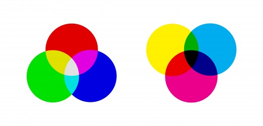
What do You Think are the 3 Primary Colors?
Designing with Color - Advanced
The science behind color modes is actually quite fascinating, and there is a lot of information out there for the interested party.
TVs and computer screens operate in RGB (red, green, and blue) and printers operate in CMYK (cyan, magenta, yellow, and black). Why? The answer is in additive vs. subtractive color.
RGB colors are coded using the decimal system and are assigned a hexadecimal number. These, for example, create a similar lavender to the one we just looked at in CMYK.
(150, 151, 203) | #9697CB
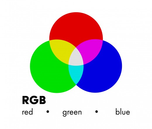
RGB stands for Red, Blue, and Green, and is generally used for the web.
The RGB color mode is based on an additive color theory, which is about adding light to make the primary colors of red, green, and blue or RGB.
By starting with complete darkness, we can add red, green, and blue light. Adding red and green makes yellow, green and blue make cyan, and red and blue mix into magenta. When all three overlap, we see pure, white light.
Resources on CMYK
- Why do printers use CMYK?
Ever wondered why printers use CMYK? The answer is pretty straight forward. We explain the differences between CMYK and RGB. Click here to read more. - Subtractive Color Theory
A brief introduction to CMY colour mixing. Explains the basics of tristimulus theory of colour perception in terms of subtractive primaries and secondaries a...
Each color in CMYK mode is coded in percentages. This combination, for example, creates a soft lavender tone, at a mixture of cyan and magenta, with 0% yellow and black: C: 42% M: 38% Y: 0% K: 0%.
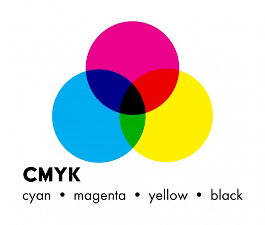
CMYK stands for Cyan, Magenta, Yellow, and Key (or Black) and is used mainly for print designs. These are the four colors that are used by all printers.
The CMYK color mode is based on subtractive color theory, which is about using the secondary colors (cyan, magenta, and yellow or CMY) to absorb certain colored lightwaves, leaving the others perceptible to our eyes as the remaining color.
Confused yet? Let's look at this in further detail:
Start with white, which reflects all colors of light.
- Yellow absorbs blue light, allowing red and green to pass through or reflect on a surface, thereby allowing us to perceive yellow.
- Magenta absorbs green light, allowing red and blue to pass through or reflect on a surface, thereby allowing us to perceive magenta.
- Cyan absorbs red light, allowing green and blue to pass through or reflect on a surface, thereby allowing us to perceive cyan.
- Yellow and Cyan absorb red and blue, allowing green light to pass through or be reflected.
- Yellow and Magenta absorb green and blue, allowing red light to pass through or be reflected.
- Magenta and Blue absorb red and green, allowing blue light to pass through or be reflected.
Cyan, Magenta, and Yellow together absorb all the primary colors, allowing no light to pass through or be reflected, thereby creating darkness, or what our eyes perceive as the color black.
When we put colored ink on a page, we see the color that is NOT absorbed by the substance it's printed on. So, color on a page, is about using various amounts pf cyan, magenta, and yellow to subtract various amounts of red, green, and blue light until our eyes perceive the right amount of those colors to see particular hues.
Something to Watch Out For
Because RGB uses a wider digital color spectrum, many times, designers will design using RGB in their software of choice, then just before sending to print, convert to CMYK.
The problem here, as mentioned before, is that not all RGB colors are available in the CMYK range, and some of them will be converted to the closest color in that mode. If you take this approach, be sure to do multiple print tests to make sure this won't take away important elements of your design.
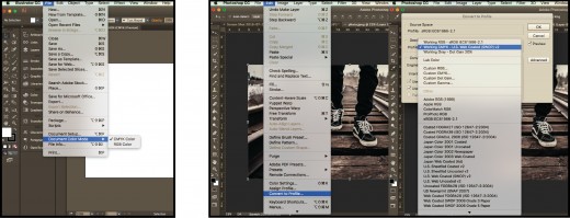
Choosing Color Options in Adobe

DPI
In the world of print, DPI stands for Dots Per Inch. It is a measurement of "dot density," that is, the number of dots that can be printed along a 1 inch line segment. The general rule is 300dpi for high quality print.
As a designer, you need to realize that this refers to a "printer setting," not to the quality of the graphic being printed. If you print a low-quality graphic at 100dpi, 200dpi, or 300dpi, it's still going to reflect the poor quality.
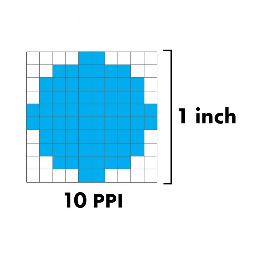
PPI stands for Pixels Per Inch. It is a measurement of "pixel density," meaning the number of pixels that are displayed on an inch of computer screen. Sounds a lot like DPI, right? The major difference between DPI and PPI is that DPI refers to print quality, while PPI refers to graphic quality.
When designing for print, the rule is 300ppi, just like 300dpi is the standard printer setting.
There are different standards, however, when designing for web. The rule used to be 72ppi when designing for screen. However, Apple's release of the new retina display computers has change the game a bit. Now, a Retina Display iMac has the capability to show quality at up to 218ppi.
The standard still remains 72ppi for screen, however, to ensure the highest quality possible on every screen, you'll have to export at a higher ppi.
Summary
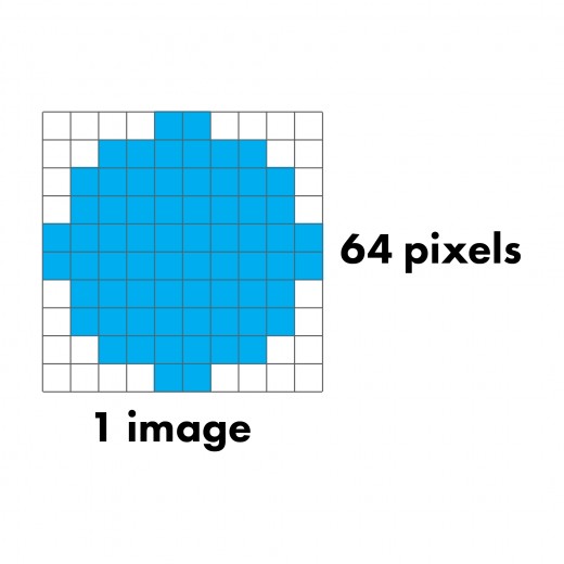
PPI measures the pixel density of a digital image.
DPI measures the dot density that your printer prints in.
If you're designing for WEB, export at 72ppi for standard computer screens and 218ppi for retina display.
If you're designing for PRINT, export at 300ppi and make sure the printer is set to print at 300dpi.

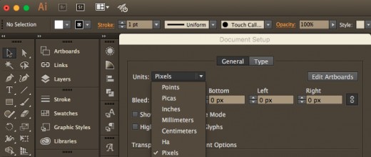
Graphic design softwares, such as Adobe Illustrator, Photoshop, or InDesign, can measure in many different types of units. For example, these are all the different units of measurement that Adobe Illustrator offers:
- pixels
- points
- picas
- inches
- centimeters
- millimeters
- ha
What do all of those mean?
How I choose which one's right for my graphic?
Pixels
When exploring the difference between raster and vector images, we mentioned pixels already - that they are tiny squares of color that form a much larger raster image. They are the smallest, controllable element in a digital picture. Photographs are made up of thousands of them.
Wikipedia
Units of Length
Points, on the other hand, are measurements of length and are the smallest elements of a vector graphic. A point is more commonly known as a typographic unit, developed originally for use in creating digital fonts.
Picas are also typographic units that are used to measure length in a graphic.They are larger however - measuring about 12 picas to a point.
Most of the software programs have options to use imperial measurements, such as inches or feet, and metric units, such as centimeters and millimeters.
Toshi Omagari Blog
Obscure Units
Some, like Adobe Illustrator, even have the Japanese typographic units ha and q, which are the equivalent of a quarter of a millimeter. This is a unit of measurement that American and European designers often don't understand and allow to lay in ambiguity for most of their design careers.
The reason that units like ha and q, are helpful, is that while, points and picas convert well to imperial measurements, ha and q, convert well to the metric system, which is still used by the majority of the world, including the "design world".
1 Point
| 1/12 pica
| 1/72 inch
|
1 Pica
| 12 points
| 1/6 inch
|
1 Ha
| 0.708661 points
| .25 mm
|


