How to Draw Using Pastels

On a recent trip to the beach I found a scallop shell half buried in the sand. something about the simplicity of the image made me want to draw it, so I took a quick snapshot for reference later.
Scallop shells represent the personal spiritual journey and may be carried by pilgrims. They represent both the earthly struggles - the link of the shell to St James, the Fisherman, and the spiritual ones. We are said to all be on the outer rim of the spiritual shell, with the many ribs pointing towards the one centre, although we focus on our own path.
Scallop shells mark the way of the Camino de Santiago - the Way of St. James, a spiritual pilgrimage walk from France to the 100 year old town of Santiago in Spain.
How To Draw Using Pastels

The only problem, was how to draw the sand, in particular how to obtain the grainy effect. After a bit of mulling I decided on using artists' pastels. I particularly enjoy using pastels, as they have a slightly uncontrollable nature, in that it's difficult to draw sharp, straight lines due to their softness, so sharp edges have to be suggested rather than drawn.
They are also incredibly messy.
Equipment
Pastelmat Pastel Paper
| Unison pastels borwn mix
| Pastel fixative
|
Craft knife
| Pastel Indian Red and black
| Cartridge Paper
|
Unison pastels blue mix
| White gouache
|
Rather than usuing the more straightforward technique of drawing with the pastels, I decided to work by shaving flakes of pastel with a craft knife, on to the paper, thus creating pastel 'dust,' which I hoped would give the texture of grains of sand when the piece was finished. You can judge for yourself whether or not this has been successful.
Artist's Pastels. Sand and Shell - first two layers
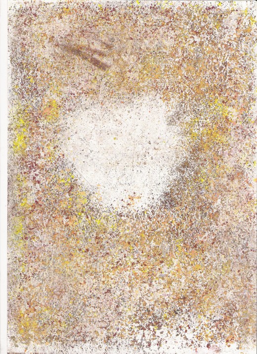
When using artist's pastels I find it easier to begin with the darkest colours and areas of deep shadow, before adding more colour and the body of the drawing, and then finishing with highlights.
In this picture there were no deep shadows as such, because I was looking directly down at the shell, so I began by covering the white page with pastel shavings, firstly of black, then dark brown, Indian red then grey/brown.
I used a rolling pin from the kitchen (notice to family - I will wash it, I promise) to press the colour into the paper, then continued with a layer of ochre shavings, pressing these in the same way.
From then on I let rip with all the colours I fancied, although I stuck to earthy browns, greys, yellows, oranges, reds and peaches, with the exception of a few sprinkles of duck-egg blue, without which, the picture would have become 'muddy;' the blue acting as a highlight and providing contrast. Sometimes I used the rolling pin to press the colours into the cartridge paper, and sometimes I placed another sheet of cartridge paper over the picture and pressed with my hands.
Every couple of layers of pastel, I used spray fixative to stop them from rubbing off.
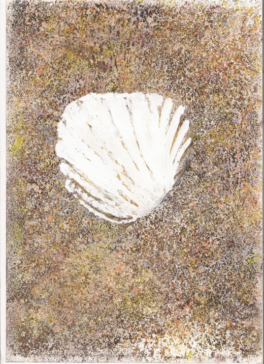
Artist's Pastels. Ochre shadows

Once happy with the sand, I used an ochre pastel to roughly put in some shade lines on the shell itself. Then, and this is where I cheated a little, I used white artist's Gouache to paint in the body of the shell in bright white, as it's often difficult to achieve bright white with pastels alone.
Artist's Pastels. Artist's Gouache Highlights
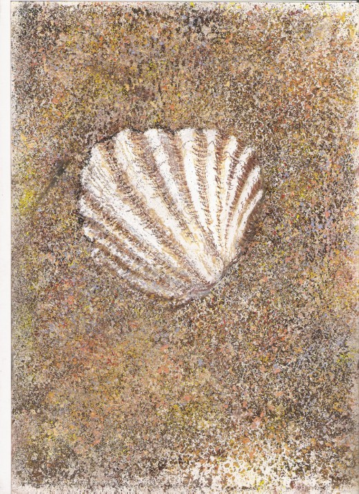
After letting the Gouache dry (which took about the length of time I took to drink a cup of coffee) I began to put some detail on the shell. I put broad shade lines in using a snady/peach colour, then, using the sharp edge of an Indian Red pastel I used short inverted curved lines to suggest the ridges on the shell's surface.
I added more ridges in the same way, using a dark brown pastel, then finally suggested some shadow by drawing broad vertical lines with the duck-egg blue.
At this point the shell looks like it's floating, so I used the shaving technique again, and sprinkled pastels over the edges of the shell to simulate parts of it being buried in the sand. I used the same blend of colours that I'd used for the body of the sand.
I also shaved some dark pastels lightly over the shell itself to suggest a few stray grains of sand.
Finally, I stippled black pastel around the top of the shell, just to give the whole picture a little more definition.
Once happy with the whole drawing I used the spray fixative again to set the whole picture and stop the pastels from rubbing of
The use of fixative has been hotly debated within the art world. Some pastel artists absolutely refuse to use it, as it alters the colour of pastel pigments. This is true, but I find there are times when using fixative is the best option. As I'd shaved my pastels onto the page in this case, there was a lot of loose pigment, and the finished piece benefitted from a light spraying.