Create Stunning Warped Ornate Text in Photoshop

I have always wondered why most designers avoid using Create Warped Text option of the Type Tool. Distorting the Text in different ways gives the opportunity of creating really amazing effects.
In this tutorial I am going to show you how to apply Squeeze Style of Warp on Text. We will also be using Pen Tool Paths, Brushes and the great potential of Polygon Tool to add really awesome decorations.
So if you have never created warped Text and still don't know how to turn an ordinary polygon into cool star or floral shape, this tutorial is right for you.
I created this Text Effect in Adobe Photoshop CS6 but all other versions are applicable too.
The tutorial is for intermediate level of Photoshop users. You should know how to use Pen tool in Paths Mode and also know how to Stroke the Paths with Brush tool. I have done my best to explain everything in detail, but from my own experience I know that it is difficult for a newbie to draw with Pen tool so either better don’t risk or ask an advanced user to help you. J
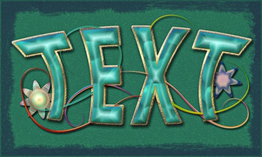
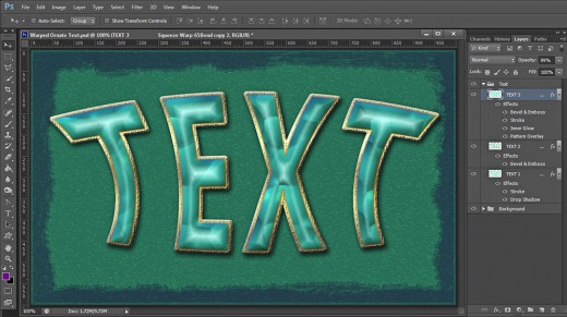
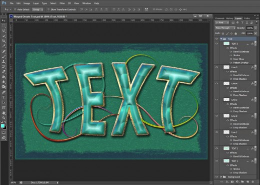
This is the outcome you should achieve:
STEP 1
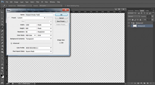
Firstly create a new .psd file of 1000px Width, 600px Height and 96 Pixels/Inch Resolution. As you can see, I have named my document Warped Ornate Text. Choose RGB for Color Mode and Transparent for Background Contents. Rename Layer 1 to Background then press Ctrl+G or go to Layer, Group Layers to place your first layer in a Group. Rename Group 1 to Background.
Fill the Background with Green Color and Apply Graphic Pen Filter
In steps 2-7 you should firstly colorize your Background layer with Paint Bucket Tool, then you have to create another layer on top of Background group and fill it with yellow color.
While the yellow colored layer is selected, you should open the Filter Gallery and apply Graphic Pen Filter from the Sketch set. As a final touch you have to change the Blend Mode of Opacity of the Filter layer to achieve subtle Texture.
STEP 2
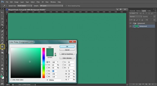
Set Foreground Color to #338c6e then take Paint Bucket Tool and colorize with it your Background. The same you can do by using Edit, Fill, Foreground Color.
STEP 3
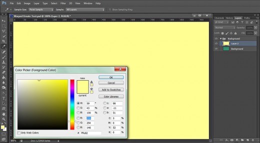
Create a New Layer on top of Background Group. Later we are going to give it a new name. Change Foreground Color to nice yellow- #fffe92 and colorize with it your second layer.
STEP 4
Now firstly change the Background color to Black (keep the yellow Foreground) as the Filter we are going to apply depends on both colors set in the Tools bar, then navigate to the Menu bar and select Filter, Filter Gallery.

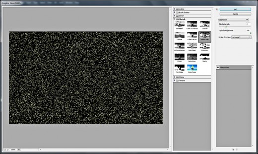
STEP 5
After the Filter Gallery window appears on your screen, select Sketch Filter then highlight Graphic Pen from the Filters menu. Set the Stroke Length to 4, Light/Dark Balance to 100 and leave Stroke Direction to Horizontal. Press OK button when you are ready with the Filter settings.
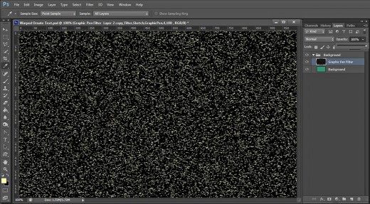
STEP 6
This is how your canvas will look after applying the Sketch type of Filter on your yellow colored layer. Rename the layer to Graphic Pen Filter.
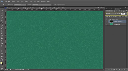
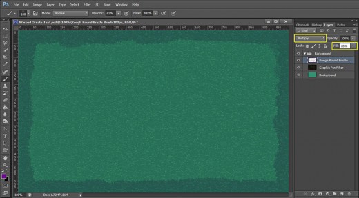
STEP 7
Change the Blend Mode of Graphic Pen Filter layer to Multiply and reduce its Opacity to 20%.
Create Rough Vignette Effect to Complete Your Work on the Background
In the coming two steps you have to finish your work on the Background. You need to create another layer on top of Background group and use Rough Round Bristle Brush of dark purple color to paint the borders of the canvas. When you are ready, you have to change the Blend Mode and Fill Opacity of the Brush layer then apply Bevel and Emboss to give subtle embossed effect to the Rough Vignette you have painted with the Bristle Brush.
STEP 8
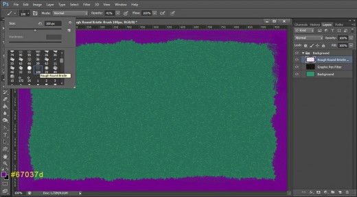
Set your Foreground Color to dark purple- #67037d then Create a New Layer on top of Background Group and call it Rough Round Bristle Brush after the Brush we are going to use right now.
Grab Brush tool and find Rough Round Bristle Brush from the Brush Preset picker. Leave its Size to 100px as by default then brush around the borders of the canvas. You should get something like this:
STEP 9
Change Blend Mode of Rough Round Bristle Brush layer to Multiply and lower the Fill Opacity to 20%. Please make a difference between Opacity and Fill Opacity value. If you reduce the value of Opacity, it will affect the layer styles you intend to apply and their visibility will be lowered. If you reduce Fill Opacity, it will make the object in the respective layer transparent, but it won’t affect the layer styles and they will be visible.
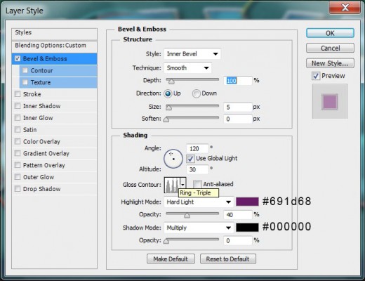
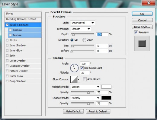
Double click on Rough Round Bristle Brush layer's thumbnail or go to Layer, Layer Style, Blending Options. Check Bevel and Emboss and change its settings like this:
Style: Inner Bevel
Technique: Smooth
Depth: 100%
Direction: Up
Size: 5px
Soften: 0px
Angle: 120 degrees
Use Global Light: checked
Altitude: 30 degrees
Gloss Contour: Ring-Triple
Anti-aliased: not checked
Highlight Mode: Hard Light
Color for Highlight: #691d68
Opacity: 40%
Shadow Mode: Multiply
Color of Shadow: #000000
Opacity: 0%.
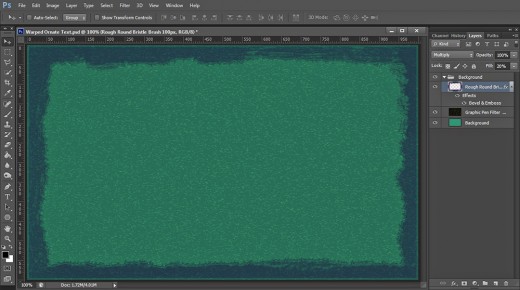
Press OK button to close Layer Style dialog box. With this we completed our work in Background Group.
You should get this Background if you have followed all my previous steps in detail.
Type the Text then Distort it Using Squeeze Warp
In Steps 10-13 you have to type the Text using the ordinary Microsoft New Tai Lue default Font. Then you need to apply Squeeze Warp to distort the Text. For the purpose you have to highlight your Text and navigate to the Options bar in order to select the Warp Text icon and apply Squeeze type of Warp with changed Bend value.
After the Text has been typed and warped, you have to rasterize it in order to turn it from vector to pixels.
STEP 10
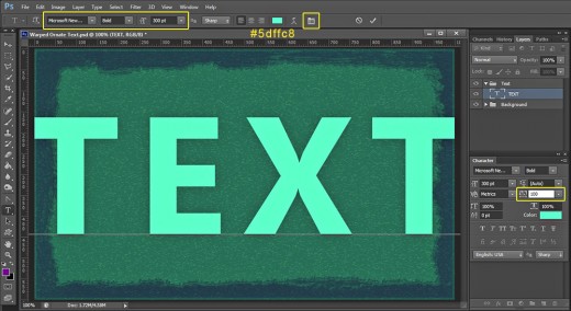
Let us start to create our Text Effect. Take Horizontal Type Tool. Navigate to the Options bar and find Microsoft New Tai Lue default Font from Font Family drop down menu. You can choose another thick font if you like. Set the Font Style to Bold and Font Size to 300pt. Change also the Text Color to #5dffc8 then click on Toggle the Character and Paragraph Panels icon and set the Tracking to 100. We need this bigger Tracking as later we are going to apply Warp and Stroke which will get the letters closer to one another and they may overlap.
Type Text in Capital Letters. Don't worry that the Text is a bit bigger than your canvas. Later all will be fixed.
Place Text layer on top of Layers panel and press Ctrl+G to group it. Rename the new Group to Text too.
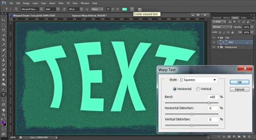
STEP 11
With Horizontal Type tool and Text layer selected (don’t forget to highlight the Text with the mouse!), click on Create Warped Text symbol in the Options bar. When Warp Text dialog box appears on your screen, select Squeeze from Style drop down menu, check Horizontal and increase Bend to +65%. Press OK when you are ready with the settings and you'll get this warped Text:
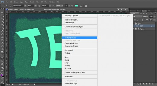
STEP 12
Right click on the Text layer and select Rasterize Type to turn our text into raster image.
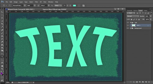
STEP 13
This is how your Rasterized Text layer will look in Layers panel.
Rename the Text layer to Text 1. Later we are going to duplicate it.
Apply Blending Options on the First Text layer
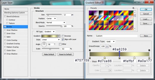
In the coming two steps you have to apply Drop Shadow and Golden Gradient Stroke to the original Text layer. You should prepare Gradient consisting of five Color Stops of Golden Shades to create the thick 13px Stroke Effect.
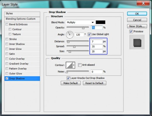
STEP 14
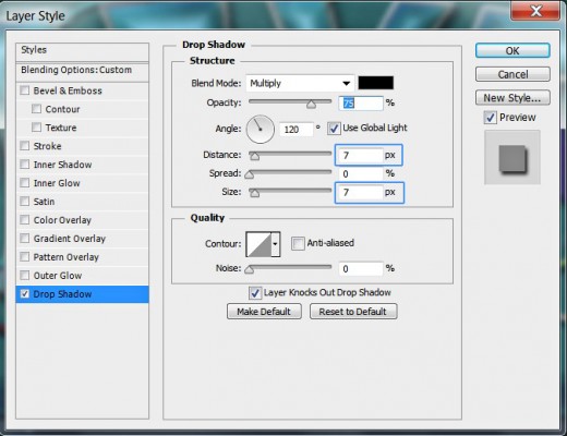
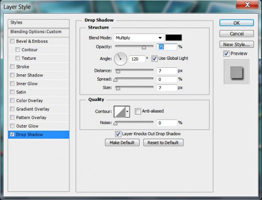
Right click on Text 1 layer and select Blending Options (Layer, Layer Style, Blending Options) or just double click on its layer's thumbnail to activate Layer Style dialog box. Check Drop Shadow. Change only its Distance to 7px, Spread to 35% and Size to 20px. Leave all other settings as given by default.
Keep Layer Style box active as we are going to add another effect in the coming step.
STEP 15
Now we have to apply awesome golden shaded Gradient Type of Stroke so for the purpose tick Stroke Layer Style and insert the following settings:
Size: 13px
Position: Center
Blend Mode: Normal
Opacity: 100%
Fill Type: Gradient
First Color Stop (Location 0%): #757359
Second Color Stop (Location 25%): #d7ce86
Third Color Stop (Location 50%): #8a8259
Fourth Color Stop (Location 75%): #feffbf
Fifth Color Stop (Location 100%): #a0a177
Reverse: unchecked
Style: Linear type of gradient
Align with Layer: checked
Angle: 90 degrees
Dither: not checked
Scale: 82%.
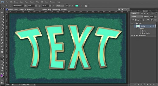
This is how your Text will look after adding Drop Shadow and Stroke:
![Adobe Photoshop Elements 2018 [Old Version]](https://m.media-amazon.com/images/I/51AQ4wl7eOL._SL160_.jpg)
Duplicate the Original Text Layer, Rasterize its Layer Style then Add 3D Effect and Texture
In Steps 16-19 you firstly have to make a duplicate of the Text layer and leave intact the Stroke Layer Style on the copied layer. After that you have to Rasterize the Stroke in order to be able to apply new Blending Options. If you start to add layer styles without rasterizing the Stroke, they won’t be able to affect it and it can‘t be texturized.
After the Stroke have been rasterized you have to add two Blending Options- Bevel and Emboss and Hard Charcoal Light Texture which is default for Photoshop.
Don’t delete the original Text layer. We need it because of the Drop Shadow layer Style applied on it. We also have to duplicate it once more and add new Blending Options.
STEP 16
While Text 1 layer is selected, press Ctrl+J (Layer, Duplicate Layer) to make a copy of it. Now rename the duplicated layer to Text 2. Select its Drop Shadow Layer Style and drag it to the Recycle Bin icon at the bottom of Layers panel to remove it. We need the Stroke only.
STEP 17
Only right click on Text 2 layer and select Rasterize Layer Style.
STEP 18
Text 2 layer needs Blending Options too. The first Layer Style to be applied on it is Bevel and Emboss. Only check it in Layer Style box and leave all the settings as given by default.
STEP 19
Check Texture Layer Style to add nice relief to the Text and insert these settings:
Pattern: Hard Charcoal light (200 by 200 pixels, Grayscale mode)
Scale: 100%
Depth: +60%
Invert: not checked
Link with Layer: checked.

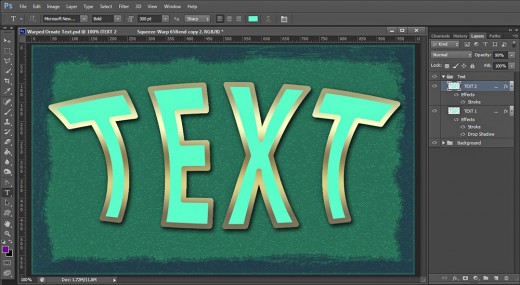
This is the outcome of the Bevel and Emboss and Texture overlay:
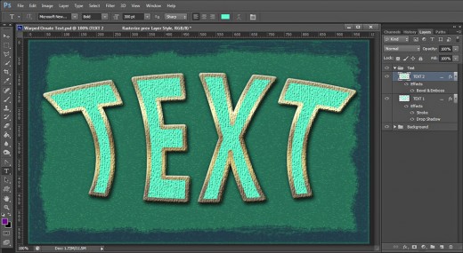
Create Another Duplicate of the Original Text and Apply Four Blending Options
In the next two steps you have to create another duplicate of the original Text layer, remove the Blending Options from the copied one and place it on the top of the Text group.
Secondly, you have to apply Bubbles Pattern which is default for all Photoshop versions, you should also add light blue Inner Glow, thin (only 2px) orange to brown Gradient Stroke and blueish Bevel and Emboss.
STEP 20
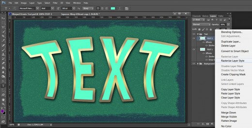
This time duplicate Text 1 layer and move the copied layer on top of Text Group. Rename it to Text 3 then right click on it and select Clear Layer Style to get rid of the previously added Blending Options. I have switched off both Text 1 and Text 2 layers for a better visibility.
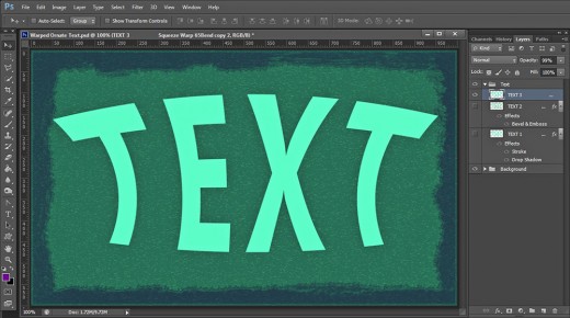
This is the result you should get up to now in Text Group:
STEP 21
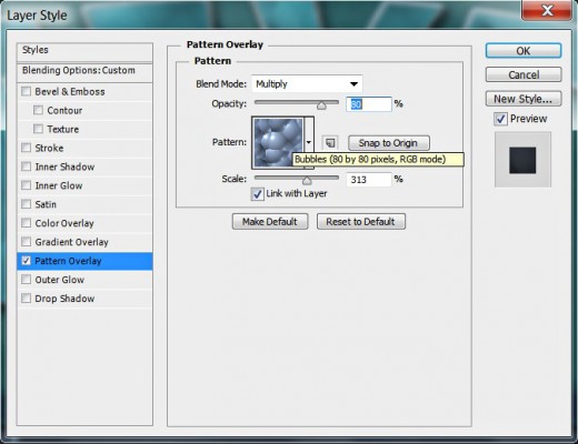
Now we should add four Blending Options to Text 3 layer. Firstly apply Pattern Overlay with these settings:
Blend Mode: Multiply
Opacity: 80%
Pattern: Bubbles (80 by 80 pixels, RGB mode)
Scale: 313%
Link with Layer: checked.
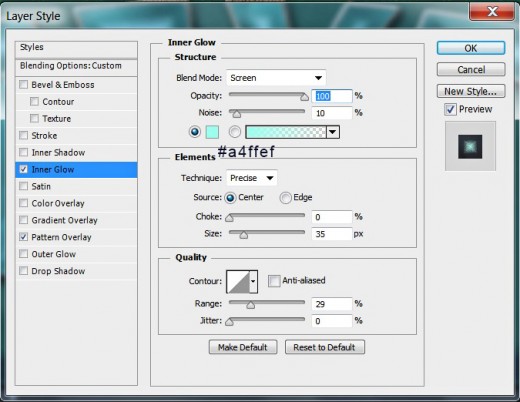
The second Layer Style to be added to Text 3 layer is Inner Glow. Change its settings as follows:
Blend Mode: Screen
Opacity: 100%
Noise: 10%
Color of Glow: #a4ffef
Technique: Precise
Source: Center
Choke: 0%
Size: 35px
Contour: Linear
Anti-aliased: unchecked
Range: 29%.
Jitter: 0%.
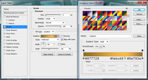
Now apply this thin Gradient type of Stroke:
Size: 2px
Position: Inside
Blend Mode: Normal
Opacity: 100%
Fill Type: Gradient
First Color Stop (Location 0%): #977729
Second Color Stop (Location 70%): #febc49
Third Color Stop (Location 100%): #9e793e
Reverse: unchecked
Style: Reflected type of gradient
Align with Layer: checked
Angle: 90 degrees
Dither: not checked
Scale: 80%.
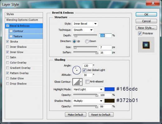
In this step we are going to add slight 3D effect to Text 3 layer so check Bevel and Emboss Layer Style and insert these settings:
Style: Inner Bevel
Technique: Smooth
Depth: 100%
Direction: Up
Size: 7px
Soften: 16px
Angle: 120 degrees
Use Global Light: checked
Altitude: 30 degrees
Gloss Contour: Linear
Anti-aliased: not checked
Highlight Mode: Hard Light
Color for Highlight: #165cdc
Opacity: 100%
Shadow Mode: Multiply
Color of Shadow: #372b01
Opacity: 99-100%.
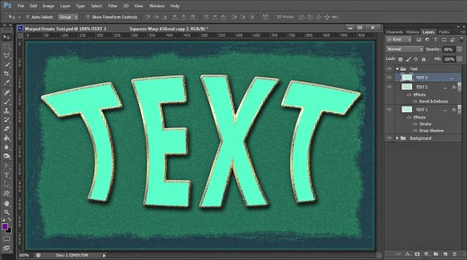
With this fourth Layer Style we finished our work on the Text.
You should get this awesome warped Text after applying the layer styles on Text 3 layer:
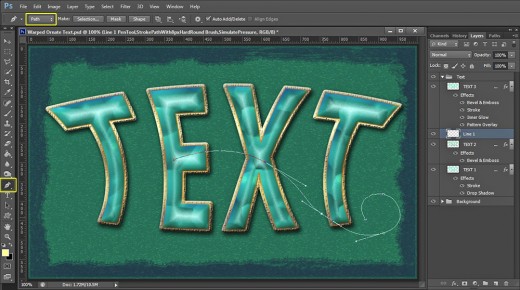
Draw Curves with Pen Tool and Stroke them with Hard Round Brush
In Steps 22-28 you should start creating awesome decoration for your Warped Text. You have to use Pen tool in Paths Mode to draw curves which should be placed between the upper two Text layers. After you are ready with drawing the respective curve, you should Stroke its Pen tool Path with Hard Round Brush of 8px Size (Simulate Pressure Option checked!).
Please take into consideration that you need to draw every curve on a separate layer because we have to apply different Blending Options on each of them.
You have to apply Drop Shadow and Bevel and Emboss of different color shades to each curve to make them colorful and more prominent.
STEP 22
Create a New Layer, placed between Text 2 and Text 3 layer and call it Line 1. Firstly take Brush Tool, select Hard Round Brush from the Brush Preset Picker and set its Size to 8px. Grab Pen Tool in Path Mode and draw a path as you see on the screenshot below. It is not necessary your path to be absolutely identical to mine. You can create your own decoration and can use this and the following steps only as a guidelines.
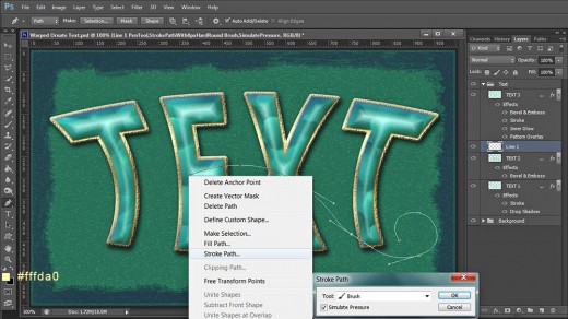
STEP 23
Change the Foreground color to #fffda0, then right click on the Pen Tool Path (Pen Tool should be active), select Stroke Path, choose Brush for Tool and check Simulate Pressure.
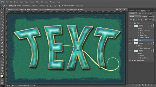
This is how my first part of the decoration looks after applying the Stroke Path option. Press Delete key to get rid of the Path.
STEP 24
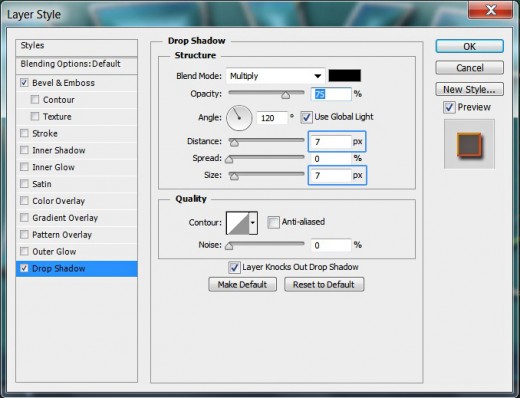
Now double click on Line 1 layer's thumbnail and firstly tick Drop Shadow Layer Style. Change only Distance and Size to 7px both and leave all other settings as given by default:

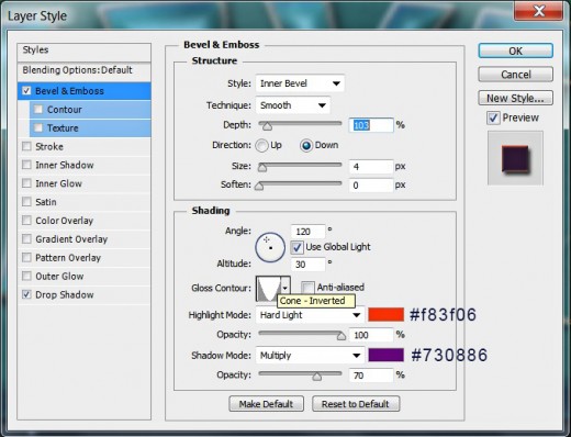
The second Layer Style to be added to Line 1 layer is this Bevel and Emboss:
Style: Inner Bevel
Technique: Smooth
Depth: 103%
Direction: Down
Size: 4px
Soften: 0px
Angle: 120 degrees
Use Global Light: checked
Altitude: 30 degrees
Gloss Contour: Cone-Inverted
Anti-aliased: not checked
Highlight Mode: Hard Light
Color for Highlight: #f83f06
Opacity: 100%
Shadow Mode: Multiply
Color of Shadow: #730886
Opacity: 70%.
This is how our first decoration will look after applying Drop Shadow and Bevel and Emboss.
STEP 25
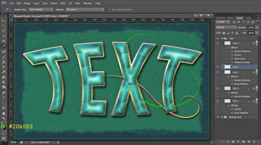
Set Foreground Color to #20b503, then Create a New Layer above Line 1 layer and rename it to Line 2. Check if your Brush is Hard Round of 8px Size. Create another Path with Pen Tool and Stroke it with the green Brush.
Now we are going to add Blending Options to Line 2 layer. Firstly apply the same Drop Shadow you added to Line 1 layer- all settings by default except Distance and Size- both 7px.
The second Layer Style to be added to Line 2 layer is Bevel and Emboss. Insert these settings:
Style: Inner Bevel
Technique: Smooth
Depth: 1%
Direction: Up
Size: 4px
Soften: 0px
Angle: 120 degrees
Use Global Light: checked
Altitude: 30 degrees
Gloss Contour: Peaks
Anti-aliased: not checked
Highlight Mode: Hard Light
Color for Highlight: #f8ad0d
Opacity: 100%
Shadow Mode: Hard Light
Color of Shadow: #fa7821
Opacity: 100%.
Line 2 is ready with both layer styles added to it:
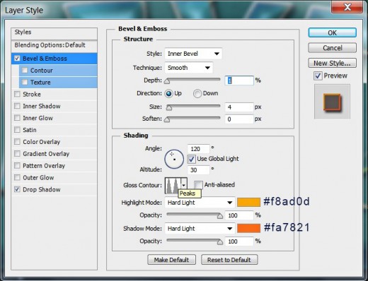
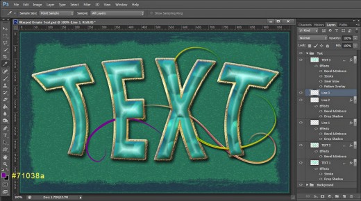
STEP 26
This time change the Foreground Color to dark purple- #71038a and Create a New Layer called Line 3. Place it above Line 2 layer as you see on the following screenshot, then draw a new Pen Tool Path and stroke it again with Hard Round Brush of 8px Size.
Now Copy the layer styles applied on Line 2 layer and Paste them on Line 3 layer. Open the copied Bevel and Emboss Layer Style and only change:
Depth: 11%
Contour: Ring
Color for Highlight: #f8d135
Color of Shadow: #57fae9.
On the screenshot below I have marked all these four changes with blue color.
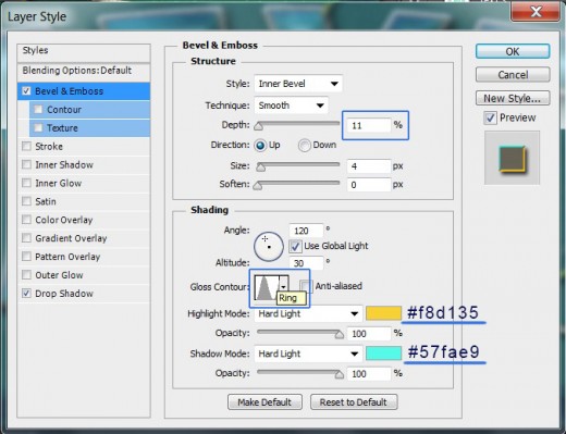
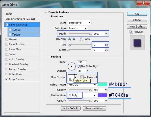
STEP 27
Set your Foreground Color to vivid orange- #fd541d, Create a New Layer above Line 3 layer and call it Line 4. Draw a Path with Pen Tool then stroke it with the same brush used to stroke all previous paths and you'll get this result:
Now Copy the layer styles from Line 3 layer and Paste them on Line 4 layer. Change only these settings (marked with blue) in Bevel and Emboss box:
Depth: 1000%
Size: 3px
Gloss Contour: Valley-Low
Color for Highlight: #4bf8d1
Shadow Mode: Multiply
Color of Shadow: #7046fa.
STEP 28
Set Foreground Color to cyan- #4effea, Create a New Layer named Line 5- place it above Line 4 layer in Text Group. Draw a new Pen Tool Path then Stroke it with the same Hard Round Brush of 8px Size.
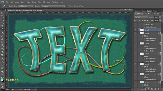
Now Copy and Paste on Line 5 layer both layer styles applied on Liner 4 layer.
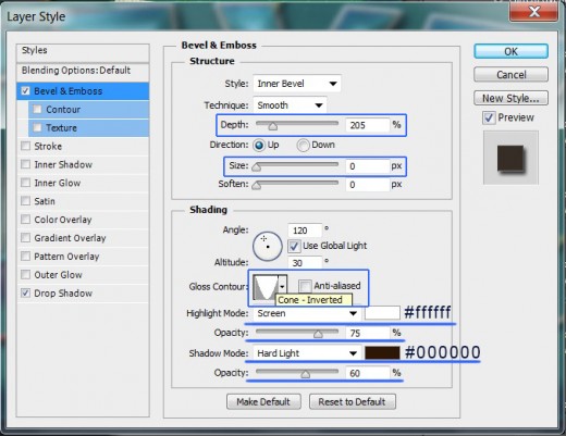
Only change these settings in Bevel and Emboss box:
Depth: 205%
Size: 0px
Gloss Contour: Cone-Inverted
Highlight Mode: Screen
Color for Highlight: #ffffff
Shadow Mode: Hard Light
Color of Shadow: #000000.
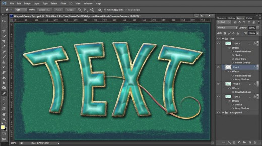
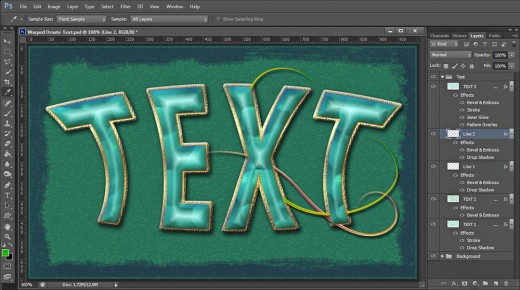
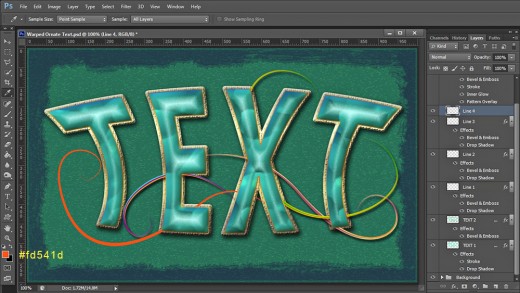
This is how my lines decoration looks after drawing all paths and applying layer styles to them. If you have followed all my steps for Text and paths creation, you should get eight layers in Text Group: at the bottom of the Group is Text 1 layer, above it is Text 2 layer, then come five Line layers- from Line 1 to Line 5 and on the top of the Group is Text 3 layer.
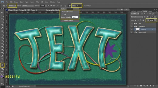
Complete the Decoration of Your Warped Text Using Polygon Tool Shapes
You will finish the work on decorating your Text with adding two awesome floral ornaments which you are going to create with the help of Polygon tool.
You need to select Smooth Corners and Star options of the Polygon tool settings and also insert value for Indent Sides option. You can experiment with the values of these three options if you like in order to create really unique shapes.
Certainly drawing the floral ornaments only is not enough the magical final effect to be achieved. You have to add different Shadow, Colorful Radial Gradient, Glow, 3D Effect and Satin Layer Style to each of the flowers to colorise them and make them look embossed.
STEP 29
Create a New Layer placed between Background and Text Group. Call it Flower 1. Press Ctrl+G to Group it and rename the new Group to Decoration.
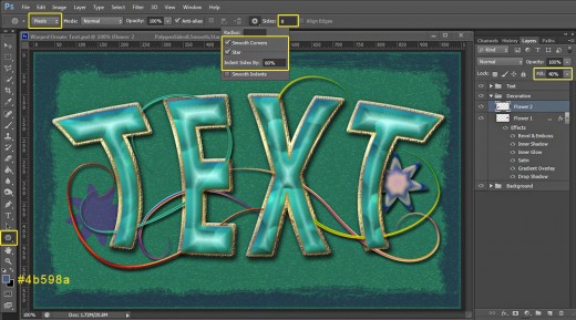
Now firstly Set Foreground Color to #55347d then grab Polygon Tool and in the Options Bar set its Mode to Pixels. Insert 7 for Sides then click on the gear icon, check Smooth Corners and Star options and Indent Sides By 70%.
Draw the first floral shape and move it so that part of it to be behind the second letter T.
Reduce Fill Opacity of Flower 1 layer to 60%.
In this step we'll start to add layer styles to Flower 1 layer. Firstly apply the same Drop Shadow which we added to the lines layers- change only Distance and Size to 7px both and leave all other default settings.
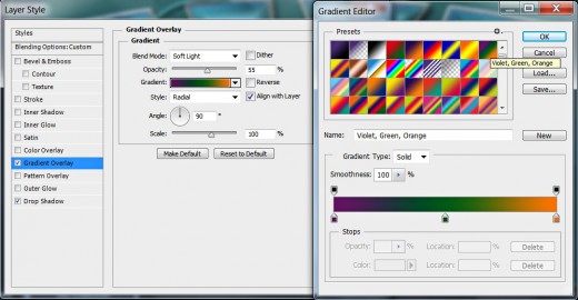
This time we are going to add Gradient Overlay to Flower 1 shape:
Blend Mode: Soft Light
Dither: unchecked
Opacity: 55%
Select Violet, Green, Orange Gradient
from the Gradient Picker.
Reverse: unchecked
Style: Radial type of gradient
Align with Layer: checked
Angle: 90 degrees
Scale: 100%.
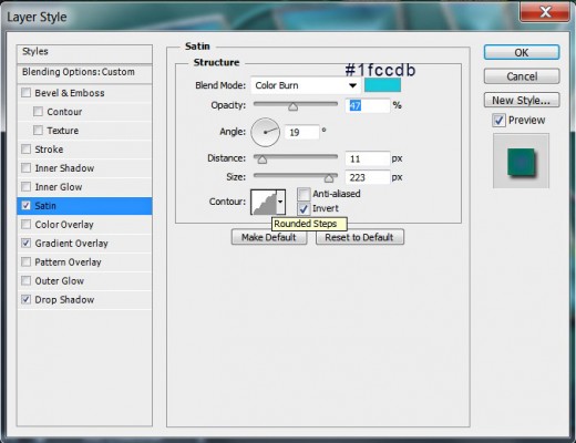
Now tick Satin Layer Style and change its settings as follows:
Blend Mode: Color Burn
Color of Effect: #1fccdb
Opacity: 47%
Angle: 19 degrees
Distance: 11px
Size: 223px
Contour: Rounded Steps
Anti-aliased: unchecked
Invert: checked.
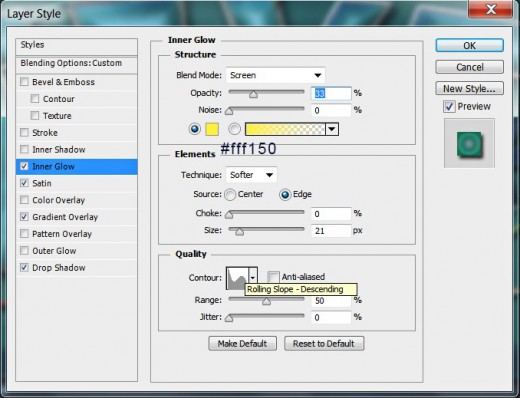
Apply also this Inner Glow Layer Style:
Blend Mode: Screen
Opacity: 33%
Noise: 0%
Color of Glow: #fff150
Technique: Softer
Source: Edge
Choke: 0%
Size: 21px
Contour: Rolling Slope-Descending
Anti-aliased: unchecked
Range: 50%.
Jitter: 0%.
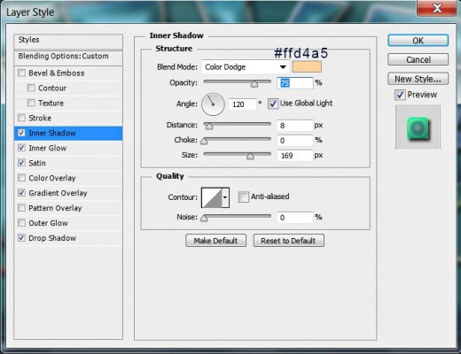
Add also this Inner Shadow Layer Style:
Blend Mode: Color Dodge
Color of Shadow: #ffd4a5
Opacity: 75%
Angle: 120 degrees
Use Global Light: checked
Distance: 8px
Choke: 0%
Size: 169px
Contour: Linear
Anti-aliased: unchecked
Noise: 0%.
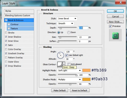
The last Layer Style to be added to Flower 1 layer is Bevel and Emboss. Insert the following settings:
Style: Inner Bevel
Technique: Smooth
Depth: 144%
Direction: Up
Size: 13px
Soften: 0px
Angle: 120 degrees
Use Global Light: checked
Altitude: 30 degrees
Gloss Contour: Cove-Deep
Anti-aliased: not checked
Highlight Mode: Soft Light
Color for Highlight: #ffb369
Opacity: 100%
Shadow Mode: Multiply
Color of Shadow: #f0ab33
Opacity: 66%.
You should get an awesome multicolored flower after applying all previously described Blending Options. Compare your result with my screenshot given for the next step.
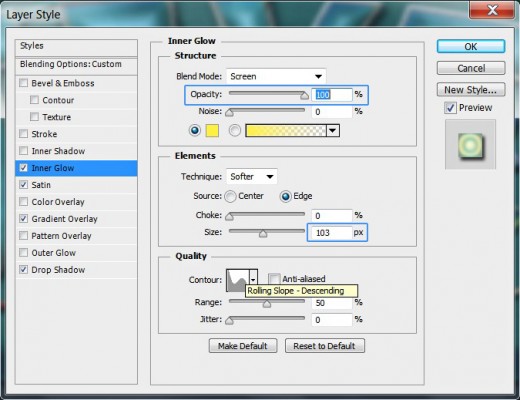
STEP 30
Now Create a New Layer on top of Decoration Group and name it Flower 2. Change the Foreground Color to #4b598a. Take again Polygon Tool in Pixels Mode, but this time insert 8 for Size and Indent Size by 60%. Smooth Corners and Start options should be checked. Draw a floral shape part of which should be behind the first T letter. Lower Fill Opacity of its layer to 40%.
Copy the layer styles applied on Flower 1 layer and Paste them on Flower 2 layer. We are going to make only slight adjustments of some of the Blending Options.
At first don't change anything in the copied Drop Shadow:
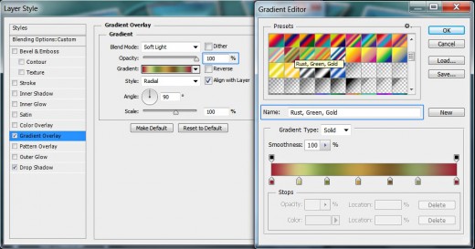
In Gradient Overlay box only increase Opacity to 100% and choose Rust, Green, Gold Gradient from the Gradient Picker.
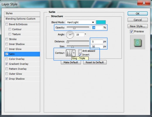
In Satin dialog box change these settings:
Opacity: 34%
Distance: 5px
Size: 50px
Contour: Ring-Triple.
Open Inner Glow Layer Style box, then increase Opacity to 100% and Size to 103px.
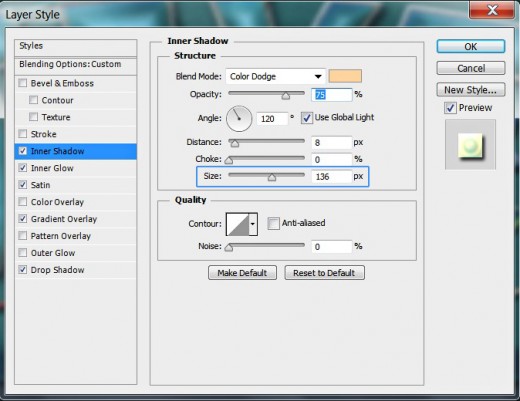
In Inner Shadow box change Size to 136px.
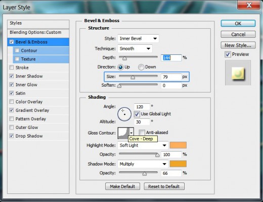
As for the last Layer Style- Bevel and Emboss- change its Size to 79px.
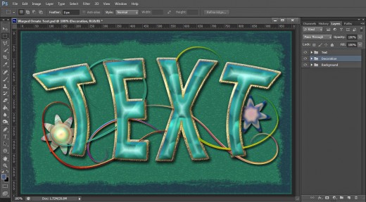
STEP 31
So long with the big Blending Options play. Our Warped Ornate Text is ready and to the right you can see the three groups of layers in Layers panel- Background, Decoration and Text.
STEP 32
This is my outcome shared in .jpg format. You can apply Filter, Sharpen, Unsharp Mask or Filter, Other, High Pass if you like to improve your final result.
Hope you learned something new from this tutorial. Thank you very much for reading and have a great day. :)


