How to Design Book Covers: An Insider’s Guide to the Secrets of the Trade

The future of ebook publishing, including self-publishing, is subject to much debate. The ebook revolution may have peaked, with ebook revenue falling 4.2% in 2019, according to data from major publishers. Whatever the hard numbers say, self-publishing remains easy, and small indie publishers pop up constantly to try to meet reader demands.
Covers are a huge part of book sales, of course, and the self-publishing revolution has brought about a huge number of books that need covers. Some authors are just as gifted at designing covers as they are at writing, but most people need a little practice. Here are the design tips you need to know to start designing and even selling your own book covers.
Color and Contrast
Unless your story is very lighthearted or fantastical, having a rainbow of colors on your cover could end up looking unnatural, or disrupting the mood of the cover. If your story is chick lit set in a sunny city, you’ll want colors like pink, red, and white or black to take center stage.
You don’t necessarily need a blue sky in the background or green grass in front of a brick house. Simplify your color scheme so your text and key visual elements have room to shine. That may mean editing backgrounds or toning down the contrast on parts of the image that aren't very important.
However, you'll want to strike a balance by having your backgrounds and textures visible enough. Although subtlety can be nice, it won’t matter if it doesn’t show up on someone else’s monitor or Kindle screen. Remember that black and white Kindle screens are still common, and readers who can't see details or text might not be able to enjoy your cover.

Artificial and Natural Lighting
Have you ever looked at an image that you were pretty sure was altered in Photoshop, but you couldn’t quite tell why? Maybe you thought the beautiful woman standing on a beach looked somewhat flat and unnatural, but assumed it was just the airbrushed.
Chances are it was the lighting. If the shadows in the background are starker or fall in a different direction than the other objects or people in the scene, our brains will register it as incorrect. Even subtle differences can make someone look artificial and out of place.
Warmth of the lighting also matters. Yellow-tinged indoor lighting looks very different from outdoor natural light on a cloudy day. Images taken in different lighting and then merged together must be adjusted to match.
The Rule of Thirds
The biggest mistake cover designers make is having key visual elements too close to the edge of the cover. Your eyes are not immediately drawn to the important elements, and you end up wandering over the image, searching for meaning.
You can have visual elements front and center, but depending on the exact photos and art you’re using, trying to perfectly center the visual elements may actually look unnatural. In those cases, following the rule of thirds is the best option. This means placing faces, weapons, glowing objects, or other important things one-third from the top or bottom and one-third of the way from the right or left side.
With standard amazon book cover dimensions of 2,560 x 1,600, important visuals can be placed around 853 pixels from the top or bottom, and around 533 pixels away from either side.
Naturally, there’s some flexibility to the rule of thirds. If your cover features a couple who is leaning in for a kiss, either their eyes or their lips can be at a one-third mark. If one of the characters is more visible than the other, that character’s face can be the focal point at a one-third mark.

Flow from Right to Left and Top to Bottom
Don’t make the viewer’s eye jump all over the cover looking for important information. Compositional flow helps readers’ eyes move naturally from important visual elements to the text on the cover.
Whether or not the title or character’s face is centered, the key elements should generally flow from left to right and top to bottom, just like reading text. If you go for an asymmetrical design, make sure there is a major visual element in the top left, and another visual element in the bottom right. That way, everything important still flows in a way that is natural to the human eye.
Believe it or not, placing the title at the top doesn’t always work well unless the font is tall and very bold. A memorable image may capture a potential reader’s attention much faster than text, so try to use a strong image on the top half of the cover.
Title and Author Name Size
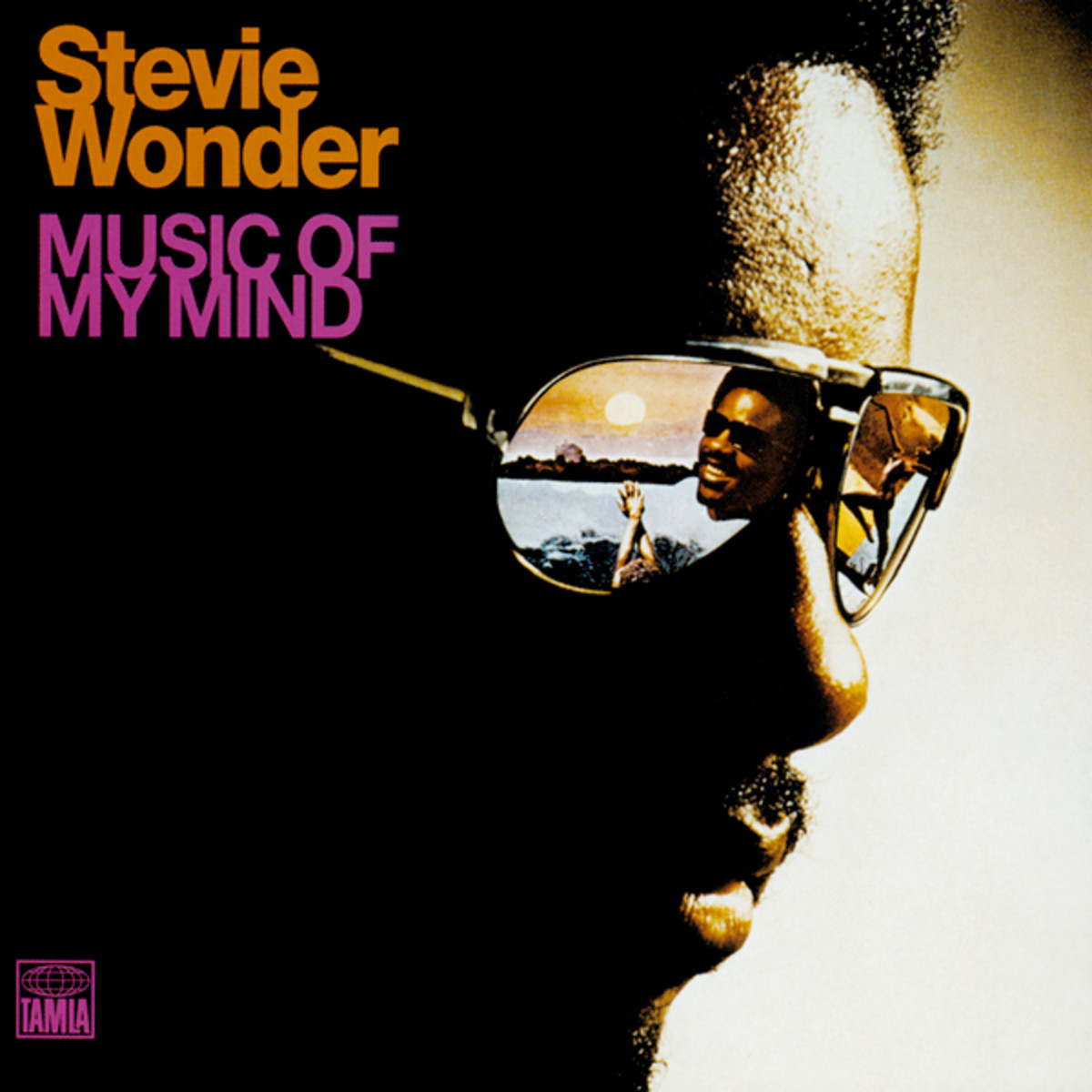
Look at the covers of best-selling books at a bookstore. If the author is famous, the author’s name will take up a huge portion of the cover, and sometimes even be as large as the title. Either way, the title and the author’s name together usually take up at least a quarter of the cover, and sometimes take up much more if the title is long.
Make sure to leave more than enough room on your cover for a title. If your title is short and doesn’t have a subtitle, you can leave about 25% of the total cover space for the title and author name. This doesn’t mean that the area has to be left completely blank, but it at least needs to be free of high-contrast visuals or important elements of the cover.
Keep in mind that the title and author name don’t have to be right next to each other. The author name is sometimes placed at the very top of the cover, with the title in the middle or near the bottom.
You can also play with asymmetrical title placement or break up the title in unique ways, as long as it’s clear what the title is. You’ll want to read the cover out loud to yourself to make sure it works, and get a second opinion to make sure it makes sense to your potential fans.


