McConnell Group Logo Design

How I Designed My Logo
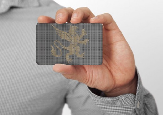
If we look at the logo for the McConnell Group we can see there is both orange and and dark gray. The orange used is usually strong positive or negative association which commonly elicits a stronger "love it" or "hate it" response than other colors. Fun and flamboyant orange radiates warmth and energy.
The grey used is a neutral, balanced color. It is a cool, conservative color that seldom evokes strong emotion. It also, represents the saying of grey matter. The intelligence portion.Logo Design

Griffen
So if were to interpret the McConnell Group logo by just the colours alone we can say that the company is fun and warm and conservative.
Another aspect is the meaning of the Griffin. I chose the griffin prior to following up with research. The griffin's combination of lion and eagle gains in courage and boldness, and it is always drawn as a powerful fierce monster. It is used to denote strength and military courage and leadership. Griffins are portrayed with a lion's body, an eagle's head, long ears, and an eagle's claws, to indicate that one must combine intelligence and strength
Effort and Research
It's this type of research and effort that I put into each and every logo that I am tasked to do. As a part of design I feel that the way we look and interpret visual ques is vital to any designer or artist. Part of the psychology of colour and understanding how it affects people can be very beneficial to convey the proper message


