Principle of Mating and Display of Objects of Art

Introduction
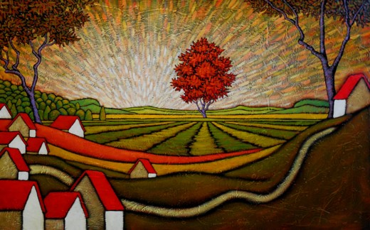
What is matting? It is a word used to describe the visual enhancement of a painting or a object of art. .A bare painting or a piece of art is like a bare room without furniture and decorations. Just as a bare room does not appeal to most people, similarly a bare work of art also may not look appealing to a viewer. It's important to embellish the artwork. This is done by framing and matting, that makes the work of art appealing.
The three most important uses of matting are
-Practicality. This simply means that the work of art must not touch the glass. If a painting touches the glass, there is a chance that, because of humidity, the work of art could stick to the glass with causing damage to the art object.
- Decorative.This helps in giving the work of art a fillip by blending it with the room decor and color of the walls.
-Beauty: People buy art objects because they love art. Matt's work enhances the appeal of the art object and makes it more pleasing to the eye.
There are no rules as far as mat work is concerned. Generally, the guiding principle is aesthetic sense, and that can vary from person to person.
Despite there being no hard and fast rules, it is recognized that the above three basics govern the use of mats.
Basics
The basics of matting are outlined below.
Firstly, It must be borne in mind that the color of the mat should be different from the wall color. A different color creates a contrast and makes the work of art stand out.
Secondly, A mat's purpose is to brighten the print. If this is remembered, then the mat should be lighter than the print, but darker than the wall. this will allow the work of art to stand out in the room and be noticed.
Thirdly, there is a need to harmonize the prints and colors in case you are displaying a number of them.
Another point to consider is what should be the color of the mat's core. Generally, the cores of the mat are either the same color as the mat or plain white. White color has a dual property. It can make an object stand out or it also distracts from its artistic merit. You will have to make the decision depending on how you feel and your aesthetic sense.
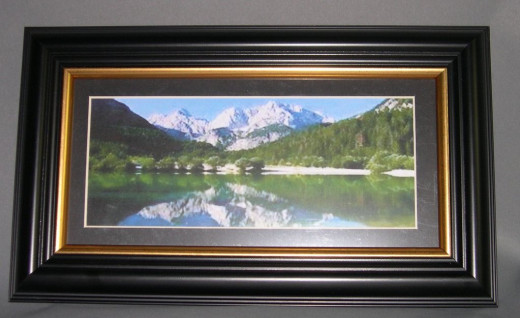
Many photographers and photo collectors who display objects of art in galleries and homes use a white mat with a black core. This is an excellent combination and allows the work of art to stand out. It is especially helpful in pencil drawings and black and white photo murals.
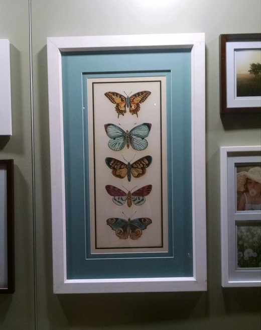
Color and mats
Colored Mats have their charm, but using them is again a matter of choice. As there are no fixed rules, the use of color mats is again dependent on the aesthetic sense of the framer and the displayed.
The one-color rule is not to have the mat color match the wall exactly. This again is not a rule and can be changed. Bear in mind that a display and a mat aim to draw the attention of the viewer to the object of art and not suppress the work of art. Use colors that make the artwork stand out, and that means creating contrasts with the color of the walls.
Though choosing a mat color is not a complex work. However, sometimes it may be advisable to take some help. In that case, it is better to contact a professional framer. These people deal with hundreds of works of art and frame them and thus are quite adept in making suggestions. It may be a good idea to invite one of them to the house for a practical assessment. It may cost some money as no advice comes free.
Summary
A work of art has its beauty enhanced with a mat and proper framing. Once this is accepted then a person can go about his task in adding a mat and frame to the work of art. There are no hard and fast rules, yet the principle is to create contrasts so that the artwork stands out and does not blend with the walls.
© 2013 MG Singh


