What are the Basics of a Good Logo?
How it all starts.
Don't be fooled, making a good logo is not easy. It does require some patience, time and practice. But don't let that get to you, literally everything started with a blank canvas.

Where do I even start with making a good logo?
Draw, draw, draw! This is incredibly important. A logo needs to be a refined visual element, and should last a long time. But you can not get there without enough ideas.
Every logo process should start with getting as many ideas out as you possibly can. Anything goes! Don't erase anything, fill up an entire sketchpad if you have to. This is an incredibly valuable skill and you'll find it helps you out in the long run.
You may go with an idea, find out the client doesn't like it but that's okay because you've got plenty of sketches and concepts left over from your initial process.
Knowing what type of logo you're crafting is key.
There are two objects that generally make up a logo. This isn't always the case, a lot of brands will alternate between two, always use two or only use one.
There is the "wordmark" and the "graphic".
An example of a graphic would be Nike and it's iconic tick.
A "graphic" logo does not necessarily have to be basic shapes or just one shape. Making a unique logo in this fashion is incredibly difficult, but can prove to be rewarding in the long term if executed effectively.
Graphic logos can be closer to depictions of things. For example, the Lacoste logo (below) is an actual illustration of an alligator, but has just enough detail for it to be identified as an alligator. Specifically with this logo, what they have done well is keep it to shapes. There's no outlines and the smaller more finicky shapes (that could have very easily ruined the logo) are cutouts of other shapes. The cutout idea is important because it is a clever way of getting around introducing pointless complexity. If they had decided to fill it in with a color, even white, it would have meant it's necessary to have consistent across all placements of the logo.
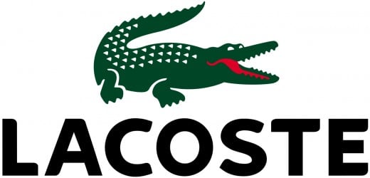
Do note though, that the Lacoste graphic more often than not appears alongside the wordmark. This is a tricky situation for a brand, because if you're focused on the graphic itself and you use it in all applications, it's very possible for the audience to just disregard it as a logo. One could assume it's just a decorative sticker or image on a piece of clothing etc. By having a wordmark appear alongside the graphic, it means two things. 1. People will learn what the graphic means. 2. The graphic can appear later on without the wordmark. That does assume though that the brand is well known, which may or may not be true.
Illustrations can mistakenly be too complex to be an effective logo. Whilst an actual drawing can be a logo, the artist/designer needs to be careful about context applications (see below). If you're going to use a drawing as a logo, be sure to create it as a vector and keep it as simple as you can. The Lacoste logo is definitely an illustration, but executed in a suitable way to be used as a logo.

Above you'll see the "Wrangler" logo. This is a great example of a wordmark logo because of the following reasons:
It uses a unique typeface. This is a great way to set your wordmark apart. I personally love wordmarks but a lot of modern-made ones look the same because they just use a geometric or modern sans serif font. I'm not sure if the Wrangler wordmark is custom made or not, but it does look it, which is what you want if you're going for a wordmark. The sharp W and rounded g are iconic in this wordmark.
It's in an appropriate weight. As I've mentioned a few times, a logo needs to be able to appear in all contexts. If you use too light of a font variation it might be an illegible mess at smaller scales or go unnoticed in larger contexts. This is also extra important when taking into account color, a thin line can be hard to notice as black on a busy background, imagine if you relied on the wordmark being red or some other color, it'd just get lost in the scene.
The basics covered!
Thanks for reading, I hope you enjoyed my covering of the basics. Next article I'll look at some more advanced logo centric theory.
For now though, let me know what you find the hardest when designing a logo. If you're new to graphic design then what scares you the most about designing a logo?
