How to Photograph Using the Color Wheel


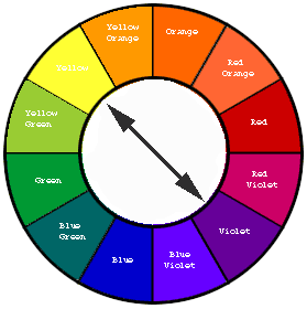
"A color wheel or color circle is an abstract illustrative organization of color hues around a circle that shows relationships between primary colors, secondary colors, complementary colors, etc.
Some sources use the terms color wheel and color circle interchangeably;[1][2] however, one term or the other may be more prevalent in certain fields or certain versions as mentioned above. For instance, some reserve the term color wheelfor mechanical rotating devices, such as color tops or filter wheels. Others classify various color wheels as color disc, color chart, and color scale varieties.[3] The arrangement of colors around the color circle is often considered to be in correspondence with the wavelengths oflight, as opposed to hues, in accord with the original color circle of Isaac Newton. Modern color circles include the purples, however, between red and violet.[6] Color scientists and psychologists often use the additive primaries, red, green and blue; and often refer to their arrangement around a circle as a color circle as opposed to a color wheel." Wikipedia
Ever though about the colors present in a scene before you pressed the shutter and snapped a photograph?
Probably not as many of us simply look at a scene and decide whether or not to take the picture based on how pleasing the scene and its colors are to us.
However by understanding how colors work together and what colors complement each other, thus thinking about your photography from the color wheel approach.
You can enhance a shot depending on the color combinations you choose to highlight or rather showcase one specific point of the picture or a specific element in the scene.
There are basically four ways of looking at the colors present in a scene. The first is to find complementing colors and that is colors that blend well with each other but tend to highlight one particular area over another if reds or any other strong color is present.
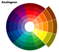
The second is to use an analogous color scheme. Analogous color schemes use colors that are next to each other on the color wheel. They usually match well together and create serene, comfortable designs that the eye finds pleasing.
Analogous color schemes are most often found in nature and usually present a harmonious view which tends to be found most pleasing to the eye.
One key is to ensure that you have enough of a contrast when choosing an analogous color scheme.
Basically you have to look for one color to be dominant, a second to support and the third to accentuate the others.
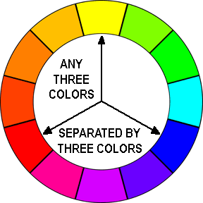
The third is to use the triad scheme; this color scheme uses colors that are evenly spaced around the color wheel (scene).
Triadic color harmonies tend to be quite vibrant, even if you use pale or unsaturated versions of your hues.
To use a triadic harmony successfully, the colors should be carefully balanced. You let one color be the dominant one and the two others to serve as accents.
The fourth and the most useful to create contrast and really call attention to a photograph or parts of it is the split-complementary color scheme;
The split-complementary color scheme is a variation of the complementary color scheme. In addition to the primary or main color, it uses two other colors which are adjacent to it that serve to complement the main color.
This color scheme has the same strong visual contrasting composition as the complementary color scheme.
This scheme is the easiest since it is what is most often found in many nature shots such as a field of flowers; the green of the grass, yellows/reds etc of the flowers and the blue of the sky, as well as in many landscapes scenarios.

Color Wheel
Click thumbnail to view full-size


Interior decorators know the color wheel quite well and they use it to their advantage when designing colors schemes for home décor.
Photographers can use the color wheel too but in their case they have to often depend of what is naturally found in a scene rather than artificially manipulating them, unless off course you do a custom studio set up.
But even if you are not in a studio, by simply looking carefully at a scene, exploring various perspectives and angles you can often do the same as an interior decorator would do.
This scenario requires the photographer to not only know the color wheel well but take time and in a way "manipulate" himself or herself so that the camera can capture the colors accordingly. Keep in mind that sometimes you may need to play the role of moderator; eliminating from the scene any element or colors that distract from the theme. This is usually done physically or by careful framing.
This approach does not really work well if you leave things to chance and are in the habit of taking a shot as soon as you come upon the scene. It takes time and patience but once you have mastered the concept you can do this rather quickly and effortlessly.

Did you know about the color wheel and do you know how to use it?

Once you fully understand how colors work together or even against each other you can begin to see typical scenes and start capturing images in different ways that end up enhancing each element in the scene thus making your images stand out more than other similar shots.
Colors can either create striking pictures because of the clash or they can enrich vibrant color schemes more.
You will also need to pay attention to the brightness (illumination of each color). Contrasts and complements work better when the light that falls upon each is in balance with the rest of the elements within a scene.

© 2014 Luis E Gonzalez


