- HubPages»
- Arts and Design»
- Crafts & Handiwork»
- Textiles»
- Embroidery
The Artistic Use of Color in Embroidery

Color temperatures
A lot of attention has been given to the so-called temperatures of color lately. Many women have paid color analysts to discover their "season" and determine which colors will look best on them. This concept far surpasses the cosmetic forum, however, and now many of the terms commonly associated with color analysis apply to other areas of color usage. But what is a warm color, anyway?
In broad terms, warm colors are those associated with things we think of as warm or hot in nature, such as the sun or fire. So, warm colors are variations of reds, yellows and oranges. Warm colors are seen by the eye before cool colors and they create the illusion of compressing space.
Cool colors are those associated in nature with cool things like the sky or foliage. Thus, cool colors include blues, purples and greens, with blue being the coolest of colors. These colors give the illusion of expanding space.
It is possible, however, to have a cool red or a warm blue by adding an undertone. Red with a blue undertone, or cast, is cooler than a red with a yellow undertone. And, a red-purple is warmer than a purple with obvious blue undertones.
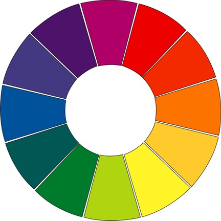
Using a color wheel
These variations allow a great deal of flexibility in creating combinations that are pleasing to the eye. Most people have the ability to recognize a pleasing color combination when they see one, but have no idea how to create one. The best place to start, according to many experts, is with a color wheel. Although you may not have picked one up since your school days, a color wheel is invaluable in finding a jumping-off point for creating pleasing color combinations.
There are different types of color wheels, but buy one that lets you turn an overlay wheel around a stationary wheel, so you can try different color relationships or harmonies. A good wheel will have a row of pure colors, a row of tints and a row of tones. Pure color is a primary, secondary or intermediate color. A primary color is red, yellow or blue. A secondary color is the mixture of two primary colors, such as green or orange. An intermediate color is the result of mixing one primary and one secondary color.
Tints are created by adding white to a pure color; tones have gray added instead. Shades are a mixture of a pure color plus black.
What does all this have to do with selecting a color combination? Every color family has a complementary color family that lies directly across from it on the color wheel. Let's say that you have a given color that you must use; perhaps it is the garment color. For this example, let's use light blue, which is located on the tint row of the blue family on a color wheel. (Remember, tints are made by the addition of white.) Located directly opposite on the wheel is blue's complement, the orange family. The tint counterpart to light blue is peach. Light blue and peach are a lovely combination, and the use of peach makes any blue look much bluer. This combination can strengthen and enhance a weak blue.
Because the pure color columns of the blue and orange families are often too strong to create a pleasing harmony, good combinations are more commonly achieved by combining colors from the tint or tone columns. In other words, lightening complementary colors to pastels or tints, or deepening them to tones, yields more harmonious combinations.
An example of a good combination of tones can be found using the red and green color families. The tone column of the red family contains a deep brick red, which blends beautifully with the rich teal green from the opposite tone column of the complementary green family. A currently popular color scheme-mint green and pastel pink-are the pastels found in the tint columns of these two families.
This "opposites" approach works well when combining only two colors, but how do you choose colors for designs with three, four or more colors? The next colors you should consider for combination with a key color are those families located on either side of the complementary color family on the wheel. These neighbors to the complementary colors are called split complementary colors. In the case of the light blue with peach, the split complementary colors to add would be either rose and daffodil or lilac and seafoam green.
In general, colors far removed from each other on the color wheel do not make good combinations. There are some exceptions, such as complementary and split complementary colors.
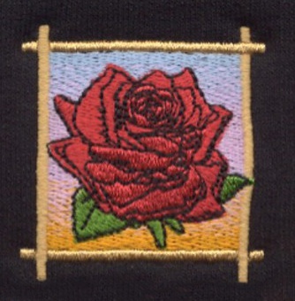
Tints are usually good choices for highlights, whereas tones work well for shadows and shading. On a red rose, for example, its highlights could be stitched in a rose pink tint, while its shading could be done effectively in a wine tone.
Other tools you can use
The Pantone Matching System, or PMS, helps ad agencies and others in graphics and related fields assure consistency of color.
There are hundreds of PMS colors, far more than the number of thread colors that are available to embroiderers. It's not a bad idea to have a PMS color selector available to help determine the closest thread shade, but do not guarantee your client that the thread color will be an exact match. There are two main types of PMS color selectors: the miniature version has small, color samples on uncoated stock; a larger version has bigger samples, including metallics, on both uncoated and coated stock. The shiny, coated stock gives a much better representation of a color as it relates to shiny rayon threads.
An alternative to these color selection aids is the color swatch "fan" used by color analysts. These swatches, also held together with a swivel screw, have only one color per card. This enables you to place anyone colored swatch in the deck next to any other swatch. Many colors can be combined in this way and placed against the background color of your choice for evaluation.
Refer to your embroidery thread color chart provided by your thread manufacturer to help match Pantone colors. PMS numbers should be listed next to each color to assure as close of a match as possible.
Rules about color
Many so-called rules concerning color are now ignored, such as the old saying that "blue and green should never be seen." But there are some guidelines or principles that can help you make more educated selections.
When using variations of the same color family next to one another, the lighter tint appears lighter than it would if it stood alone. For instance, peach looks paler when placed next to orange. This illusion can help tone down a raucous color in a color scheme. As an example, use a light yellow with orange undertones to help tame a bright, mandarin red orange. Outlining in black enhances the enclosed color, while outlining in white diminishes the enclosed color and allows it to spread into adjacent colors. The technique of black outlining is effectively used by mosaic and stained glass artists, who well understand black's ability to lend richness and clarity. Many embroiderers, however, favor using a deep charcoal grey in place of black for a rich, but softer, look.
It is generally a good practice to choose a dominant color for the color that will occupy the most space and use less dominant colors for accent and harmony. This helps create tonality, giving dominance to one particular color family, regardless of other colors present.
Colors will appear more lustrous on a shiny surface like satin than on a matte surface like sheeting, terry cloth or corduroy. This principle is also the reason that rayon is the thread of choice for most embroiderers-its shiny qualities give embroidery more radiance. For this reason, it is sometimes desirable to use colors with more intensity on matte backgrounds.
The illusion of movement can be created in a design by using gradations of light to dark and back to light. When combined with effective patterning of design elements, this type of color combination can be very exciting.
The use of vivid colors from a variety of color families is effective only when they all have the same saturation, or intensity. If even one color is weaker than the rest in such a color scheme, an imbalance is created, thereby diluting the appeal of a potentially-striking effect.
Placement
Selecting colors that work well together is really only half the battle; placing them in an appropriate relationship to each other within a design is equally important.
Background colors should play a major role in thread color selection and color schemes should be altered, when necessary, if a background color is changed. Some design elements may need to have a fill section outlined in a different color, rather than having the outline match the fill, when the background color is too close to the fill color. For example, it may be necessary to outline a light rust basketball in deep rust when the ball is applied to a tan shirt. It is a good idea to request plenty of color change stops to be placed into programs that are likely to be embroidered on a variety of background colors.
The psychology of color is fascinating and complex and it affects each of us every day. In the world of embroidery, knowledge of color is a skill that helps artisans create appealing combinations. Put this knowledge to work and you just may start looking at your embroidery through rose-colored glasses.


