Corporate Logo Design - Why is it Essential for a Brand?

Your corporate logo is the essence of your brand. It is a symbolic presentation of your brand and it’s not wrong to call it your public face. Your Company’s logo is one of the most essential brand elements that effectively define your success story. A corporate logo design is the first visual expression that comes in contact with its target audience.
A great logo design humanizes a brand. It gives your brand a voice that speaks of the messages intended to reach a specific audience. It is a significant contributing factor of your brand that develops into a personality, thus it is important to consider the type of logos that will work best for your company or organization. We work with a lot of logos forwarded by clients for the purpose of web and print projects and it surprises us as to how many organizations yield common mistakes that incapacitates the communicative attributes of their logo design. For guidance, we would like to share some of our best practices for design strategy to help you achieve an incredible corporate logo.
1. Simplicity is the key
A viewer is repelled by clutter at all times. Your corporate logo has to be a simple representation of your brand story and personality. However, a corporate logo is just a hint, a glimpse, an impression of what your company is made of and what has to offer to its valuable clients. Now your ultimate struggle is on developing a symbol, a simple text, or precise artwork that communicates your brand identity successfully. It’s a daunting task but fruitful at the end of it all. Less is always more and for this reason we suggest that your logo design should be as simple as possible. Do not use more than one font but two fonts are alright if you are adding a tagline apart from the logotype.
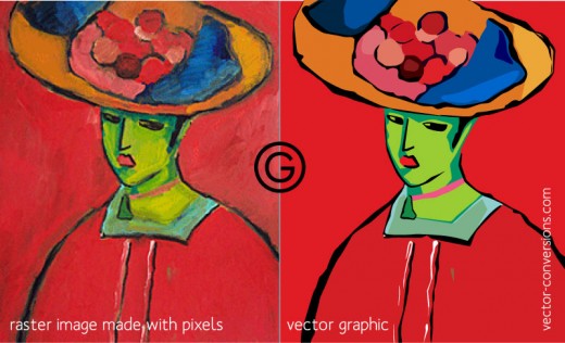
2. Consider Logo Types
There are two types of logos or image files. Vector and Raster. We strongly recommend using vector files for a logo – as opposed with Raster, it is based on pixels and thus loses image details when enlarged. A vector logo is based on larger resolutions and upon zooming in or out, it does not get pixelated. Vector logos can be scaled up or down to fit any size because you never know when you will need a super large or super tiny version of your logo that which can be depicted on a business card to that of a billboard banner.
3. Design and Color Matters
The most effective corporate logo designs are found to be bold and simple. Using a color palette of two to three colors with decipherable text and graphics is the best. Always remember that more colors your corporate logo has, the more expensive it will be for printing purpose. A logo with less colors is more cost effective and neat in representation.
4. Logo Variations
It is always a good idea to have logo variations i.e. one with black and white and the other with color. You never know where your logo needs to be printed, getting this done before hand saves you time, quality and money. You may also want a version of you corporate logo in different banner sizes that are meant for social media profiles and for website favicon. So be sure that your logo designer provides you with 4 Color Process (CMYK), Web Colors (RGB), Black only, and reversed (white logo on black/dark background) versions.


