The Origins of 8 Famous Logos
1. Apple
Apple’s history slaps you in the face. If you think that the apple was also the primary object, then you’re wrong.
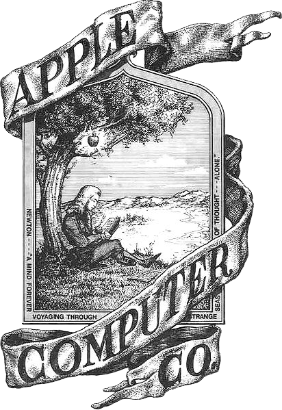
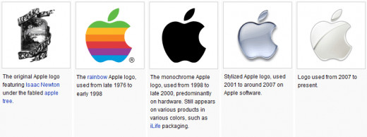
Apple’s first logo featured Isaac Newton, just before the famous apple fell on his head. Can you imagine this printed on all those modern iPods and Macs? It’d look…majestic?
The later designs featured a rainbow colored apple (like the one right now). Many people say it was created after Alan Turing, one of the few people to work on the first computer. One of the reasons this rumor is around is because of the bite missing from the apple — Turing committed suicide by taking a bite of a cyanide-infested apple.
Rob Janoff, the creator of the logo, laughs it off as “a wonderful urban legend”. Apparently it’s like that to avoid confusion between an apple and a cherry. But who cares what he says, right? We’re onto you, Janoff.
2. McDonald’s
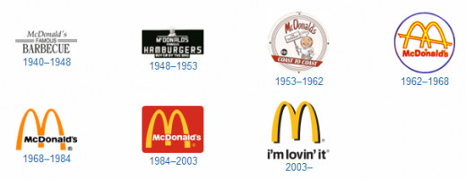
The logo similar to the one we all know now was only designed in 1960, by Stanley Meston. Many people think it symbolizes french fries, but it’s actually a raised roof beam with a pair of illuminated golden arches. Yeah, I know that it doesn’t make sense, but neither does their list of salads.

3. Firefox
Firefox used to be called Phoenix, then Firebird before the fox won the role. Phoenix and Firebird were actually really crappy predecessors, which definitely can’t be said about most companies. Their first logo was startlingly different to the current one, and looked a bit like a red goose.
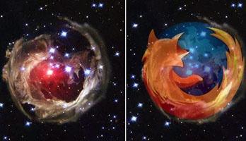
The modern logo was created in 2004. Firefox will probably deny it, but people have spotted stunning similarities to a photo taken by the Hubble Space telescope. What do you think?
4. Nokia
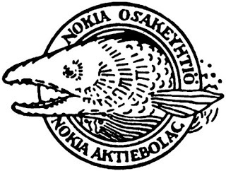
Nokia is also a town, where the river Nokianvirta runs through. You may or may not know this, but Nokia’s first logo was of a fish. This is because salmon swam in the river of Nokianvirta. Nokia also used to make car tyres, rubber bands, and, uh, raincoats.
I wonder if those raincoats could be used as bricks too. Anyone tried throwing a Nokia phone through a bus window? No…?
5. Pizza Hut
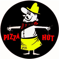
How tired are you of mascots? Every company seems to have a monkey, rabbit or meerkat as their one. Pizza Hut slapped the name ‘Pete’ on theirs and threw two words in his direction. Poor guy.
He looks more suited to a Godfather movie. Then, Pete ran away, forgetting his hat and words. Without him, Pizza Hut had no choice but to make a logo with what they had left.
6. Pepsi
Imagine picking up a bottle of Pepsi, then turning it around and seeing Brad’s Drink. Yeah, I’m serious. That’s what they used to be called. Who’s Brad? In 1893, back when the gunslingers played poker for a living and everything was like Red Dead Redemption, a guy called Caleb Bradham invented Pepsi. Oh, I mean Brad’s Drink.
Luckily, someone had the idea to rename it to Pepsi-Cola in 1898, but it was 1905 when the logo changed to something… suspicious.
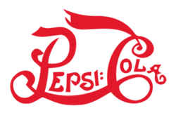
*Cough*Coca-Cola*cough*. But don’t worry, we’re getting to that.

7. Coca-Cola
Coca-Cola was invented by John S. Pemberton in 1886. I wonder if it still looked like it does today. It must have been illegal to swig around a bottle of black liquid. They arrested you for everything back then. Different colored shoe-laces? Witchcraft!
In 1887 came the logo we’re familiar with.
Wait, that means…Caleb Bradham, Pepsi guy, is a thief! Well, I’m sure the local sheriff ordered a young cowboy to go and find him, dead or alive, for a big reward (I’ve got to get rid of those Westerns).
8. Cartoon Network
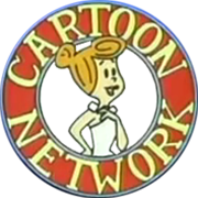
Before Cartoon Network began broadcasting, they used a completely different logo for marketing. The character used was interchangeable with any character that would be featured in their new shows.
This was in 1991, but I’m sure it feel like hundreds of years ago for some people. Cartoon Network has been around for seemingly everyone’s childhood, scaring us with King Ramses and his slab.
They recently redesigned the logo to say CN instead of Cartoon Network, which doesn’t seem to be proving popular.

