Create & print photographic business cards easily & quickly


Photographic business cards always make a great impression
This is especially the case if you are working in a creative field - maybe you're an interior designer, a photographer, a writer or perhaps you make jewelry. What better way to show your skills than right there on your business card.
Quick and easy to make
Even a simple drawing program on your computer can help you create your cards. There are plenty of free programs you can download or even website services. Here's an example. I used InDesign for these examples but free programs are fine.
Order online
Once you have created your cards, you can order them online from a company that offers a fabulous service. The minimum order is for only fifty cards that are double sided; your photograph on one side and your contact details on the reverse. (Note that this is to the US site but you can also reach others from here - UK, France, Germany, Spain and France.)
Click here
Materials:
- None required
Tools:
- Computer
- Basic drawing program

Instructions:
1. Select photographs.
I created a fictitious company for this demonstration and selected copyright-free images from Wikipedia but of course, your own photographs would work even better.
Choose photographs that are high quality and reflect your business well.
Juicy, ripe tomatoes show exactly what the company provides.
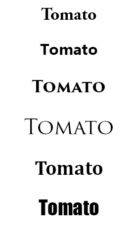
2. Select font.
Because these cards are for a business, I wanted a typeface that would be straightforward and businesslike.
The image shows the ones I considered.I chose the one at the bottom (Impact) because of its readability and the fact that it has a tomato-y 'chubbiness'.
Font selection should always be based on
a) readability and
b) suitability for purpose.
Your personal preferences should not be a factor.
'Because I like it' is not a valid reason.
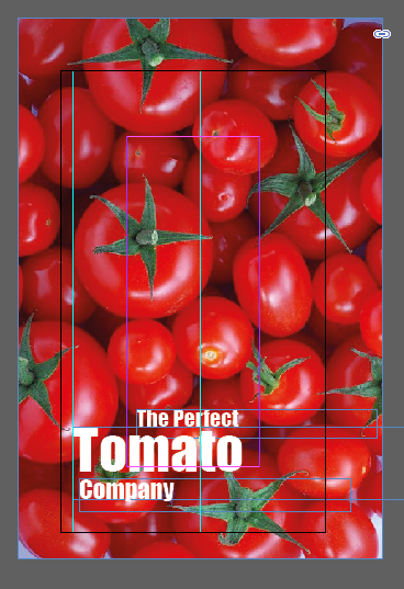
3. Set up the business card
Create a new file in your drawing program and add the image of your choice.
I like photographic business cards on which the photograph covers as much of the card as possible, preferably bleeding to the edge of the card.
To ensure that it does, extend your photograph well beyond the card's size.

4. Add the text.
For this card, the text is in three separate text boxes (see the image in the previous step).
This allows you to position it exactly as you wish and enlarge the most important words.
Use the 'free transform tool' (as it is called in most drawing programs) and keep the shift key pressed down to to maintain the proportions.

5. Line up the text.
I prefer to do this manually. If you select a text box, you'll be able to move it using the arrow keys on your keyboard.
See here how the 'f' of 'perfect' is centralized over the second 't' of 'tomato' and the 'c' of 'company' is aligned to the left hand upright of 'tomato'.
6. Tip!
Note the four colored boxes on the card at the top of the page.
They add a little interest. See how the colors have been taken from the photograph using the eyedropper tool. Instant coordination!
Note that to be sure they are aligned, there is an 'invisible' white rectangle at each side.

7. Tip!
I like the use of white space, especially when combined with an image that disappears off the side of the card.
In this example, I have used the white space below to add the company's web address at the bottom, picking the green color for the text using the eyedropper tool.

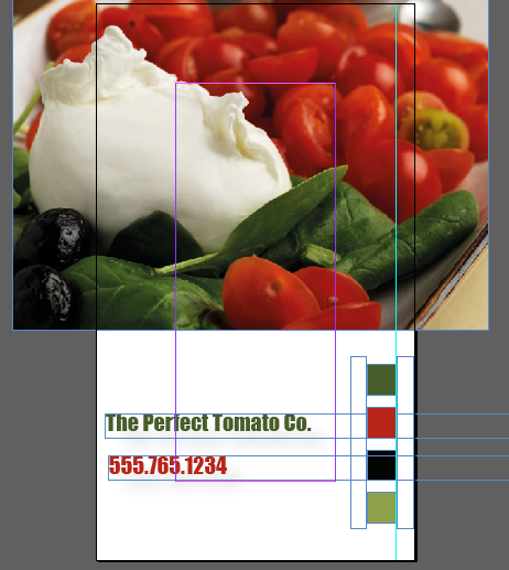
8. The back of the card.
Finally, create a new file for the reverse of the card.
Copy and paste the text boxes from the front of the card.
Adjust the colors if you wish and add any further details such as your name, mailing address or email address.
I like to leave plenty of white space on a card because many people like to use the area to make notes about you and your business.
_____________
Although the following products aren't essential to make your own cards, they are great if you want to get serious about your design work.
© 2014 Jackie Jackson