Create your brand without a logo

Create a visual corporate identity
It may be that you're a small business or perhaps your company is brand new. You need a brand. You need stationery. You need it fast.
Ideally, you need a brochure to demonstrate the goods you sell or the products you make. But money is tight. You can't afford a professional designer to work for you.
The best of both worlds
So there's a simple answer. Professional logos are expensive but you can create a corporate identity yourself, easily. Brochures are also expensive, especially as they are normally in full color. So we need a solution that you can create yourself, that supplies you with business collateral and visually shows your products.
Step-by-step to your brand
All you'll need is a drawing program on your computer (a free online service works just fine) and for this example, three photographs of your products. (The ones here are from Wikimedia).
Instructions:
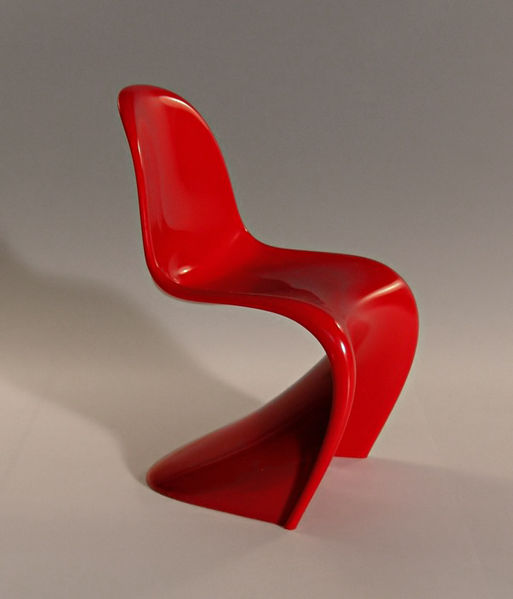
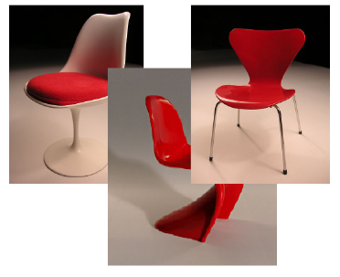
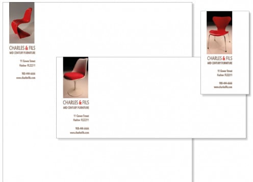
1. Assemble your photographs. For this demo, I have imagined a company that sells mid century modern furniture. (A particular love of mine).
Choose photographs that are similar in color and size but show distinctly different products. See the examples on the right.
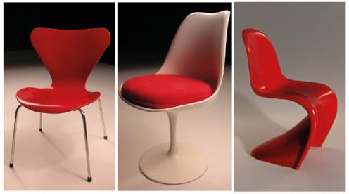
2. Resize the images.In your drawing program, crop and resize the images so that they are alike.You don't have to be totally obsessive and spend ages doing this.
Although it's always good to be 100% accurate, a few millimetres here and there aren't worth spending time on.
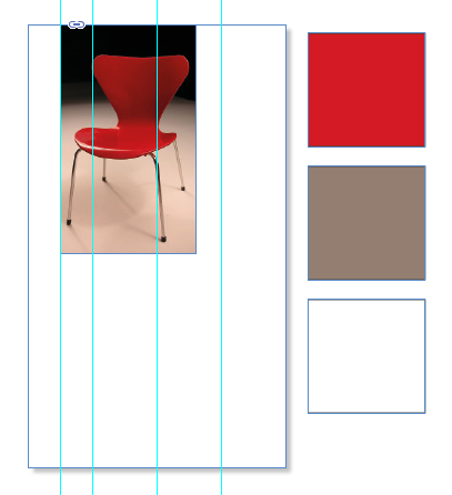
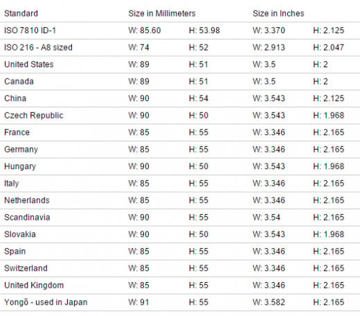
3. Now,let's build the business card. Create a new file to the correct size (different countries have different standard sizes - see the chart below) and divide the area into four with grid guides.
Divide the left column in half. Now, resize your first photograph and place it as shown in the image. Create three squares. Color one white.
Using the eyedropper tool, color the remaining two in the most prominent colors from the photograph.
This give you your colour swatches for the text.
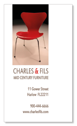
4. Move the white square to underneath the photograph and make it the same width. Add your copy.
Increase the font size of the company name and it's description until they fill the width of the rectangle. This variation adds visual interest.
Align the copy to the right. Color the copy in one of the colors in the other squares, in this case the grey. Add just a touch of the other color, the red in this instance, to add visual interest.
Here, I've used it for the ampersand but you could use it for the company name - it adds a pop of color that draws the eye.
Because you have selected the colours from the photograph, the coordination and match is perfect.
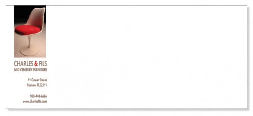
5. Create a new file for the envelope. You can copy and paste the photograph and the text from the business card and resize as necessary. Switch out the photograph for one of the others.
This looks so very stylish when it arrives in the mail and instantly tells the recipient about your products.
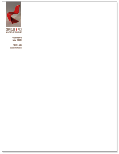
6. Open yet another new file to create your letterhead.
Again, sizes differ depending on what country you're in but for the sake of cost, use standard sizes. Once again, you can copy and paste from the previous file and switch the photograph.
You'll notice that I've flipped it for the sake of consistency - all three chairs are facing the same way.
Little details like that make all the difference.
Your letterhead looks stylish and represents your business well.
7. Now you have a letterhead, an envelope, a business card and, because of the images, a mini brochure. (See the image below).
When you enclose your card along with your letter, the recipient sees three different examples of the products you sell.
Recommended
Graphic design can become an obsession - the more you design, the more you want to know. Try the book below to learn more.
It also makes a wonderful gift for a design student or working professional. It's a wonderful reference tool and inspirational guide.
Business cards - sizes in different countries