Go the Extra Mile with Text: How-to and Examples


Go an extra mile with text
It's easy and quick to create graphics using text by formatting each letter individually. This can really make your graphics stand out
The alternative to the method I describe here is to create each letter individually, then format each one - this can be very time consuming.
None of the examples you will see below took more than five minutes to build. I used InDesign to create these examples. Illustrator has the same facility and the images are created in the same way using that program too.
The steps are simple:
- Type your text ('jolo' in the example on the right).
- Select the text box.
- Click 'type' then 'create outline'.
- Click 'object' > 'paths' > 'release compound paths'.
Now you can color, resize or add effect to each individual letter; each one (and its component parts) has become an image. You can transform each one individually - quickly and easily.
See examples below
Tools:
- Drawing program
Instructions:
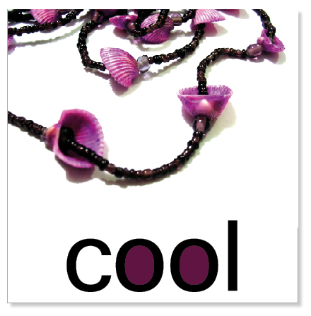
1. One of the first things you'll notice is that letters such as o, p, d, b and so on can have their center sections colored individually.
In this example, I've simply colored the centers of the two letters using the eyedropper tool to select a color from the photograph.
This takes only seconds but can look very effective.
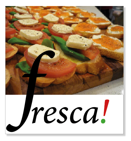
2. Individual letters can quickly be resized.
Here you can see that the initial letter has been pulled out to be larger than the rest.
The two component parts of the exclamation point can be colored individually.
The red and the green were selected using the eyedropper tool - in seconds.

3. Because every letter is now its own entity, it takes just seconds to make each letter a different colour.
The colours from the photograph have been used.
This way, everything harmonizes beautifully without effort.
Using too many colours in text can be overkill but it works here because each one has been carefully selected from the image.

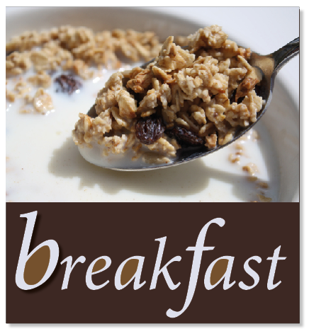
4. This is similar but the colors - again taken from the photograph - are more subtle.
Notice too that the font chosen is more sophisticated than the one in the example above.
This is a more classic, timeless font.
Even though the principle is exactly the same as the previous idea, the look is completely different.
5. I did this example to show you another way in which individual letters can have special effects applied to them.
Notice that the initial letter has a shadow.
Using the colors from the photograph, some letters use two complementary tones.
When you're selling or promoting food, always try to show an image that will make the viewer's mouth water.

6. This was probably the quickest and easiest example to create.
I love the square 'dots' in this font so it took only seconds to color them using the eyedropper tool to pick out the color of the table covering.
It adds a special touch to a very plain typeface.
The look can be subtle, as it is here,or as striking as you wish.
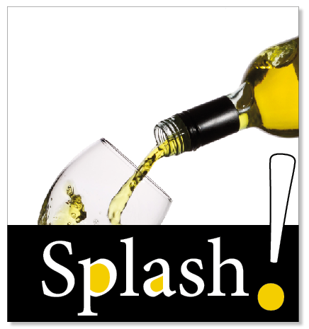
7. Because each component part of a character can be dealt with separately, it was easy to add an outline to the upper portion of the exclamation point.
This makes it visible against the white of the image. You can adjust the outline to the size you prefer.
As you can see, it has also been enlarged and rotated slightly for emphasis.
__________________
The only two programs I have which have this facility are InDesign and Illustrator. Of the two, InDesign is my program of choice.
Not only can it be used to create the small graphics you see here, it also is a professional tool used for creating complete books, magazines, brochures and other printed material. Creating PDFs is an absolute breeze too.
If you've seen InDesign advertised - and its high price - don't think it's beyond your means. I use the Cloud version for a small monthly fee. Another option is to purchase an older version (which has all the features of the current one) from Amazon.
See the links below.


