How and Why to Create a Slideshow

Add simple sideshows to your article to increase reader engagement
Click thumbnail to view full-size


A quick and easy way to display your images
Tease your readers with thumbnail images
As web readers, we are becoming increasingly visual. This is well demonstrated by the popularity of curation sites and services such as Pinterest.
Images, as we know from the old cliché, can say far much more than words alone. Many content writers today spend as much time preparing images for their articles as they do developing the actual content. I often do.
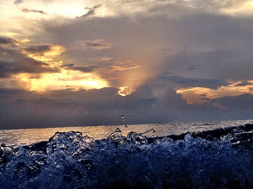
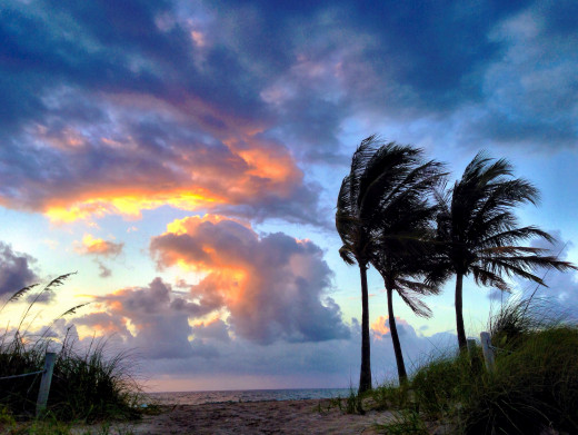
Thumbnail images pique the readers interest. Let's take the photographs above which were taken on Fort Lauderdale beach at dawn.
What are those black shapes we can see in the fifth thumbnail? Look at the one second from the right - are those shapes birds? It's a rare web reader who doesn't click on intriguing images to find out more.
Slideshows are also a wonderful way to showcase various images without taking up too much valuable real estate space on your page.


Showcase your portfolio or products
Small slideshow showcases
As you can see on the right, smaller images can work just as well as larger versions. These too whet the appetite. The thumbnails are just the right size to interest the viewer.
The images you see here show the work of a designer company - some examples of their web work -but it's easy to see how you can adapt this to your own needs.
Jewelry makers can show example of the items they've created, a book publishing firm can show photographs of their latest titles, chefs can show their latest recipes ... there's so much potential.
Here, the designers have five example of their work which takes up hardly any space at allon the page but demonstrates their flexibility well.


Demonstrate a transformation
Show step-by-step illustrations
The illustration in the large image on the right shows a simple Word document containing copy and a photograph.
This is the sort of thing designers are often sent with the request to format it - or as clients often say, 'make it look pretty'.
In these five images, I demonstrate how four simple stages can change the document from a basic chunk of copy to a print-ready piece suitable for a newsletter, magazine page or flyer.
By showing them in a slideshow which demonstrates the changes, the reader can easily see the transformation as they move through the images.
This is an excellent way to show a 'how-to' demonstration or a restored item.
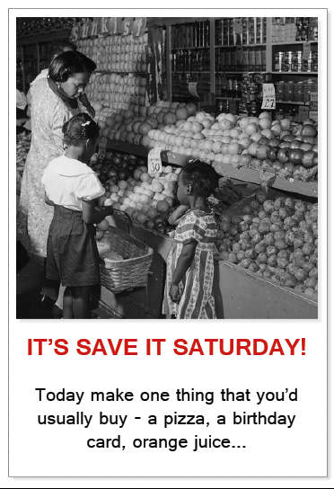
Show the passage of time
Click thumbnail to view full-size


Demonstrate changes over the years
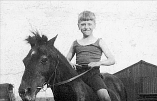
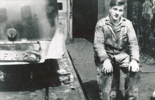
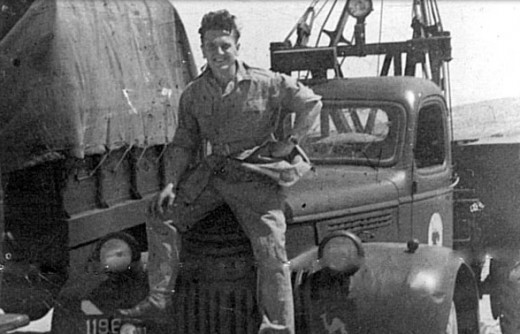
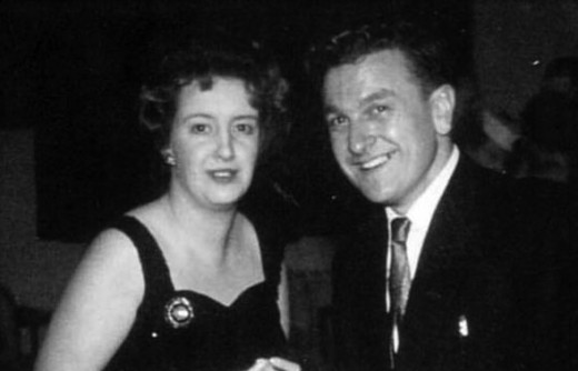
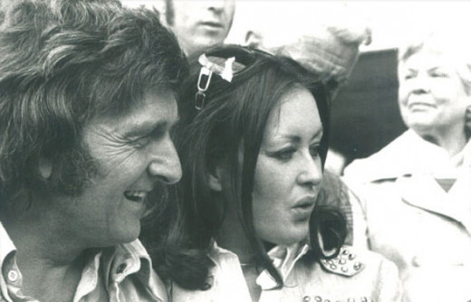
he first photograph you see above was taken in 1931. The final one was taken eighty years later in 2011.
Slideshows are a useful way of showing the passage of time without taking up too much space on the page.
This could be, for example, a series of images of the same place - or same building - over the years.
Charts and graphs are ideal for use in slideshows. For example, the reader sees the first image which shows the number of people using Google+ in 2009. The next shows 2010, the next 2011 and so on.


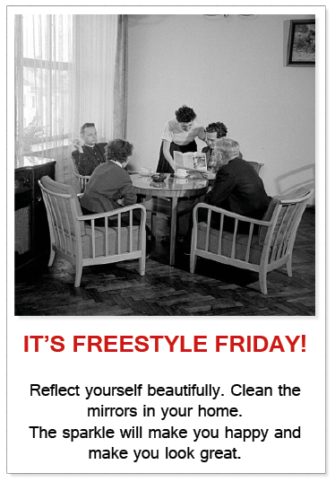
Tips and hints with captions
Show tips graphically
Adding cations to your images will increase engagement. As you can see, in the large image you can read the text but not in the thumbnails.
Aren't you intrigued? What does it say on the others? The thumbnails are small enough to tempt the reader and whet the appetite.
It's quick and easy for your readers to click on your thumbnails and read them in a logical progression. We're getting more and more lazy - we don't want to scroll down a long page. Give your readers what they want - it's easy for you and it's easy for them.
Using half-width images as I have done here, also means that you don't interrupt the flow of the text your viewer is reading. It's less distracting and more user-friendly.
Large images can be distracting. Be sure to keep your readers' attention. Unlike in previous years, slideshows also render well when seen on phones or tablets. With more and more people using smaller screens to view the web, it's important to make the most of every page's real estate.
Great for recipes
Click thumbnail to view full-size


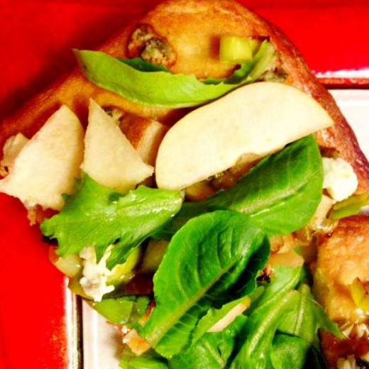
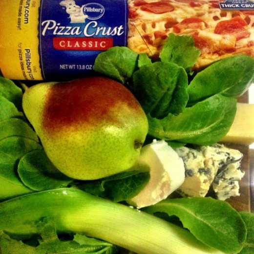
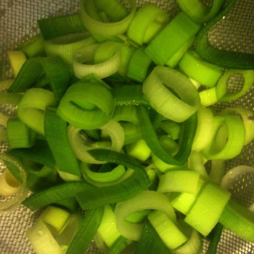

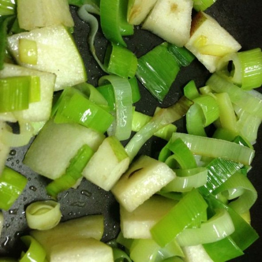
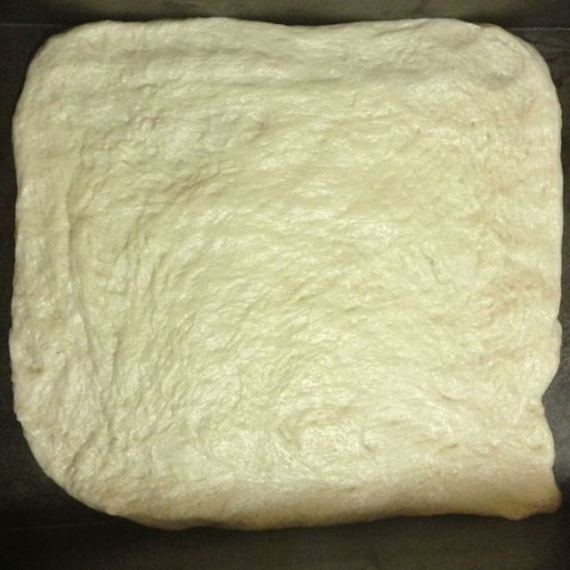
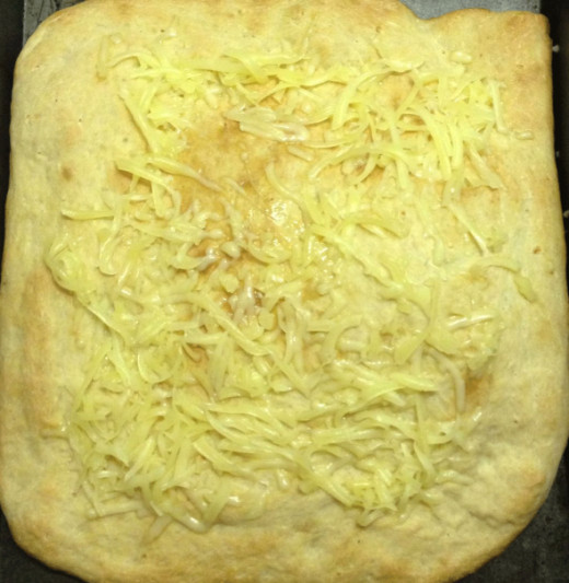
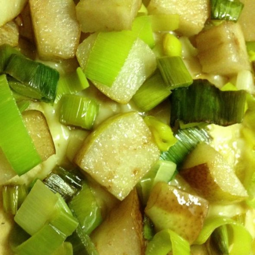
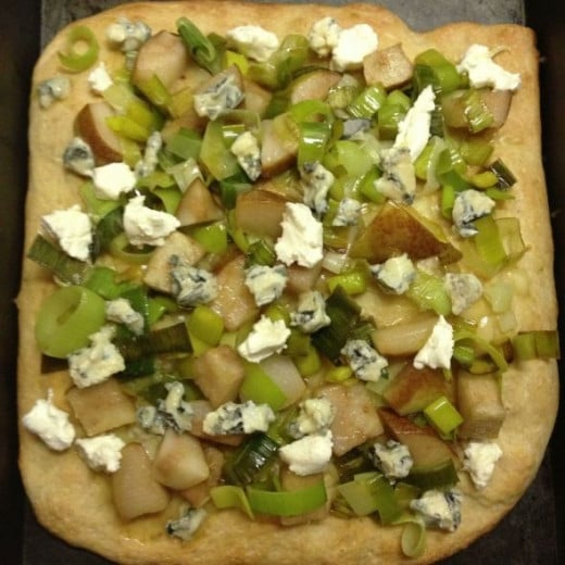
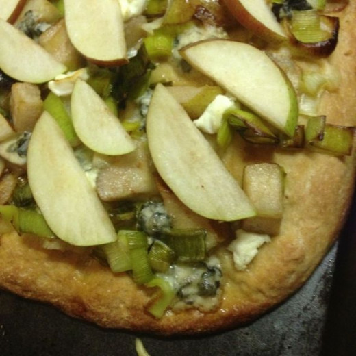
Recipes
Show detailed recipe instructions
I sometimes find recipe instructions a little challenging to write. Show a series of photographs is much better and enhances your descriptions.
I like to show the finished dish in the main photograph, then the ingredients required and then the stages.
What you're doing here is giving the reader a choice. When you add a large image in between your copy and instructions, that choice is removed. Some readers will want to see your step-by-step photographs so will click on the thumbnails.
Others may be irritated by large photographs that break up the text - 'yeah, yeah, I know how to caramelise onions, I don't need to see a picture.' By using slideshows you're making sure that your recipe or 'how-to' is suitable for all skill levels.
How to create a slideshow on this site
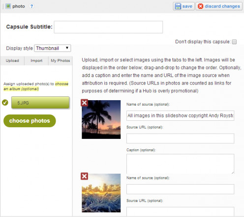
Easy steps to creating your slideshow
Using the photo capsule
This is so easy. Upload all the photographs you want to show using the photo facility. Be sure to use the drop-down box to the 'thumbnail' option.
It's as easy as that.
Points to note
- As you can see in the examples above, a full size image is perfect with ten thumbnails. A half-width slideshow is better with five or a number that is divisible by five
- Your images will show on the page in the order in which they are uploaded. Upload the image you want to lead before the others
- The simplest way to do this is to save your images numerically - 1.jpg, 2.jpg etc.
- If you see all the images fullsize, you've forgotten to show the 'thumbnail' option in the drop down box. Simply edit and correct
© 2014 Jackie Jackson


