How To Create Tri-Colour Images With Adobe Photoshop Elements

Digital Tri-Colour Photographs Are Easy!
I was browsing the internet the other day, looking for instructions on how to use Adobe Photoshop Elements to create Tri-Colour images.
I was unsuccessful!
The general consensus seems to be that it is perfectly possible using the full version of Photoshop, but not Photoshop Elements, because Elements can't process colour channels separately.
Elements may not be able to process colour channels, but I have found a way to make excellent Tri-Colour images with Photoshop Elements... and it's pretty easy too!
In this article I am going to show you how to do it. You'll be up and running in no time.
Please excuse my spelling. UK and US English have a few differences!

What is a Tri-Colour?
Tri-Colour photography was originally a film technique but it adapts to digital very well. In fact it is much easier with digital as you have a lot more control over the results. Film photography relied on multiple exposures and coloured filters to achieve this effect. The technique required three exposures of a scene to be taken on the same frame through specially selected red,blue and green filters, with a time delay between each shot. The end result, if you were lucky, was a photograph that looked quite normal except that any part of the scene that had moved between each exposure would record in a mixture of strange colours. Anything that had not moved would appear unchanged.
The good news is that it is much easier to do with a digital camera.
What Subject Material Is Suitable?
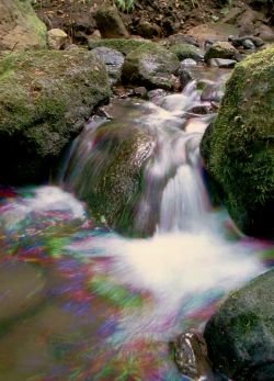
Clouds moving across the sky, waterfalls, fountains, rivers and streams, trees in the wind, crowds of people moving around, traffic etc are all good subject matter. Even grey, overcast skies can be good but there does need to be movement, detail and contrast for best effect.
The photographs in this lens show the effect much better than I can describe it.
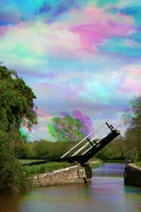
The photo of the canal bridge is a good example. It was taken on a very windy day. The clouds, tree branches and water were moving considerably between each exposure, and have recorded in different colours. The bridge and foreground did not move and so recorded normally.
These images work best when there is a good mixture of static and moving elements in the scene. Though there is much opportunity for experimentation. You never know exactly how it will turn out each time. That's part of the fun.
If you haven't got a tripod you could try Tri-Colour abstracts of just clouds, or water perhaps. With these you may not even need to align your images. You can make some colourful patterns this way.
Taking The Component Pictures...
You will need:
Any digital camera that can be attached to a tripod.
A tripod.
A remote shutter release or self timer function (not essential but very helpful).
A computer and any version of Adobe Photoshop Elements.
Choose your scene. I have given some scene suggestions already. Just go for something simple to start with. Don't worry about creating a masterpiece just yet. Practice with the technique first.
Set up your camera and tripod. Compose your scene and clamp it up tight. It is VERY important that the camera does not move between each shot. This is where the remote shutter release is useful. If it does move, it can be corrected later but that will increase the work load considerably. In this case it is sometimes easier to re-take the images.
Use aperture priority, or manual mode to take the shots. You will want to keep the aperture the same, otherwise there will be differences in the depth of field and your pictures will not align properly.
If using autofocus, select a focus point that will not change between shots, or use manual focus instead.
Feel free to use any filters that you would normally use for landscapes, such as polarizers, grey grads, warm-ups etc. It is your choice as to whether you do this or not. I personally do not like to put filters in front of the lens, as every extra piece of glass will degrade the image a little. Polarizers are the main exception as they cannot really be simulated on the computer.
Do not alter the zoom or other settings between shots.
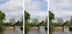
Take at least three normal photographs of your chosen scene. Allow a time delay between each shot. The length of the delay will depend on the amount of movement within the scene. Fast moving subjects like running water don't need much of an interval at all. Slower moving things might need several seconds, minutes, or longer! It is easy to be impatient but just relax and give things time to move. If your delay interval is too short you will just get a subtle colour fringing effect.
Do make sure that if picture one is taken in sunlight, then all the others should be sunny as well. Keep the lighting conditions as close as you can for all shots. Otherwise you will get an undesirable colour cast to the parts of the image that are meant to be normal.
Apart from the intended subject movement, all of your images should look the same in terms of lighting and exposure. I usually take about six photos and then choose three of them for the final Tri-Colour.

Making The Tri-Colour Image
Now for the fun bit!
Transfer your pictures to your computer.
Choose your three images.
Open them in Elements (in full image editor mode) and select one as the base image. With the move tool, drag the other two images into the base image. They will appear as separate layers.
Zoom in to 200% top left corner and make sure that the corner of each layer fits exactly into the corner of the image. Your images should now be perfectly aligned provided you did not move the camera during capture. Zoom back out again.
At this point you can make small adjustments to the brightness levels of each Photograph if you like but do remember to keep them all looking the same.
Now the fun part...
Select the bottom (background) layer.
At the top of the screen click Enhance - Adjust Colour - Colour Variations.
Select Midtones, crank up the intensity slider to MAXIMUM and click "Increase Red" once. Then click "Darken" once. You should now have a dark red image - click OK.
Select layer two and do the same again but this time click "Increase Green" and "Darken" - OK.
Select layer three and click "Increase Blue" and "Darken" - OK.
So now your three layers should be dark red, green and blue. it doesn't matter what order you do this in.
Leave the background layer as it is.
Select layer two and change the screen blending mode to "Lighten".
Do the same for layer three.
You should now have a Tri-Colour Image!

A Few Final Touches
Now that you have your beautiful Tri-Colour image before you, the next step is to double check the alignment of the layers. If your camera did not move at all during your exposures you should be fine and not need to adjust anything, but do check anyway. I sometimes find that despite my best efforts one or two of the layers will need a small nudge of maybe just one pixel to get the alignment just right. If your alignment is out by even a tiny amount, it will affect the overall perceived sharpness of the combined image.
First, choose the most important fixed object in your image and zoom in to 100%. Now click the "eye" icon at the left of the layers pallet to toggle the corresponding layer off and on. Using the background layer as a guide, check for any movement of the layer as you toggle, that will indicate misalignment. If the layer appears to move slightly when toggled you can adjust its position with the move tool and arrow keys on your keyboard. You can move the image 1 pixel in any direction this way (if you hold the shift key down as well you can move in 10 pixel increments).
In the canal bridge Tri-Colour, the sky was a little too light. I created a new empty top layer and then with the gradient tool, I selected the "black to transparent" gradient. I clicked on the top of the image and dragged down to the horizon. This created a dark gradient over the sky.
Set the screen blending mode for this layer to "overlay" and adjust the opacity to your liking. If this darker gradient overlaps trees etc above the horizon you can carefully use the "erase" tool with a soft brush to remove some of the darkness from the gradient layer.
And that's it, You're done!
I hope that you found this lens useful?
Thank you for reading my first Squidoo lens.
Clicking on this picture will take you to my Zazzle store where you can see a larger version of it.
Important: I own the copyright to all images featured in this lens. They were photographed and/or digitally created by myself. They cannot be used elsewhere without my permission. Please respect my ownership of these images and text. Thank you.
Links
- The Kryfold Sky Zazzle Store
My Zazzle store features a wide range of my photography and digital images. Including a greeting card which features the canal bridge and other tri-colour images.
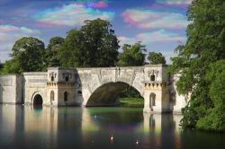
The Grand Bridge at Blenheim Palace
An alternative view!
This beautiful bridge crosses the lake at Blenheim Palace, Woodstock, Oxfordshire, UK.
Many people take photographs of this bridge but I bet that I am the first to make a Tri-Colour of it.
Clicking on the photo will take you to my Zazzle store. This image is available as a greeting card and the site also shows a larger version of this picture.
Some very useful photographic kit.
Do check that your camera is compatible with this equipment!


