How to format print pages quickly & easily

Quickly transform a print piece
Many designers will chuckle at this familiar scenario. A client sends you a Word document with text and an image.
"Can you please make it look good? And don't use colour, the print costs must be kept really low. Oh, and the printer has a deadline - can it be ready within half an hour please?"
Why you might need to do this yourself
You can easily transform a chunk of copy and an image into something more attractive and readable. You might:
- Be sending out information about a new product to your clients
- Want to create interest for a non-profit
- Use the information in a PDF that will be linked from your website
- Be creating a newsletter for your organisation
- Be building a hand-out sheet to distribute at a trade show or craft fair
- Want to create educational sheets for your students
There are so many reasons and the good news is that you can vastly improve the piece with just a few simple steps that make all the difference.
Instructions:
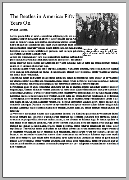
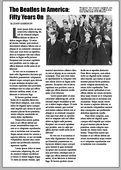
1. This is the sort of thing the client will send. If you're a designer, you've seen this so many times. The writer has a lot to say so the image is squished into the corner, almost as an afterthought.
We have five separate elements.
1. The body copy
2. The photograph
3. The headline
4. The photograph's caption
5. The author's byline
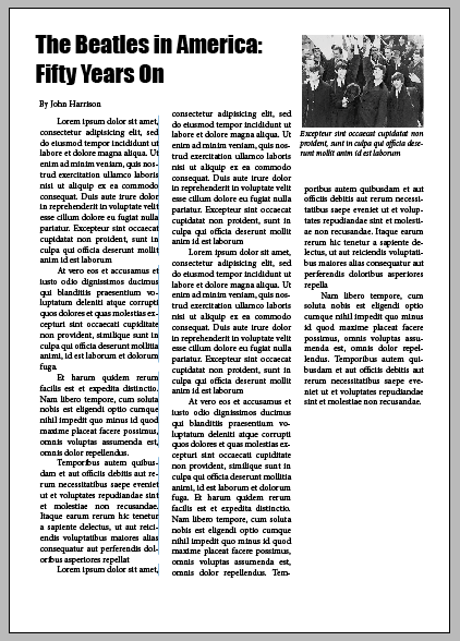
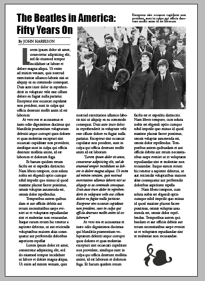
2. Here, three of those elements have been changed.
Firstly, the body copy has been spaced between three columns. People are more accustomed to reading print materials in columns - think of newspapers and magazines. Although it's hard to see in the image, the font has been changed for readability (to Garamond). In addition the first line of each paragraph has been indented.
Secondly the headline has a new font (Impact) and is spaced at the colon. Finally the caption font has been made a little smaller to distinguish it from the body copy.
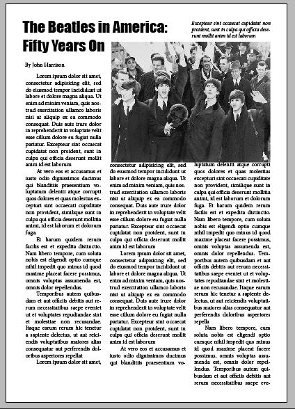
3. The photograph is so important as it draws people into the piece. So here, it has been enlarged to be the same width as the second & third column.
The caption has now been moved to above the photograph, lined up with the headline. But enlarging the photograph hasn't left enough room for the text. This is always a fun part of the process.
And there are several solutions to that important problem.
4. To begin with, the columns can be extended slightly. The original text was justified - which takes up more room - so it was changed to left-aligned.
Then I noticed that one paragraph (in the middle column) was a quote. This meant that it could be italicised, which again takes up less space.
As a decorative touch, the first letter on the page was made into a drop cap. This was changed to Impact, the headline font, and coloured a grey tone so it didn't appear to be overpowering.
Now, the columns are aligning well at the bottom. The only problem (or opportunity) is the additional space at the end of the article.
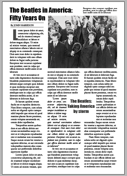
5. I have two favourite ways of dealing with this. Both include using an object that can be adjusted in size so that the copy on the page lined up perfectly.
The first is shown here. A text box has been added and an ornamental flourish added. This give the piece an end - it's almost as if it's a visual period.
Another small decorative touch has been added - two thin lines;one above and one below the author's name. The name itself has now been changed to uppercase letters to add weight and authority.
6. If you'd like the text columns to align perfectly at the bottom, this is an excellent method. Create a text box and add a few words.
This can be a short quote from the copy or a short summary of the article. Place this between two columns. Using the free transform tool, resize it until the copy at the end of the piece is just where you want it.
Here, I have used the headline font again and given it a transparency so that it isn't overpowering.
__________________________________________
Find out more about fonts. We see hundreds every day and despite the fact that they are so much a part of our lives, few people outside the design world know where they originated. And yet the book below explains so much in an amusing and entertaining way.
I chose two fonts for the demo above. The headline font used was Impact. This is a lovely font for headlines. It was designed in the 1960s so was very suitable for an article about the Beatles.
Garamond, the font chosen for the body copy, has been around since the sixteenth century. Not only is it a very beautiful typeface, it's also considered to be the most readable in print.
© 2014 Jackie Jackson


