Showcase your team or products


Showcase your staff, team or personnel
There are many reasons why you might have to showcase a group of people or objects. It could be your interior design team, award winners, a sports team ... there are so many options.
This could even be a dessert menu, or a card to showcase your products with short descriptions. You want to be stylish but don't have the best material to work with.
The problem - no professional photographer
Not everyone can afford a professional photographer to produce uniform headshots with the same color background. It's the same with products or menu items.In an ideal world a photographer will take the headshots, using the same colour background and that makes a designers life much easier.Unfortunately, it's not a perfect world.
Often, the designer is presented with group of photographs that are all very different.
The answer is to crop and colorize
And actually this might be a quicker process than you realise. Just follow the step by step instructions below.

Instructions:
1. The first thing to do then is to crop the images.
Zoom in close and crop until you have just the face - no conflicting backgrounds. Crop each to a square - squares are always easier to work with.
Use your favorite drawing program or online editor. For the purposes of this demo, I used InDesign.

2. Now we are ready to build the tables to contain and organise the copy.
As you can see here, we have eight columns (for eight people) and three rows, one for the name, one to create a small space and one for the job description. The screenshot shows setting up the columns and rows using InDesign. It may be different in the program you use but the essentials will remain the same.

3. Now we are ready to build.You can see that I have used vertical guides to ensure all the elements line up. A text box is added, saying 'meet the team'.
Then the copy is added to the tables. The copy on the left is right-aligned and vice versa.
This looks almost like movie credits. You can see that the original idea was to have the 'credits' centered underneath the image block.

4. But you can see that I quickly changed my mind. I'm not completely happy with the look yet. But after a minor adjustment...
The names of the team are much shorter than the descriptions and the list looks SO much better when the space is centralized under the two capital Ts. Note how the white space forms another T. By now I liked it but I still didn't love it.
It seemed too bright and the colors needed softening plus the whole thing needs bringing together.

5. There's such an easy way to do that. Draw a rectangle that completely covers the image and copy. Move it to one side and with the eyedropper, select a color from the photographs. Move the colored rectangle back over the entire thing. Now, alter the transparency (depending on your program, that will probably be IMAGE > EFFECTS > TRANSPARENCY.)
A transparency of about 20% will be about right but experiment. Be sure that the box covers all the other elements by using OBJECT > ARRANGE > BRING TO FRONT.
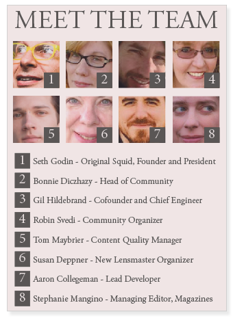
6. Here's another variation. I created this in case you are interested in building a similar card for your products or menu items. By numbering the faces AND the descriptions, people can easily see which piece of text refers to each image. This makes for easy ordering as your customers can refer to your products by number (like a Chinese takeout).
You can use this for almost any type of product - from fresh fruit to fashion wear.
Incidentally,you can see that I had to flip one of the faces to accommodate the little black number box.
Working with type is fascinating and wonderful. If you'd like to learn more, the book below is excellent. It also makes a wonderful gift for any designer - either design student or a seasoned professional. We all keep learning all the time.
© 2014 Jackie Jackson
 - Walkthrough and Cheats")


