Use simplicity to create effective webpages

On the web today - keep it simple for your article or blog
It's really interesting to look back at some of the strange things we used to do on websites in the last century. Today, whether you're creating a huge website or a single page here on this or any other content writing site, it's important to keep it simple.
Because we could, we did
That was our attitude - we'd find a piece of 'clever' coding that created colored scroll bars (for example) and think we were being very smart. We would add all sorts of nonsense simply because we could. But today, people are accessing the web from many different types of device and our 'cute' little tricks just won't work any more.
Things to avoid
The internet - and the devices we use - change all the time. And they'll continue to change. If we keep our pages simple, then we can assure readability on all platforms, plus creating an insurance for ourselves so that our pages and websites won't need extensive overhauling next week, next month or next year. Avoid:
- CSS - the more code you have, the more you're likely to need to update in future
- Tables - these do not render on cellphones
- Flash - not many people use it today because many devices just don't 'read' it
- Huge quantities of text - people simply don't read them
- Lots of links in the text - these confuse the viewer; should they click or read on?
- Excessive confusing images - we want to make it easy for our readers
Below, I'm demonstrating using a content writing site and creating a simple article but most of these principles apply on your own website or blog too. If you'd like to see the page demoed below, click here.
Design for usability

Top tips
1. The introduction. On many sites, the image you select for your intro will be used as its icon, so choose carefully. (In Wordpress, for example, this will be your 'featured image'.)
It's a good idea to crop the image in closely so that its subject matter can still be seen when it's shown much smaller.
If it has the ability to intrigue the reader, so much the better.
2. Text should always be broken up into small chunks as you can see here.Don't worry if you need to create a paragraph at a point that isn't strictly grammatically correct.
You want people to read your article - they aren't there to criticise your paragraph usage.
People skim your copy and home in on words they find interesting. This is very difficult to do with long passages of text.
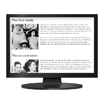
3 Uniformity is important.
Some of these images were monochrome, others were color but it's gentler on the eye if they do not change in general aspect.
By making the colored images monochrome, a more consistent look can be given to your page. To achieve uniformity, create all images to the same size.
The same applies to the copy. Your readers will feel more comfortable - and more inclined to read - if the chunks of copy are approximately the same length.
People don't want to be surprised or unsettled - make readers feel comfortable on your pages or your website.
Human nature is such that we like patterns - we naturally like visual order and neatness.
Use dark coloured text on a pale background and at all costs, avoid fancy fonts. Keep away from any feature that will send your readers to the back button.
4. Something that your viewers will find unsettling is a page that screams 'buy this'. If you are reviewing a specific product, that's different, but if you're writing an informative article, be sure that any commercial aspects fully gel with your subject.
Again, use paragraphs to break up text.
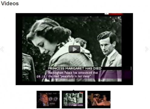
5. Adding video is easy.
Many content sites make it particularly simple by offering a video module or capsule where you can show several relevant clips.
On other sites, use the embed code to add clips to add to the value you are offering to your readers.
Videos add interest to your page quickly and at no cost. Be sure that the content highly relevant - never add videos just for the sake of it.
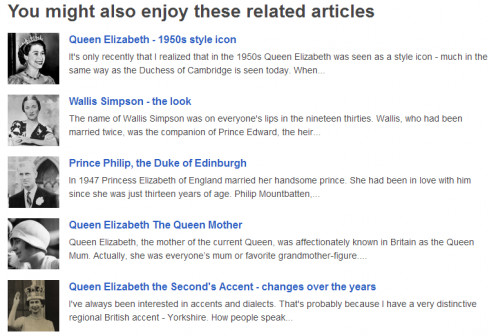
6. Related articles are a splendid idea.
If your readers have been interested in what they read then they'll be happy to read more. Some content sites have a very convenient module which you can see on the right.
If you use Wordpress, there are any number of plugins that will generate these automatically.
Be sure that the related sites truly are dealing with related subjects.If possible, use images that suit the rest of your article - monochrome in the example on the right.
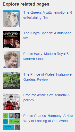
7. People are accustomed to sidebar ads.
Almost every site uses the right hand sidebar for commercial purposes.
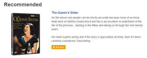
On your own site, the sidebar is the place to add any affiliate links or banners. Alternatively (or as well as) add links to any product reviews you may have written. Include an image if possible to make it more visually appealing.
Once again, I have to stress that these should be highly relevant to the content of your article.
This is sensible from every point of view - your readers are more likely to click on links that are genuinely related,plus this can be an advantage for search engines.
If you're relatively new to the complexities of working on the internet, check out the books below:

Who am I to advise you?
Good question. If you're going to take my advice, then it's a good idea for me to explain my experience to you.
I created my first website in 1996. There were no blogging sites or editing software in those days, we wrote in raw code. A year later, I create my first social media site.
In 1999, I started working on the internet full time - creating sites, designing, writing, coding and promoting. I have been doing this every working day since.
I have created thousands of websites and written millions of words on the internet.
So, I'm an old fogey, eh? Out of date maybe?
No.
Anyone who works on the internet full time will not be a success unless they remain nimble, flexible and they learn every day. Yes, the internet does change daily.
I have seen websites grow from a curious little geeky endeavours to the powerful medium it is today.
I've seen big clunky old computers develop over the years to something that can fit into my jeans pocket.
This means growing, learning and always being up to date with current trends.
© 2014 Jackie Jackson
Related

How to create paranormal website, from free templates to wordpress management
 for Website Building")
12 Best Free CMS (Content Management Systems) for Website Building

Best Paying Article Directories To Earn Smart Passive Income - Revenue Sharing Websites

Simple and Easy Sewing Patterns for Beginner Sewers and First Time Sewers

How to Use Published Recipes on the Internet


