Why Use a Graphic Author Resource Box: Plus 10 Design Ideas

Why should you have a graphic author resource box?
If you write online, your author resource box is an important part of your online brand. Often, this will be text but there are good reasons for having a graphic version ready too.
The chances are that, as an online writer, you have your own sites for your articles, you may write on sites such as this one, write guest posts - it's likely that you're all over the place on the internet.
And wherever you are, you'll have a goal - a call to action.
You may want readers to:
- Visit your own website
- Go to a specific page where you're selling your book or other products
- Email you for further information
- Telephone you for a quote
- Follow you on social media
- Simply read further information about you to lend weight to your authority
Why a graphic?
Many sites use text with a tiny image of the author at the end of articles and that can be perfect in many cases. But a graphic is also useful for the following reasons:
- Because author resource boxes are usually so generic, they are overlooked by readers
- A graphic on the other hand reflects your online brand and who you are
- Regular text boxes can interfere with keyword density
- They are also duplicate content
- Graphics are quick to add - if you write guest posts, your host will appreciate the speed
- You control the amount of information given
- Your resource box becomes recognisable icon for viewers
- Once you have your graphic ready, it's quick and easy to send by email to host blogs
- If you write on several sites, it gives your work continuity
- Once you have your design in place you can use it for offline purposes too
Here are a few examples
Instructions:
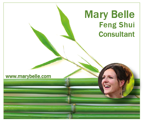
1. This example reflects the services offered.
Feng Shui is a way of improving the harmony in your home and is Asian in origin.It emphasises simplicity and calm, as does this design. But yet it's visually appealing and noticeable.
This example simply encourages the viewer to visit the website where they can learn more about the services offered.
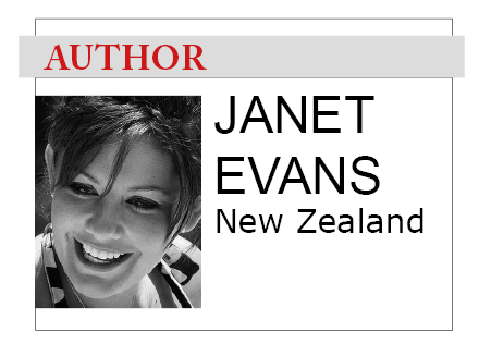
2. You can decide exactly how much - or how little - information you want viewers to have.
On a site that specialises in travel, for example, you might just have your location.When you are adding your box to your own site, or sites that allow it, you can of course link it to wherever you wish.
If you are using it on a guest post, your host will probably add the link of your choice.
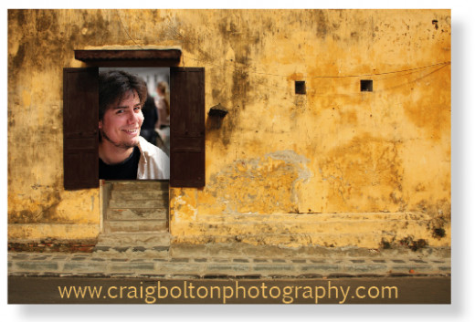
3. Here an imaginary photographer has added his image to the doorway of the building on one of his photographs.
This has the advantage of showing his work, in addition to his own photograph.
The bottom of this image is idea for showing the URL of the photographer's own website.
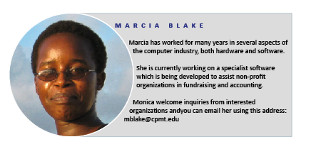
4. This is more like the traditional author box in that it gives a couple of paragraphs of information.
However, it is far more visually appealing than the normal textbox and putting the photograph in a circle softens the image.Use a clear font when conveying information such as this.
5. Shy? People like to know who they are dealing with and showing your face is the best way to 'meet & greet' people online.
But you might not want to reveal all.In this instance, the box shows just a portion of the face,the first name and a brief tagline showing readers what to expect.
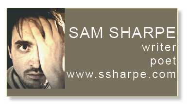
6. Alternatively, use a quirky image. You probably wouldn't recognise this man if you met him in line in the grocery store but this image is memorable.
The background colour is taken from his collar - seen on the left hand side of the photograph.By using a smaller font, more information could be added.
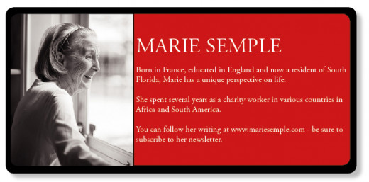
7. Here's an example which has far more information.
It has biographical information about the author plus it encourages viewers to visit her website.It specifically mentions signing up for her newsletter - this author's goal.
The box is given a softer appearance by rounding the edges and adding a soft drop shadow.
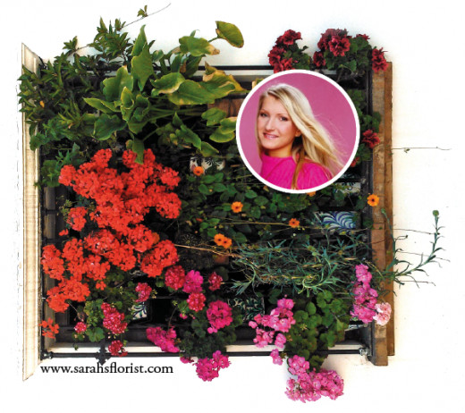
8. Use a fabulous photograph.
Here, the colours of the girl's clothing and the background of the portrait matches perfectly with some of the blooms.The photograph instantly - and visually - shows what her business is.
So all that is needed is the URL of her website. It confirms what her company does and is a call to action for the viewer to visit.
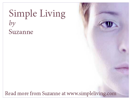
9. This is an example of an author box that perfectly explains the author's way of life.
Her site is about simple living and the graphic,correspondingly, is very simple and straightforward.
To keep it simple and minimalistic, the colour for the text has been picked from the image using the eyedropper tool.
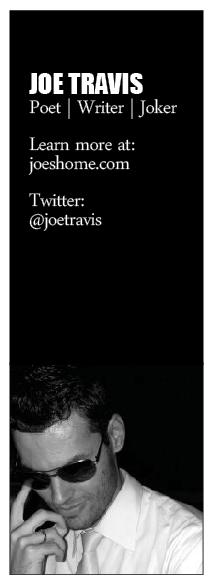
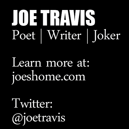
10. So far, our examples have been horizontal or square but there's also often a case for a 'skyscraper' image.
These look excellent in the sidebar of a website or blog or even in the body copy to one side of the article.
The use of black and white makes it striking and, on a practical level, means that it will match any other colour scheme.
There are two goals Joe has for this resource box.
Firstly, we wants people to visit his website to read his work and secondly, to increase his Twitter following.
This format gives plenty of space for additional information, if required.
Designing for print and designing for the web are two very different animals.
Usability is an issue with both but when designing for the web, there can be more restrictions to bear in mind,I would recommend the book below as a great way to learn more.


