Working with Text: Ampersands

Just because a font has an ampersand, you don't have to use it
I admit that I love them - ampersands, that is. And it's wonderful to see the huge variety that font designers have created for us. Some are simply beautiful.
When you're creating decorative text, there's no need to use the ampersand supplied with the font. Look around and see what other beauties you have on your computer.
To demonstrate this, the examples you'll see contain a lovely, basic sans serif text but you'll be able to see how the the two words come to life by the use of different ampersands from various fonts.
By using these lovely ampersands, you can really bring text alive, especially for graphical uses.
These are in alphabetical order.
Materials:
- None
Instructions:
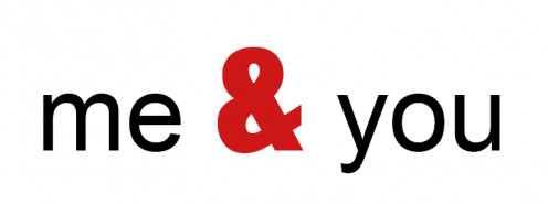
1. Caslon Bold.
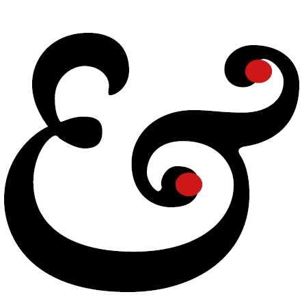
I love this ampersand with its curves and flourishes.Here you can clearly see that the symbol has its roots in Latin. The ampersand grew from the letters 'e' and 't'; 'et' being the Latin word for 'and'.It's a beautiful design object.
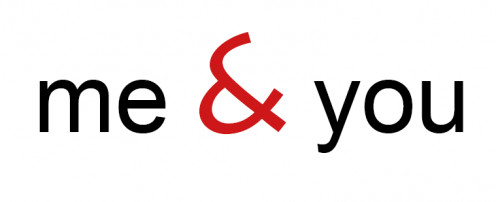
2. Courier New.
Look at the difference between this and the previous example.This is light and delicate and, like the font itself, has an old-fashioned 'typewriter' look and feel but at the same time, it's a modern style.
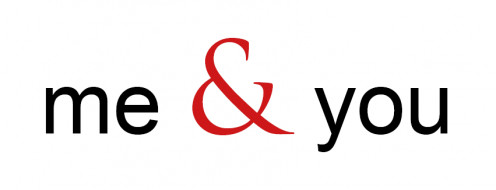
3. Garamond Italic.
This is probably the finest - the king of all ampersands. In the regular font the ampersand, although beautiful, doesn't have the same flair as the italic version.Choose Garamond Italic when you want a flourish.
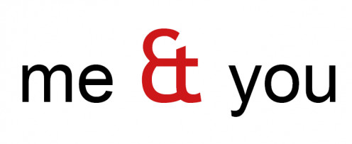
4. Impact.
What a lovely businesslike version this is.You can tell that this symbol won't take any nonsense - it's down to earth, forthright and functional.This makes a bold statement. I always think that Impact has a distinct 1960s look.
5. Lithos.
Yet another very different example. It's light and airy with clean, swooping lines.Enlarge the image to see how the two arcs join and intersect to create this lovely symbol. The origins ('et') are barely noticeable here but it has a wonderful, modern elegance.
6. Trajan.
Although this is similar in form to the Lithos example above, look how very different it is.This is so classically elegant. If you think you can imagine it carved on ancient Roman monuments, you're right.That's what the font was based on.
7. Trebuchet.
Isn't this just fabulous? It is very clearly the letters 'e' and 't' and the designer of this font chose to celebrate that rather than hide it.In the same way that the Impact font provides a down to earth ampersand, so does Trebuchet but with a more classical style.
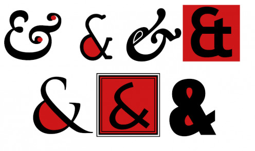
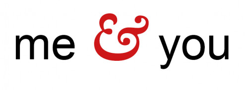
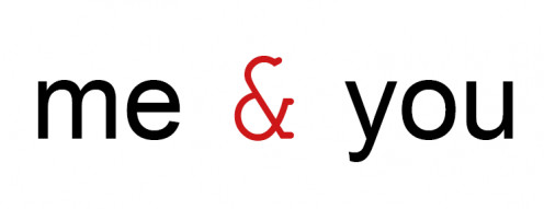
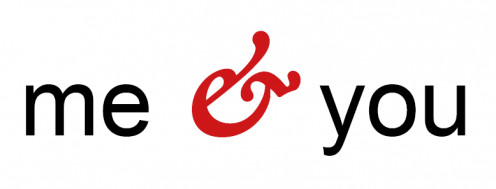
8. Fun with ampersands.The selection I have chosen on this page are, some would say, just simple symbols. But I see them as design objects in their own right.Just for fun, I experimented with various treatments, as you can see here.
We see thousands of words every day.And yet it's easy to forget that each letter, each digit, each symbol and punctuation mark has been individually designed.There are several great books on the subject and I'd particularly recommend the one below.
Remember that on your computer you have more gorgeous symbols than you might imagine. They are often hidden in a character map or a glyphs panel.
They can make all the difference to your graphics and documents. For example,if I am designing using Garamond regular, I invariably use the italic ampersand because it's infinitely more beautiful.
Typography is an important part of my job as a designer. When you've been designing for as long as I have (and that's such a long time) fonts and individual letters are as familiar to me as my own face.
Example: You know how similar Georgia and Times New Roman cab be? I remember once looking at a proof of a poster designed in our studio and pointing out that one capital T in the copy was Times when the rest was Georgia. I was scoffed at (of course) but when the designer checked the original files, it was discovered that I was correct.
Every font, every letter, number or symbol, has its own nuances.
How the ampersand developed over the years
The ampersand was originally formed from two letters of the alphabet, 'e' and 't'. This is simply because the Latin words for 'and' is 'et'.
You can see below how it developed over the years into the symbol we know today.

© 2014 Jackie Jackson


