Brand Development for a Foreign Exchange Service


Companies offering financial services must be carefully branded to show potential clients that they are trustworthy, experienced and always put their client’s interests first. The brand must also be eye-catching, memorable and significantly different to that of its competitors whilst retaining a corporate feel - or it will simply drown amongst many other similar brands.
When ToroFx was founded in 2006 in Toronto, it offered a foreign exchange service for businesses and individuals. The company owners were ambitious and believed that their expertise and company set up would allow them to succeed in a competitive industry – but they needed a powerful brand to impart this message to clients and competitors alike. In short, they wanted to be noticed for all the right reasons.
Who to work with?
ToroFx knew they wanted a brand development company with experience of working with financial companies. They approached New Design Group and found that this brand development team fully understood their aims – and so the branding project began.
The requirements
A complete brand identity was required from logo and corporate stationery to presentation folder, business card and website. The website also had to be created to allow the plugin of a third party trading software.
The angle
As with any good branding project, a specific angle was required to make the final brand stand out from the rest. ‘Toro’ means bull in Spanish and a bull is synonymous with strength, stamina and stability – all great attributes for a company destined to handle clients’ money. So unsurprisingly, a bull was the inspiration for the brand identity development.
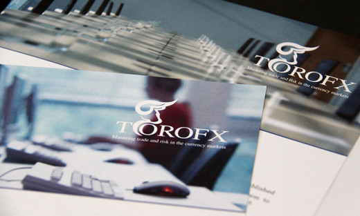
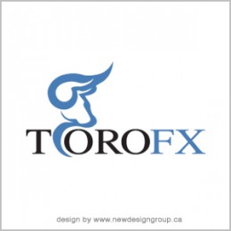
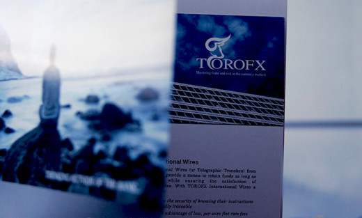
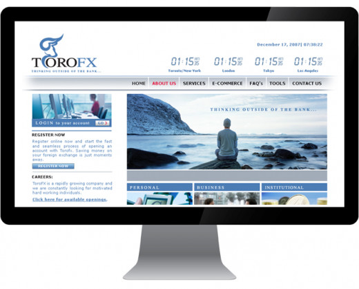
The results
Logo: The final logo combines the company name with a design of a bull’s head which appears large and powerful. These are important attributes for a financial services company. Wisely the design shows the bull’s side profile and there is nothing aggressive about this animal.
Just two colors have been chosen in this logo design: a light blue which is a very stable, corporate colour, and black for the word ‘Toro’ which ensures this company name pops out from the design.
Presentation Folder: Different designs were created, each showing the bold logo in white atop of a photographic background: an office with computers; a large meeting room table. These designs are absolutely timeless with no information which may date and make them obsolete. The separate single page inserts, which contain the information liable to change, were designed to maintain brand identity - the white logo can be clearly seen on a dark blue background.
Website: Companies in the financial sector must convey themselves as caring at every opportunity. This website design uses a photo in calm blue hues of a man looking out to sea, with the supporting statement ‘‘Thinking Outside of the Bank’. It effectively suggests that this company see its clients as individuals with their own specific needs, and the website visitor will be interested to read more.
Client presentation
New Design Group presented four storyboards to the client to show the different design options and how they would appear on the final customer facing materials. ToroFx were more than delighted and went on to launch their currency exchange company with a strong and memorable brand which depicted the company as professional, stable and trustworthy.
The final outcome
ToroFx was successful and the financial industry sat up and took notice of them. Within four years, Equity Financial Holdings Inc. bought out the company for $5 million – a great example of how a powerful brand which fronts an ambitious, professional and highly capable company, can reap dividends!
Copyright 2013 Michelle Collins. New Design Group Inc.
www.newdesigngroup.ca