Branding a Manufacturing Company: From Logo and Website Design to Brochures and Beyond
PowerOn is an industrial automation company in Concord, Ontario and has been working with a variety of sectors requiring automated machinery for 10 years. It has an excellent reputation amongst its existing clients but is not the kind of company to sit back and wait for new clients to appear at its door. As PowerOn looked towards the US and European markets, they realized that their existing outdated website with poor SEO was not doing them justice.
Consequently PowerOn hired New Design Group, a brand development company in Toronto to redesign and develop the new website with these key objectives:
- The website needed to be punchy with a modern design, clearly depicting PowerOn as a strong brand in its field.
- The website needed to be fully search engine optimized.
- The website needed a Content Management System (CMS) so the company could make updates as required.
Phase 1 – Data Gathering
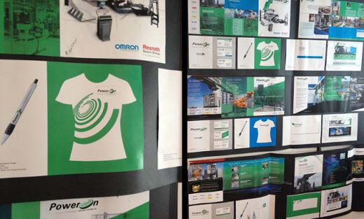
New Design Group reviewed PowerOn’s goals, took time to understand the target market and examined existing branded materials. It soon became clear that the existing materials had little brand continuity and PowerOn did not have branded staff uniforms or vehicle livery. PowerOn realized that getting their brand right was crucial to their success in this niche industry and agreed with New Design Group’s recommendation for a total rebrand.
Phase 2 -The Rebranding Project
The main objectives were:
- To produce the new, professionally designed and enticingly branded materials quickly.
- The new brand image had to be contemporary but retain sufficient similarity with the original which was already well known in the automation industry.
- The brand needed to reflect the company’s position as a big player in the market and had to be as professional as that of their partners: Rexroth Bosch Group, Omron and 360 Guarding.
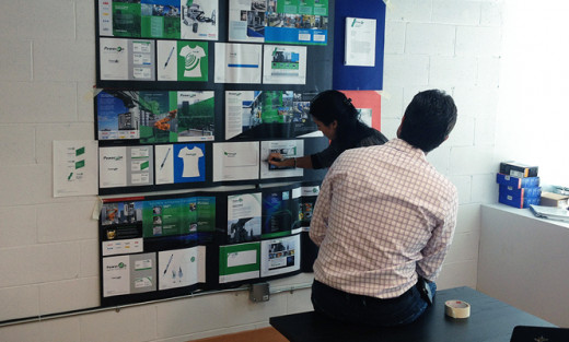
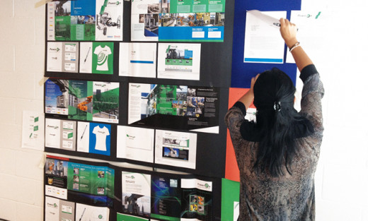
The following branded items were redesigned using three slightly different concepts:
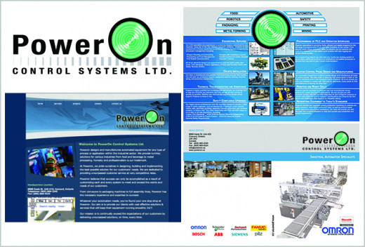
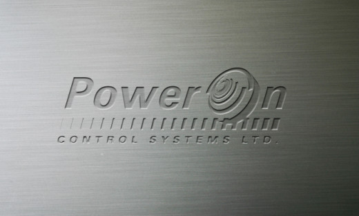
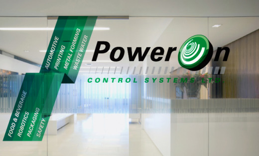
- Logo. The main focus of this logo is the large 3 dimensional green disc with white swirls suggesting circular rotation and dynamism. It is comparable to the original for customers to easily recognize which company it is from, but it is far more modern, energetic and eye-catching.
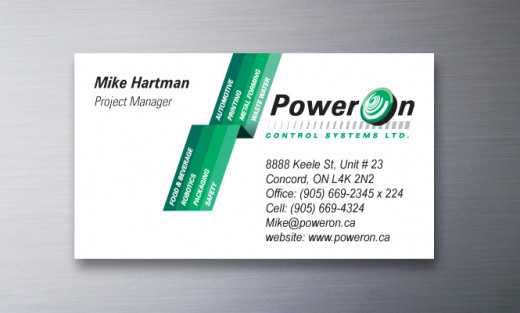
- Business cards. Crisp, professional business cards were created, displaying the logo and bold green stripes which are used to highlight the key areas of expertise offered by PowerOn. The logo and green stripes were intended to become a key part of the visual identity of PowerOn across all of its branded materials.
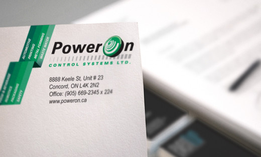
- Stationery. Company stationery was designed using the logo and green stripes as seen on the business cards. Professional and eye-catching.
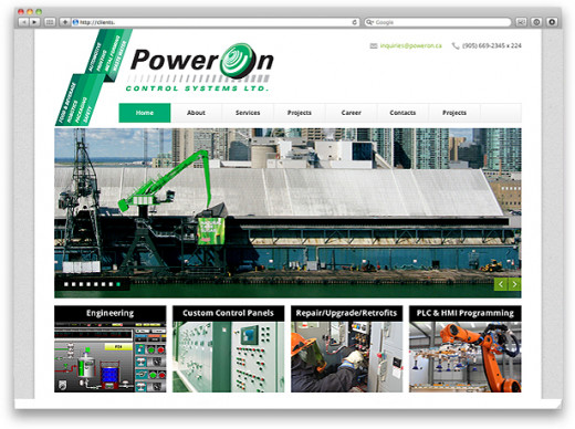
- Website.
- Visuals: The header retains the logo and green stripes. The great use of photos that draw the eye, show exactly what PowerOn has to offer.
- Content: New content was written to introduce PowerOn and explain how they could provide the best products and services possible. The text is informative, modern, upbeat and very persuasive.
- SEO: Complete SEO was undertaken on the website to improve its search engine rankings.
- CMS: The website was created using Wordpress to allow PowerOn to easily update content when required.
- Social Media
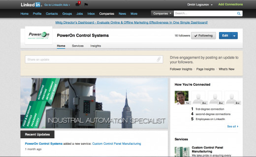
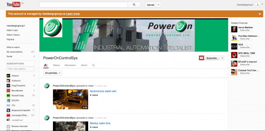
To boost the presence of the company on social media, a company YouTube page was created to showcase the existing videos that the company had already produced, and a LinkedIn account was created.
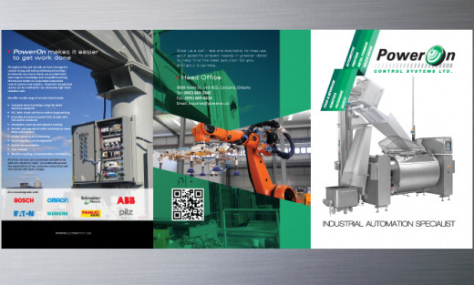
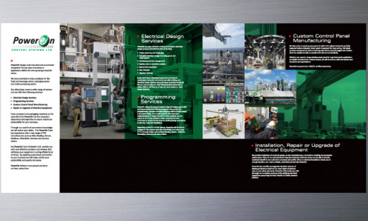
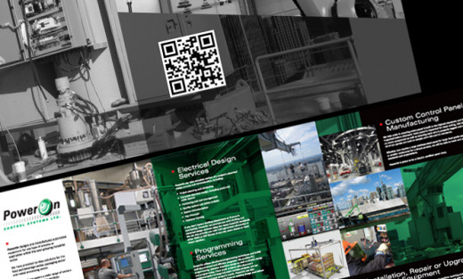
- Brochure. The front page of the 6 panel brochure maintains the corporate look with the distinctive logo and green stripes. Strong use of color, machine photography and angular lines give the impression of a no nonsense company that can deliver what it promises. The content was rewritten to clearly summarize the products and services on offer.
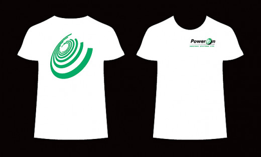
- Staff uniforms. Simple T-shirts were designed showing the logo neatly on the front. On the back, the bold circular swirls from the logo appear in corporate green without any accompanying text. Seen from behind, these T-shirts are highly memorable and likely to make the viewer want to find out more about the company behind them.
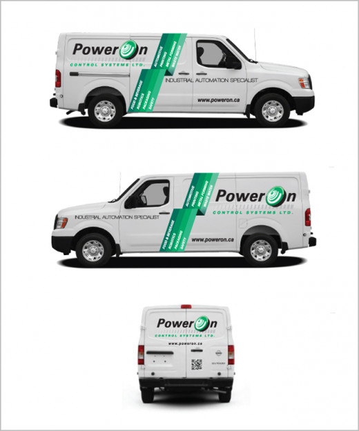
- Vehicle livery. Livery was designed for previously unadorned vehicles showing the logo and the green stripes in a very bold way demanding the attention of anyone who sees the vans drive by.
- Email signature: to complete the rebranding package, a professional email signature was created which includes the logo and social media icons.
Phase 3: The End Result
Three different concepts were presented to the client across all marketing tools so they could easily see the brand consistency throughout. The overall result was a highly professional set of branding tools which clearly showed PowerOn as a force to be reckoned with in the field of industrial automation.
PowerOn was more than delighted with the results and quickly moved forward to implement the new materials and New Design Group was able to add another very satisfied client to their growing customer list.
Copyright 2013 Michelle Collins. New Design Group Inc.
www.newdesigngroup.ca
