Making a Mark: Tips for Creating a Memorable Logo

Finding resources to create a logo is fairly easy. The internet in particular provides ample resources to design a brand for small businesses and ventures. Yet an access to tools does not necessarily equate to effective logo creation. Logos are part of a company's commercial brand. Therefore, the design should be unique and immediately recognizable. It should inspire trust, loyalty and superiority in its independence.
Effective logos are often appropriate and practical, with a thoughtful concept or meaning behind them. It is often the ideas behind a logo, along with excellent execution, that generate the best representations of a brand. Here are a few essential pieces to consider, along with a few tips.

Fundamentals of Effective Logo Design
- Simple: A simple design is essential for easy recognition. Versatile and memorable, good logos are unique without being overdrawn.
- Memorable: Effective logo design should be memorable. Simple designs make this possible, but it is also dependent on a distinctive design.
- Timeless: Successful logos can endure the test of time. Brand identifiers should be able to transcend generations almost seamlessly.
- Versatile: Maintaining the integrity of the logo across all platforms is an essential consideration in design. It should be recognizable regardless of size, orientation or color availability and the lack there of.
- Appropriate: While a logo does not need to include images of the related product or service, the design must fit with the nature of the business.

Hidden Images
One element several companies utilize is inserting hidden or dual images that often relay a deeper meaning. For example, the logo for Amazon shown above appears simple at first glance. The yellow line below forms a smile, but it also forms an arrow pointing from "a" to "z". This subtle hint lets consumers know that everything, "from a to z", is available through their site.
Some hidden images are more like optical illusions. This logo for Spartan Golf Club can be seen two ways: either as a golfer and the momentum of their swing, or a namesake Spartan soldier in his helm. By designing the logo this way, it makes the name and service easily identifiable and relatable. As shown here, this is also an excellent way to effectively utilize open space.

Own It
Though it has been stated already, it is worth noting more than once that a unique logo is essential to brand recognition. While well-worn designs and formats may be proven, they do not create the kind of connectivity to a product that logos are intended to make. With so many brands and logos already out there, however, it may seem like a challenge to truly make a brand your own.
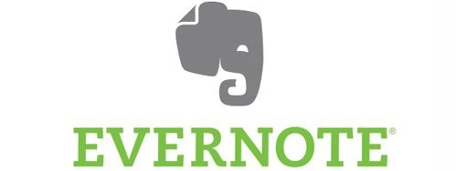
Much like how classic tales are spun into new adventures, it is possible to put minor touches on common icons to make them distinct to you. For example, elephants frequently used in logos as they are generally associated with longevity, strength and wisdom. This makes them ideal for evoking ideas of trust and loyalty. They are also associated with good memories, an idea sprung from the phrase that an elephant never forgets, which makes them an excellent option for a note-keeping app like Evernote.
The logo they created, shown below, is uncommon in its shape and design. Rounded but clear corners make it distinctive despite being a common icon. There is also a nod to the service with a "earmark", which makes the logo exclusive to them.
Format Matters
On a more technical note, formatting matters. Vector files are a must to ensure the logo appears can be used at any size, from stamps to billboards. It should work in both horizontal and vertical formats, backwards and forwards and should be both clear and recognizable with or without color.
To that point, the best approach may be to start the design in black and white. Not only does this allow a focus on the design and shape, but it is worth recalling that each additional color included adds to the cost of printing.