5 Key Skills Every Budding Data Analyst Should Know (For Beginners)

1.Organizing your data
It is not as simple as it sounds. You might have a raw data file and it is difficult to control the impulse to just start crunching numbers but you have to. Take a pause and understand what could be the future possible uses of this data. How to best organize this data so that the next time you need to find some answers out of this haystack, the needle is easy to locate.
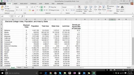
The more simply you layout the data (in a tabular format) the better. Certain softwares export the data in a way that makes it difficult to achieve such a simple feat. The correct layout is where you have variables on the columns and unique ID's i.e. names etc. on the left hand row. Most data analysts in the beginning stages of their career use Microsoft Excel. It is a very powerful tool and does not only help in analyzing the data but also organizing it which is really the first step. Make use of array formulas, vlookups to set up your data in a way that adding or deleting data is easy and the excel file gets automatically updated. One good source to learn array formulas and the likes is Microsoft Excel Bible 2013. Invest the time in your data organizing skills so that you can organize the data to help support the analysis that is to follow and not complicate it.
2. Cleaning your data
No matter how good you are at analyzing your variables to death, it is of no use if the quality of the data is bad. How do you then assess the quality of your data? Here are things to look out for.
a) Missing pieces of data
b) Sudden jumps and drops that cannot be explained
c) Format of the data (Numbers are numbers, text is text and percentages are percentages)
d) Identifying outliers and indicating them on the data file (Deleting them is not recommended always)
While you do this, there may be some instances where you are able to validate the outliers or understand why the data swings etc. Spend a good portion of your data analysis project in cleaning up your data file. This will help in providing quality information to your clients.
3. Analyze, but smartly
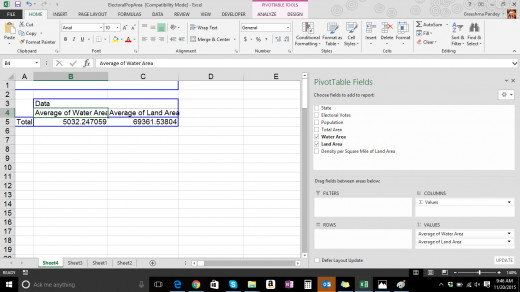
Just like with organizing your data, you need to be smart in analyzing it too. Great minds have developed tools like Pivot Tables etc. that makes you want to kiss their feet and sing their praises. Pivot Tables make it super easy to create analytics dashboards, cut and slice your data in every possible way with the help of a click and reduces the time taken to analyze the data in just a fraction of what it used to be.
However remember, that pivot tables only work if your data is organized in a table format (rows and columns). Similarly, you might need to get smart about how to arrange your analysis in a compact way so as to reduce the file size and make it easy to find the pivot table you are looking for. A data table with 15 variables and 30 unique identifiers can have as many as 450 analyzed data points. This does not mean you need to have 450 pivot tables in your excel file. You just need to understand how to lay them in a way that helps you re-run a different analysis without having to do the same thing over and over again.
Another key point in analyzing data, especially with excel is that you need to use formulas. There is such a thing as an absolute reference and a relative reference. Absolute references do not change when the cells are copied over while relative references do. You need to understand the task at hand. Let us say for example you wish to calculate the simple interest for your portfolios. Using absolute and relative references can make a big difference.
4. Formatting charts and graphs
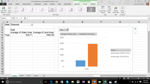
A data analyst lives and breathes charts and graphs. There is simply no running away from it. If you think, it is as simple as selecting the data and then selecting the chart type and then you are done, think again. This is an opportunity to show your creativity. Use it well. The point is not to create overly complicated charts and graphs but visually appealing charts and graphs that are easy to understand at a glance and are also attractive. They don't make you go 'Ugh'.
Not only do you need to spend some time figuring out what is the best way to present a certain type of information, you will also want to make sure you have the right axis, the right chart elements, data labels etc. They all are tiny little ornaments that you make your chart wear to look pretty. Also, this is where you pick colors so make sure you understand the tone of the output. Using flashy and annoying colors at a high level business presentation might not give you the right reaction you want from the audience.
There are a number of tools, tips and tricks that you can find in excel help, and even online. Use the resources available to you to understand every element of a chart and how to use it to your advantage. Scourge the face of the earth for interesting chart types that are creative and might require a little manipulation but will end up making your boss super happy.
5. Pack it good
Once you are done analyzing your data and creating charts and graphs, it is time to prepare the final package. The one that will put you on the map. This is what they see. Not all the endless hours you spent analyzing the data or formatting the charts. One very popular way is of course a Microsoft PowerPoint Presentation. However before you start copy pasting your charts and graphs, take a minute to plan how you want the output to look like.
A good way is to go back to the original goals and objectives. What is it that you were looking to find from this analysis? What did the clients specifically want to know? Now go to your charts and try to see if there is a story you can spin with the data points you have now. Say for example your clients conducted a market research in order to understand the potential of a newly launched product and its feedback. Your storyboard then should contain a flow that talks about who your respondents were? Where did they come from? What level of experience did they have with the product? How did the product stand up to their expectations? Are there any changes the potential customers would prefer? What was the overall opinion and feedback from the product?
Any change in the above mentioned flow will pollute the message that you are trying to get across. Only once you have nailed down your storyboard should you start moving the elements to the presentation and embellish it with aesthetic makeover to make it easy on the eye.
Popular Data Analysis Tools
What tools do you use or are planning to use for Data Analysis?
Related

Excel: The Basics of Data Validation and Conditional Formatting

5 Essential Tech Skills You Should Master in 2025

Using the Analysis ToolPak in Excel 2007 and Excel 2010

How to create and configure a bubble chart template in Excel 2007 and Excel 2010

How to create a thematic or Choropleth map in Excel 2007 and Excel 2010


