Key Elements of a Great Corporate Logo
What makes a great corporate logo? A perfect combination of both design and utility, using elements of line, shape, color and text. But before all those pieces come together to create a symbol of a business or brand name, the following question needs to be answered:
- What message should be conveyed about the business?
Usually, this message will be based on the business' brand promise, a statement that tells customers, employees and other stakeholders about the mission and purpose of the organization.
Then, as possible designs are developed and evaluated, these questions will need to be answered:
- Does this design convey the message? Why or why not?
- Is this design practical and flexible?
While the yes/no answer to the first question may be enough, evaluating why it does work or not can help refine a chosen design until it conveys the intended message. Evaluating whether a design works in practical reality will help save costs in the long run. Looking at these crucial questions encourages both the business and graphic designer to dig a little deeper to get something that works.
With these guiding principles in mind, the design process can begin.
Design a Logo In-House or Hire a Graphic Designer?
With expanded computer graphic capabilities of even the most basic of computers, it is indeed possible to create a logo in house. But this is where many businesses, particularly small businesses, make a huge mistake. They are not trained or competent in aspects of design, often creating a logo that misses the mark in terms of message or is technically unusable for a variety of print and Internet advertising projects.
Worse is that many small businesses think they can use stock clip art in their logos. This is strictly prohibited on a legal basis and could result in a lawsuit by the creator of the clip art who will seek payment for use of the artwork as a logo. Plus, being stock clip art, any logo created would not be unique which does not help build a brand.
Small businesses are also prone to hiring family members, friends or low priced design services because they feel that having a logo is nice, but not a necessary part of their brand.
If the cost of hiring an expert logo designer is out of the budget, it is better to simply use text to represent the business until funds are available.
Should a Logo Include a Graphic, Just Text or Both?
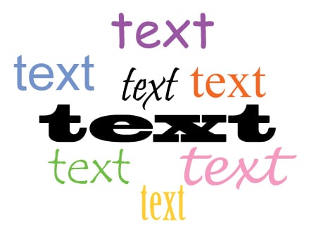
There are many corporate logos that are simply text. This is called a text treatment. Fonts are chosen that align with the message. Some text treatments put the letters and characters in shapes or with lines to give it a more artistic feel. Example: Many financial firms use text treatments for their logos, with classic fonts (e.g. Times Roman) used to convey wealth and stability.
The inclusion of a picture or shape presents additional challenges. Should it be integrated with text? Could it be used by itself (e.g. Nike's swoosh)? Will that shape or picture be readily understood by those viewing it? Will that picture or shape unnecessarily restrict the business or quickly become dated? Example: If a chicken is used for a restaurant's logo, would that limit their ability to also be known for seafood in the future?
Seriously consider the possibility that the shape and text may need to be used separately in some situations, such as on promotional giveaways where imprint space may be limited. If used separately, would each piece adequately represent the brand?
CAUTION! Never, EVER use stock art or clip art graphics in your logo—whether licensed for free or pay—unless you have legally received permission to do so. And make sure your designers don't use them either! Why? They are copyrighted! Usually, the licensing for stock or clip art has a restriction that it cannot be incorporated into a logo without receiving written permission and additional payments to the art's creator, copyright holder or distributor.
How to Evaluate a Logo
Regardless of who actually designs the logo, the design drafts should be evaluated in a pure black-and-white (B/W) version. No grays, gradients (shading) or colors allowed! If the design does not look good in B/W, reject it. Why?
The B/W version will be used more often than one might expect. For example, most silkscreen processes and embroidery used on promotional giveaways require it. As well, on many promotional products, signs and printing projects, the more colors needed to imprint the logo, the more expensive the project will be.
Tip: If the graphic designer says a B/W version of a logo cannot be done, the designer should probably be rejected, too. This is often a sign that the person is not an experienced logo designer.
Corporate Logo Case Study
The best way to show how to evaluate a corporate logo is to see it in action! Below are four logo concepts that were developed by Sikich.com (Marketing Division) for my company, Thorne Communications LLC, for my "Promo With Purpose" brand. At that time, I sold promotional products, marketing, and advertising services for small business owners, associations, events and trade shows. More recently, I've been focusing on development of publishing and marketing services.
The Promo With Purpose tagline was developed to convey that every promotion and marketing effort must have a clear purpose and objective. As well, the Promo With Purpose concept emphasizes how a company's core message and purpose should be evident through all its marketing and advertising.
Corporate Logo Concept 1 Evaluation
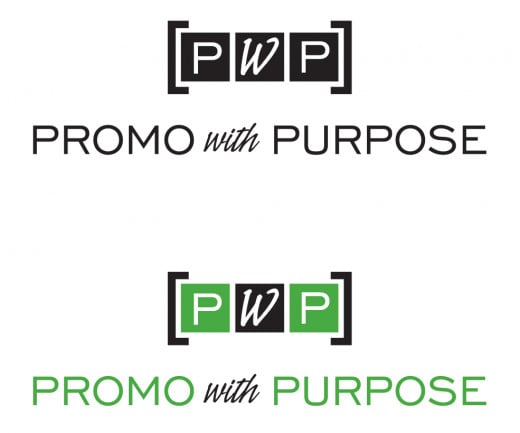
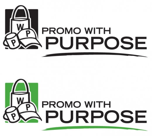
Interestingly, the first design of the concept presentation was ultimately the winning choice. Here's why it won:
- Clean design that works in black and white.
- "PWP" initials graphic can stand apart from the "Promo With Purpose" text.
- The "PWP" in blocks conveys that the Promo With Purpose concept is the foundation (building blocks) of the marketing services offered. All blocks are equal which suggests that "promo" and "purpose" must be in balance.
- The "PWP" graphic is abstract and can be used for the foreseeable future as the company continues to expand services in addition to products.
Corporate Logo Concept 2 Evaluation
Merits:
- Easily conveys the fact that the company sells promotional products.
- Clean, easy to print design for a variety of printed projects.
- Design works in black and white.
- Both the text and the graphic could be used separately.
Why Is Was Rejected:
- Like the "chicken" example provided earlier, it could limit the company to just promotional products. Since the company has been expanding non-promotional product service lines, this design would need to be redeveloped again in the near term.

Corporate Logo Concept 3 Evaluation
Merits:
- With the company's expanding consulting services, it clearly suggests being an idea provider.
Why It Was Rejected:
- While the text portion of the design is easy to use, the light bulb graphic presents multiple printing difficulties: 1) Shading which is not easily handled on promotional products without added cost; 2) Includes no less than four separate colors which can be costly to print; and, 3) The colors touch each other (called tight registration) which can be problematic on some non-paper surfaces.
- With the emergence of LED and CFL light bulbs, a graphic showing a dated incandescent light bulb does not suggest being progressive.
- A light bulb image, separated from the text, is not unique and has been used for many types of businesses.
- Design would require a separate version to work in black and white.
Corporate Logo Concept 4 Evaluation
Merits:
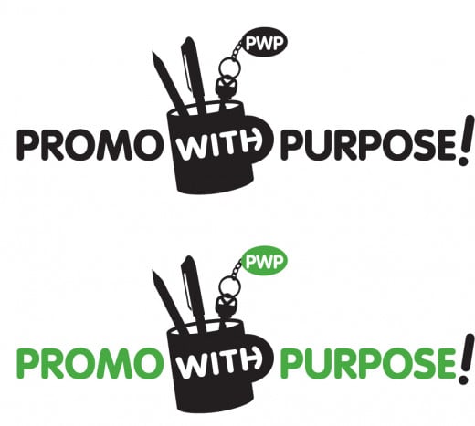
- Clearly conveys that this is a promotional products provider.
- Relatively clean design that could work in a variety of printing projects.
- Design works in black and white.
Why It Was Rejected:
- The detailing of the pens and key tag in the cup may be lost when the design is shrunk down for small imprints.
- Like Concept 2, it limits the company to the promotional products arena.
- The cup graphic, used without the words "Promo" and "Purpose," is awkward (has "PWP" near the top and then the word "With").
Logo Mechanicals
Once the final logo design is chosen, the following electronic files should be kept on file, ready to go for when a project comes along. Ask the logo designer for the complete set.
- Full color using Pantone Matching System (PMS) solid colors Encapsulated Postscript (.eps) and/or Adobe Illustrator (.ai) files, plus PNG files
- Full color using CMYK (4/color process, Cyan-Magenta-Yellow-Black) matched colors Encapsulated Postscript (.eps) and/or Adobe Illustrator (.ai) files
- Black-and-white (B/W) Encapsulated Postscript (.eps) and/or Adobe Illustrator (.ai) files
- PNG files which can be used on the web and in print
- JPEG, both high and low resolution in RGB (Red-Green-Blue) for the web
- JPEG, both high and low resolution in CMYK (4/color process) for printing on everyday documents
- GIF (for the web)
- ICO (.ico), a miniature RGB logo, or "favicon," that can be loaded to appear in browser tabs
Do not be concerned if the .eps or .ai files cannot be viewed; they are production files and often require professional level graphic design and illustration software to be viewed. Graphic designers, promotional products suppliers and printers usually have this software to access and use them.
This article is accurate and true to the best of the author’s knowledge. Content is for informational or entertainment purposes only and does not substitute for personal counsel or professional advice in business, financial, legal, or technical matters.
© 2013 Heidi Thorne

