Logos with hidden messages (Part 1)
Logos of different companies tell a different story. Lets explore them. While surfing the internet I came over these simple yet meaningful logos which I thought of sharing here. Hope you all would love it.
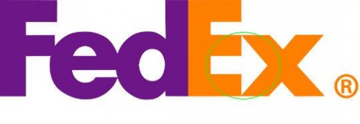
Just look between the letters 'E' & 'x'. The space indicates an arrow representing speed and precision

The yellow tick,appearing like a smile, starting underneath the letter A and ending with z says it all - FIND EVERYTHING HERE

Look closely to the letters BR. The pink in the BR acts as the 31 and Baskin Robbins has 31 flavors. Cool!!!
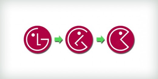
LG - Modified Pac-man!
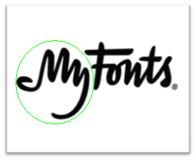
MyFonts is a digital fonts distribution. After carefully observing, you can see a human hand signified by the words 'My'.
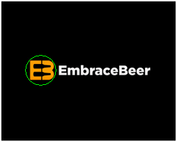
The dark space between the letters "E" & "S" denotes two beer bottles.
The empty space in-between denotes the number 1
An eye, a bee and a letter M stands for IBM
For more such interesting designs please visit my next hub http://arunabha0368.hubpages.com/hub/Logos-with-hidden-messages-Part-2 .


