Making Advertisement Layouts More Readable - 5 Tips from Drayton Bird
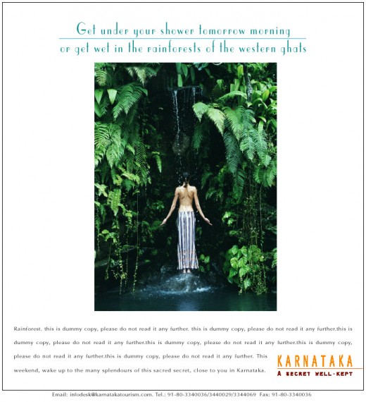
Creating Ad Layouts that are Easy on the Eye
Drayton Bird has gathered many of these tips for ad layout design from research by Colin Wheildon for The Newspaper Advertising Bureau of Australia. And some from test results – and common sense. He shares his expert views on how various typefaces, font sizes, placements of headings and illustrations, and the settings of layouts affect readability.
For ad layouts to stand out in the jungle of ads all screaming for the reader’ s attention, art directors have to know a thing or two about the basics of good layout design. It’s not just a question of typefaces and font sizes. Art directors should be aware of how the human eye peruses a page.

Tip 1: Typefaces, Font Size and Consistency
A page of copy set in serif type was comprehended well by 67% of readers. When the same copy was re-set in sans serif, the figures nose-dived to 12%. What’s more, constant changes in type face are not only ugly but confusing. At least one person in ten has imperfect eyesight. So copy in very small type is usually unwise. Type obscured by setting it over tints or textures or colours is fatal.
Tip 2: All Caps and Type Settings
The perceived legibility of a series of headlines was reduced by over 20% when the setting was changed from caps and lower case to caps only. Good comprehension slumped greatly when type was set with ragged right setting (typically down from 67 to 38%) and, even more so with ragged left setting (67 to 10%).
Tricks that Start and Keep People Reading
These tips, says Bird, are largely based on the research of Rudolph Flesch in the 1930s and 1940s, but will always apply because readers will read the same way.
- Sentences should be short. Average 16 words. Usually no longer than 32.
- Paragraphs should be short, containing just one thought in each – particularly the first paragraph.
- Words should be short and lively, not long and dull.
- The word “You” should appear 2 to 3 times more than “I” or “We.”
- “Carrier words and phrases at the ends and beginnings of paragraphs encourage continued reading. So do questions which require answers.
- Sentences should be broken at ends of pages and columns, to encourage continued reading, with “Please Turn Over” or the like at the end of a letter page.
- Unnecessary verbiage should be stamped out. There is no need to use three words where one will do.
Tip 3: Reverse Type and Columns
When a lot of type is reversed out white on black, it kills response. With one full page magazine charity advertisement, response doubled when white on black was replaced with the normal black on white. Type set in narrow columns is easy to read – the eye doesn’t have to travel so far. Around 50 characters per line is about as long as it should go.
Tip 4: Distracting Illustrations and Headlines
Illustrative elements which point out of the layout – like people’s feet, or their eye path – lead the reader out of the advertisement. Illustrations which block off a column halfway down the page discourage the reader from traveling further down. Headlines marooned in the middle of the copy destroy the flow of that copy and halve comprehension. So do headlines placed under the copy.
Top 5: Blocks of Type and Huge Headings
Long unbroken blocks of type are daunting. They should be broken up by crossheads, indents, changes in type. Giving “shape” the letters and ads will also encourage readerships. Huge headings are also to be avoided as they take up expensive space that has been paid for by the client who expects each inch of the layout to work for him.
Source:
Drayton Bird's Commonsense Creative notes previously only available to employees of Ogilvy & Mather

