The Role of the Website in Church Marketing


Two Purposes
Newcomers and members use the website in two very different ways. It is important to keep that in mind as you make your design.
Outsiders
For those who are not yet connected with your church, it provides a window into your world. It should describe in great detail what to expect when they get there. Therefore, it needs to make a good first impression, so keep it simple and familiar. It should provide helpful information and next step guidance and, finally, it helps in search engine ranking.
Insiders
For those who are already members, it serves as an information hub, an easy way for people to keep track of what is going on and a way to share information with family and friends.
Newcomers use the website in two ways:
- To find a church that meets their needs or preferences.
- To find out what to expect when they get there.
Being truthful about who you are, the things that makes your church a special place, is very important. What is on the website needs to match reality. If your strength is powerful teaching, it is OK to highlight that. If your strength is community and social interaction, it is OK to highlight that as well. Just be as accurate as you can.
Finding a Church
The main reason people look for a new church is that they moved. According to the Pew Research Center 2016 survey, most will choose their new church based on a personal visit often on the recommendation of someone close to them or by talking to clergy. A small number make their choice based on online research or a combination of all these things.
Some church marketing websites will tell you that people will begin their research with a Google or other search engine. I think it is safe to say that your church website does play an important role in the selection process for enough people for it to matter. It is also likely that this online research is increasingly done on smartphones instead of computers.
What Do Newcomers Want to Know?
What are they thinking as they sit around the coffee table looking for a church? If something is important to them, you had better make sure they will find the answer on the website. So what are the questions newcomers want answered before they go?
The Pew Research Center has identified seven things newcomers are looking for in a new church:
- Sermons. Do you have quality Bible focused sermons with relevance in their lives?
- Welcome. Will there be anyone like me there? Will they ignore or welcome me?
- Worship style. Traditional, contemporary, blended or spirited.
- Distance. Directions and parking.
- Sunday school. What they do, where and when. Who do I talk to?
- Meaningful relationships. Can I build long-term bonds with people?
- Involvement and engagement to match their lifestyle.
Almost no one will call ahead for information, but they might follow you on Twitter, Facebook or other social media. The challenge, then, is to create an experience that is as close to being there as it gets without actually being there. The great advantage of these new media is that while the website is primarily one-way communication, these are more interactive. You can engage with people who are interested in your church even before they come for the first time.
First Impression
For those who do online research, getting them to the website or social media site is only the first challenge. They are likely to select the websites to visit by a process of elimination. If the first impression, even on the search results page, is less than favorable, there is a good chance they will leave without even looking at any of your information. Once you get past that hurdle, getting them to stay is quite another one. Therefore, the most important aspect of your website is that it needs to be visually pleasing. If it is, and it is also well organized, people will seek the information they came for.
Design
There are two things about the design that will impress them the most: Simplicity and familiarity. This means that doing something out of the ordinary or getting fancy or flashy will make them hit the back button.
If you have made it through the first impression, they will be looking for information first. If that satisfies them, then, they will be looking for what kind of experience they should expect.
Therefore, direct access to relevant information needs to be front and center.
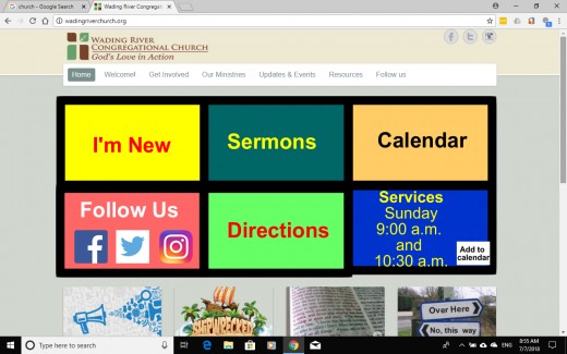
Web visitors are an impatient bunch. They have a very short attention span. If they cannot locate the information they are looking for at first glance, they will hit the back button. Therefore, the number one thing you need on the homepage is a big “I’m new” button.
Design professionals call it a focal point. The focal point of many church websites is a picture slider. This is prime real estate. Make it count. Get rid of the slider and put the most important information here instead
Multiple Devices
Websites used to be seen primarily on computer screens. Today, smart phones is the device of choice for most visitors. Therefore, you can forget about cramming everything into the area above the fold. New users expect to have to scroll. Instead of pages you can think of it as a deck of card. Each card has one message. The trick is to prioritize what to present first. The Pew Research Center results mentioned above should help with that.
Accessibility
There are basically two kinds of text: Text you scan (labels, headings, titles) and text you read (paragraphs). The difference is whether you study closely for comprehension or if you want to quickly locate a piece of information.
Crisp black letters on clear white background is good for short pieces of text, but straining for longer ones. For longer passages, slightly greyer letters on a lightly tinted background may work better for most people. White or light colored letters on dark or black background works well for text that does not need to be read, but is scanned or skimmed by the user.
Suggested for long texts
Simple Black and White suggested for short paragraphs
High impact text
Content
As mentioned above, visitors are impatient. They have a very short attention span. Therefore, above all, be crystal clear and succinct. Each idea should be contained in a single paragraph with a clear, descriptive header. Nowadays, many, if not most, users use phones for reading. They do not mind scrolling, but need a Table of Content with an easy way to get back to it throughout the page, so one informational About Us page can include both History, Belief, Affiliation, Bios, etc. A new I’m New page should be created to cater to the needs of newcomers specifically. Thanks to the Pew Research mentioned earlier, we know a lot about what they want to know.
Instead of a photo gallery, provide at least one relevant real photo, not a stock photo, or video on every page.
Sermons
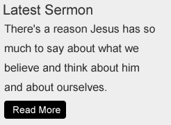
The number one thing, by far, newcomers are looking for is quality sermons. Hint: Put quality sermons on the homepage. or at least a prominent direct link to where they can be found. Once there, there needs to be play buttons connecting them directly with the sermons. Maybe something like this: https://www.versebyverseministry.org/bible-studies/judges, where there is access to additional information and resources you can explore while you are listening.
Video is not necessary, but the audio has to be good.
Welcome
The second most important thing for newcomers is answers to the question: Will there be people like me? Will they welcome me? They in particular want to be welcomed by church leaders.
One thing especially makes people feel welcome - that they matter. Are we showing them that we are glad to see them and that we want them to be a part of our community?
Nothing convinces better than video. Text, even images, do not quite cut it here.
Suggested videos:
A family is driving to church. We listen to their interaction as they find the church, find the parking lot, find a space and figure out where to enter and ending with being welcomed warmly at the door.
The first encounter with greeters, perhaps an interaction regarding Sunday school.
A few minutes of the service, the call to worship or scripture reading. Perhaps an example of the kind of worship music you play.
A fourth video could show what they do in Sunday school.
Finally, a fifth video composed of clips from social events should give them an idea what kind of people are here, how to dress, if they would fit in and if they can connect with you.
People are used to crude homemade videos on Facebook. They will accept that. No need for a fancy production although a bit of planning ahead will obviously make it better.
Worship Style
Again, video shows this off better than text or images particular on social media. In the absence of video, images are the best way and work especially well on social media. Remember, the website is mostly about information gathering so this can be a very brief clip. A pointer to a social media site may be a better way for them to explore the worship experience they will have.
Distance. Directions and Parking.
For those who begin with a Google search, the results may already be sorted by distance. The Google default is to sort by relevance, though.
Again, the above video with a family trying to locate the church could go in this section or maybe just a link back to it.
Sunday school. What they do, where and when. Who do I talk to?
Entrusting strangers with your kids is not a decision to be made lightly, so having an accurate account of what goes on in Sunday school is critical. Again, video is the number one tool for that. Some people with children may contact the church ahead of time, but most will not unless strongly encouraged to do so. Make it as easy as possible. They will click on a subscribe button or fill in a contact form before they will pick up the phone to call. Be sure to have something like that.
Meaningful relationships. Can I build long-term bonds with people?
More than half of people looking for a new church say that having friends and family there is important. It is for this reason encouraging people who are already here to invite other people is the most effective way to get them to come.
Lots of people, however, will never get that invitation and they may be the ones who need it the most. It is for this reason it is very important to have a path for them to get connected with a home group or a ministry, but that is outside the scope of this website review except to say this:
The events calendar needs to answer all the who, what, where, when, how questions anybody might ask. A calendar entry like “Piano Recital” is meaningless to anybody, even insiders, except perhaps those who are directly involved in the event.
Social media are now increasingly filling the role of answering questions about experience and connection. Therefore, the website needs to have lots of links to relevant areas of these platforms.
Involvement and engagement to match their lifestyle.
People lead busy lives. Surveys overwhelmingly show that people are believers. They want to connect with a church, but find it too difficult to find the time. Therefore, it is critically important that when they do come, it is a treat for us and we need to show them that they matter to us.
Contact Information
Basic contact information should be provided in a footer or header on every single page of the site. A Contact menu item should include all the ways visitors can contact or find the church including every social media presence.
For members, the website serves a different role, a more inward looking one:
- Somewhere to find out what is going on at the church.
- A way to share information about the church with others.
In the past, this role was served by pulpit announcements, bulletins and newsletters. Much of it still is today. With the emergence of powerful smartphones, people increasingly use them for all their information. You may not be able to completely eliminate printed information, but there are many things you can do to encourage people to use the website instead. One of them is to design the site in such a way that the most relevant information is right at their fingertips, literally.
It is easy to slip into using tribal language in your online communications. It is necessary to keep in mind that the reader may not be an insider who knows all the terminology.
Events
Events is the one thing insiders want to know about more than anything. Have an online calendar. If your ambition is for your website to ever replace printed materials, the most important thing you can do is to make sure all information is accurate, complete and up-to-date all the time. Be sure to provide all the details: Who, what, where, when, how, etc.
Every event should have a share button, a link to its social media companion and a way to sign up online.
Sermons
Members may miss a service from time to time, so have a way for them to quickly find the most recent sermon. While video is nice, it is not mandatory, but the audio has to be good. Provide links to notes, maps or other supporting material if you have any.
One way to make this even more useful is to group topical sermons together according to the questions they provide answers to.
Donations
It may seem cheesy, but the website needs to have a way for people to set up automatic bank transfers of their offerings. It might even increase offerings, but definitely make them more consistent and predictable. On the other hand, that may require some modification to the way you collect the offering during worship. There should be no pressure to give again during the service. Some churches have done away with offerings altogether leaving only a donation box at the entrance where people can deposit their checks as they enter or exit. Of course, all that is largely outside the scope of this discussion.
Conclusion
Modern website tools are quite easy to use so that should not be your excuse for not having one. The hard work lies mostly in planning it. Answer questions like: Who is this website for? What are their needs? How can we meet those needs?
Above all, visitors want simplicity and familiarity. Make a good first impression. They do want an esthetically pleasing site, but mostly, they want to be able to locate the information they are looking for right away so make that your top priority.


")


")