No More Floating! Hubpages 2017
Adult Swim is over?
The term "salty" is often thrown around the internet as a term that stands in for upset, aggravated, and just blah overall about an action or event that has happened. Well this incoming change to Hubpages has both me and a lot of fellow Hubbers Salty! What exactly is the issue and why do many people feel this way? Well the new update means floating "capsules" to the right will be removed. This feature has been a part of hubpages ever since I started 9 going on 10 years ago. The main cause is due to the world changing how it searches and consumes information. The larger part of Hubpages traffic now consists of users using mobile devices and tablets which result in a one-column layout which makes it generally more user friendly on these devices.
Well the new update means floating "capsules" to the right will be removed.
— thranax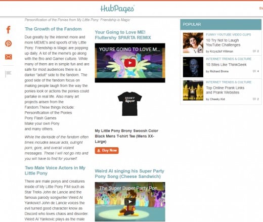
While most people see that this might be a step in the positive direction (Hubpages Staff Especially) others see it in a much more negative light. While its true, this change will bring various changes to how the website(s) platform works, it might also throw some negative human responses as well.
Weighing the Situation
Positives
| Negatives
|
|---|---|
Higher Revenue
| Forced Text Breaks
|
Easier on Mobile
| Ugly Desktop Layouts
|
Less Confusing
| Less Creative Aesthetics
|
Hubpages is a Business
While a lot of people will hate to see the floating feature leave - I am sure a whole lot of people will find the whole process easier as seeing it is more streamlined to publish and cuts down on trying to adjust the page for two layouts (mobile and desktop). While I do not like the reduction of creative options I do believe that this was a weighted choice made by the staff and it will overall improve and help grow Hubpages. If this is how hubs must be made now, the only thing to do is to press on and be as creative as possible with what we have!
Tips on how to Embrace the Changes
There is a silver lining with the changes - it means in order to create a hub that truly looks good, more thought and effort has to be put into it. Here are a few tips on how to make the most out of these changes that if done correctly will be both a productive and innovative design step on mobile as well as when full paged on desktop. The common issues that arise from doing full width layouts include image quality and design, getting specific capsules to fit nicely together, and overall encouragement to provoke the reader to not leave early.

Images are the driving force of interest online and in books alike. With the new change there are a few different things to look out for when selecting images to use in your articles. For starters the images have to be a high enough resolution that when on desktop they do not pixelate. This can also be done by simply adding white or transparent pixels around a smaller image that allows the image to hold its own centered. The transparency approach will allow you to use the same half width size images without needing to create or take new ones.
Centered layout means that images for the best effect have to be "created" "crafted" or "found" in a way that promotes the reader to enter the image and scroll down the page. Images that have white space around the top sides and a image in the center are a great example on how to lead from a text capsule into an image. Think of this like a single object sticking up that creates curiosity to keep scrolling down to reveal the entire image.
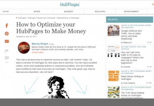
One more ending note is to use thinner and wider images that use less page real estate then standard squares or long rectangles. This kind of image or collage of images creates an appealing look for a reader and still can include the following text or capsule in the same frame allowing the reader to know that they should be carrying on. If using full size images, try to crop them to a "widescreen" format to achieve the effect of having a high resolution, epic picture that can be digested while not cutting off a full "screen" of content.


Sizing as it stands at time of publishing this article mean that some capsules result in a lot of weird looking white space around them that almost act like a page break. One of the most user friendly and interactive tools, the Poll, leaves a notorious amount of white space around it. These all look fine on mobile, but really need work masking or fitting into the desktop scheme.
We recommend using in-text Amazon links rather than capsules; they tend to perform better.
— Christy Kirwan, Hubpages Staff, http://hubpages.com/forum/post/2902066Amazon links that are in text can help eliminate the white space that might be encountered in various situations. What it does is create a text link with the little orange Amazon "a" next to the text that allows you to link a word to a product. When using an Amazon capsule make sure to use the description zone to help make the item look like it fits with text or in-between two various other capsules.
Example of In-text Linking
Panda created by Desiigner took radio stations by storm and took the top most played track in the US for more then six weeks! The immense success of this song is somewhat due to the inspirations Desiigner had when creating the track. The track is a combination of how it feels to play "Grand Theft Auto" mixed with the Panda emoji. A very likely combination nowadays as many people both use emoji's and Grand Theft Auto was one of the best selling videogame titles of all time.
Example of Filling in an Amazon Capsule with Descriptions
![Panda [Explicit]](https://m.media-amazon.com/images/I/51Q9EJVwJsL._SL160_.jpg)
Positive Reader Flow with other types of Capsules
Here is an example of a Poll used in a page. Currently the way they are formatted align everything to the left and leave a large white space to the right. In order to help combat the effect and make it look like it was designed that way, try using images that are also heavily aligned to the left compared to centered or right focused.

Panda Poll
Do you like the song Panda by Desiigner?
While I cannot see all the shortcomings of various different capsules and how they apply to your page layout (specifically everything in the recipes section) I do think that all challenges can still be overcome with creative uses of images and more thoroughly planned out sections. In this new era it is paramount to learn how to resize and manipulate images to fit your desired effect. I am not saying anyone has to go master photoshop or devote any cost into learning these skills - but maybe just a simple guide on even learning how to resize images using a free editor would suffice.
Other Thoughts and Tips
- Look at other Hubbers articles and see what works for them.
- Try to use the existing tools to your advantage such as the Table.
- Find other articles that help with layouts on Hubpages.
- Think like a reader and not like a writer when reviewing your articles.
- Have an idea of a new option for an existing tool, or a whole new tool? Make a mock-up image and a detailed description and post it on the Hubpages Forums and it might be reviewed and implemented!
