Hubpages Logo


There is an increasing number of companies today that use the power of a distinctive script of hand-written titles in place of a logo. Disney, Virgin, Harrods, s.Oliver, Cartier and countless established brands utilize hand-writing to give their image real dynamics while keeping it nice and friendly.
That being said, I don't count these logos among the best at all. Being fully aware that it's only a matter of personal taste, I'm still missing an actual logo, something like one of these:


For example:
I also noticed the similarity of HubPages and Harrods header designs, although we are still missing a tagline.
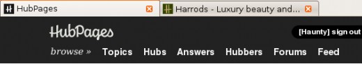
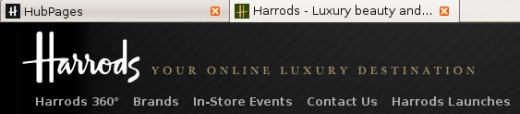
The reason why I don't really fancy the new HubPages logo is because it is nondescript and amorphous. These terms were used by a professional graphics designer to describe the Harrods logo. Although, I probably couldn't have found these terms all by myself, I feel they express my feelings towards the new logo quite well.
- nondescript: belonging or appearing to belong to no particular class or kind, not easily described, lacking distinctive or interesting qualities.
- amorphous: being without definite character or nature.
Source: Merriam-Webster
To cut a long story short: boring.
About logos in general
A logo should be
- simple and memorable,
- eye-catching, noticeable, attractive,
- immediately recognizable regardless of size.
It is up to you to decide which of these requirements the new HP logo fulfills for you.
Types of logos are:
- descriptive - an image that depicts, represents the company's name. Example: Batman logo.
- abstract - a symbolic representation not showing a product or service. Example: Nike Swoosh
- typographic (logotype) - uses the company's name or initials. Example: HubPages, Ford
If while reading this you went like, 'Gosh, this guy is hammering that funky new logo for no reason,' you are probably right. I only expressed my personal opinion in this hub.