Gender Appeal in Print and Media Advertising Design
Gender Appeal in Print and Media Advertising Design
The battle of the sexes is as old as time itself. Gender roles, stereotypes, and differences are drilled into most of our heads at a very young age. Phrases such as “boys don’t cry,” “throws like a girl,” and “that’s women’s work” are all phrases we are familiar with when referring to gender roles and norms. These phrases have all been considered in advertising and features of styles and design. We see it at an early age with boys' toys focusing on action figures, fighting, and sports with girls' toys focusing on communication, interaction, mothering, and nurturing.
We are continually exposed to it as adults with advertising for men using sports cars, sexy models, and alcohol. Advertising for women often focuses on how to be sexy, smell good for a man, and products for the home and child rearing (Lundstrom & Sciglimpaglia, 1977). Well-designed visual images, marketing terms, and typography used to describe the genders are often contained in advertising as well. Men are tough, strong, protective, dominant, and aggressive while women are sensitive, submissive, caring, helpful, and nurturing.
Document design in much of media confirms this. Colors, fonts, designs, imagery, and music are all used to influence and conform to one of the genders. Specific advertising can be based upon which gender will see it most in that particular location. This study will focus on a variety of carefully crafted images and design in advertising which help products appeal to a specific gender. Research will also focus on how designs in advertising can continue to promote or hinder gender roles, norms, and differences. Finally, this analysis will attempt to explore the following questions: Does certain advertising promote inequality, keeping men and women separated in a time when everyone is fighting for equality, and will using non-gendered advertising techniques help bridge the gap between the sexes? For instance, this research will examine commercial advertisements, such as those surrounding the Super Bowl, and whether the gender stereotypes have diminished or worsened.
Gender Roles in Vintage and Modern Advertisement Designs
Throughout time, advertisements have always been in command as tools that assist in shaping an audience’s viewpoint and stance. Studies indicate that specific types of marketing also influence consumers’ perception of product personality (Batra et al., 1993 & Lieven et al., 2014). In other words, product marketing seems to dictate gender role placement in society. The images in Figures 1 and 2 (below) feature two vintage advertisements conforming to supposed gender roles where girls should emulate their mothers in the kitchen and boys are free to leisurely play with their cars and trains, possibly emulating their fathers. Figures 2 and 3 feature magazine advertisements indicating that the roles remained the same with adult models (http://www.vintageadbrowser.com/gender-ads-1960s). Noticeably, the typeface on the advertisements differ in style, emphasizing significant role associations (Kang & Choi, 2013). Typeface elements convey specific cues for the audience, appealing to its respective gender (McCarthy & Mothersbaugh, 2002 & Kang & Choi, 2013). On the other hand, Duprey argues that these visual cues also dictate to the audience what they should think, rather than trying to understand the meaning of why there are assigned roles throughout the history of advertising (2015). In reference to the design, the font style may also indicate that one gender is appropriately more complex than the other (Doyle & Bottomley, 2002).


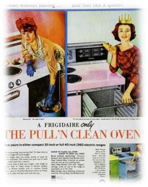
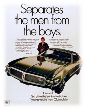
The style of vintage advertisements emphasizes “appropriateness” through gender roles and the different font styles accentuate how the designs appeal to each respective gender in order to market a product. For example, more text may provide a narrative, encouraging emotional appeal to its female audience. In comparison, succinct and plain text may be more fitting for the male audience (Doyle & Bottomley, 2002). Additionally, bright color is also absent from the typeface geared toward the adult male audience.
Modern advertisements suggest that the portrayal of gender roles have shown
little progress where women are typically seen in advertisements for cleaning products. The female model in Figure 5 is mimicking the cultural icon “Rosie the Riveter,” a symbol of women who worked in factories and shipyards during World War II. Although, as a result of the lack of context through image and text, Bissel’s marketing strategy is unclear and the audience is left wondering of its actual significance. Illuminating audience miscues, Duprey indicates the importance of communication from both the sender as well as the receiver, in order to fully grasp
the product’s meaning (2015). On the other hand, the image in Figure 6 conveys a clear message indicating gender stereotype and demonstrating that derogatory language toward women has increased in advertising. Specifically, it shows a male figure offering a carton of milk above the caption: “Milk can help reduce the symptoms of PMS.” Again, while the typographic style does not seem to favor either gender, the imagery tells another story. Often, even when the words of an advertisement are unreadable, the images alone speak loudly.


Blue is for Boys, Pink is for Girls
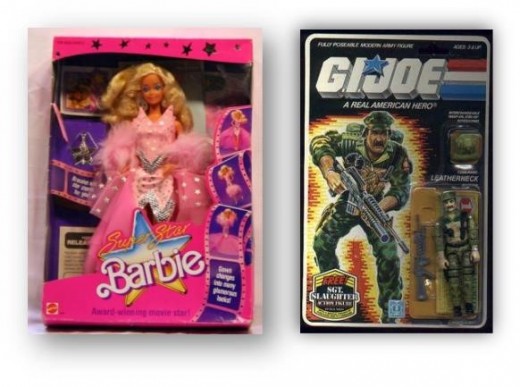
As demonstrated so far, advertising design continues to seek out, appeal to, or ostracize each respective gender. Colors marketed toward perceived genders are typically an assumed indicator of sexuality (Koller, 2008). For example, little boys’ clothing will often be blue and have phrases such as “Lady Killer,” “Heart Breaker,” and “Future President.” Little girls’ clothing will often be pink and have phrases such as “can’t date till I’m 21,” “Daddy is my Prince Charming,” and “Little Barbie Doll.” Supporting this, Koller states that “colour plays a vital role in clothing’s function as the quintessential social code (2015). Additionally, advertising for boys is often designed with “masculine” fonts, while that for girls uses “feminine” fonts. Even the voices narrating commercials pushing boy toys are often strong and aggressive, while toy commercials geared toward females are sweet and soft.
Examples of such gendered font advertisements are shown in Figure 7. Referencing the typographical font in the images below, the soft, curved font of the Barbie trademark seems to emulate the feminine nature of the iconic brand. Whereas, the G.I. Joe trademark is large and bold, emulating strength, masculinity, and its motto: “A real American hero.” Supporting this observation of pointed gendered font, Davies states that “traditionally square, bold typefaces are masculine, while rounded and curlier typefaces are feminine” (2002). While particular styles of typeface influence readability, it also shapes the perception of brand personality of targeted markets (Grohman et al, 2012). Mattel and Hasbro (respectively manufacturers of Barbie and G.I. Joe) are shaped by consumer response to their products, but it is society that dictates which audience should respond to what product (Duprey, 2015).
Sex Sells in Media and Advertising
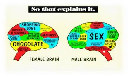
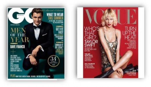
In advertising design, the phrase “sex sells” is not a secret. Advertising is one of the most powerful elements that help shape society’s viewpoints (Skorek & Schreier, 2009). Unfortunately, the effect is not always a positive one in reference to high, and often unrealistic, standards set by printed media (Skorek & Schreier, 2009). Often, printed media appealing to the male audience focuses upon strength, health, and career options. On the other hand, printed media appealing to women, more often, is dominated by beauty, diet, and fashion tips (Figure 8). It seems that the bar is set much higher in terms of superficial beauty. To reiterate this point, two magazine covers are shown to exemplify the drastic differences in terms of fashion (Figure 9). One study states: “It is not surprising that magazine marketers would incorporate and promote messages that differ for men and women given prescriptive norms for beauty” (Bazzini, et al., 2015). Also, per Zotos, et al., society does seem to dictate what is acceptable in terms of style and dress (2016). On the cover of GQ, Dave Franco is fully dressed in a tuxedo with a relaxed, but powerful, full-body pose. The tuxedo emphasizing sharp, clean lines – like the font of the GQ logo. Also, his shadow seems to further highlight his presence, assuming greater mass (Bazzini, 2015). Whereas, on the Vogue cover, Taylor Swift is posed in an assumed sexy position, with her shoulder slightly raised and her bare legs crossed. Her dress emphasizes feminine “softness” and curves (Bazzini, 2015). Swift is also showing more skin than Franco. At first glance, it appears that magazines geared toward males focus upon success and business in the workplace, while the magazines geared toward women seem to focus more upon fashion, makeup, and looking beautiful per societal standards. For example, on the GQ magazine, part of the text advertisement discusses “how to be liked at work,” while the Vogue magazine discusses how to “turn up the heat.” Also, it appears that there is more bold text on the GQ cover in comparison to the Vogue cover. Thus, the bold text seems to stand out and command attention (Skorek & Schreier, 2009).
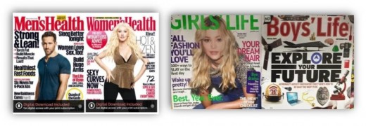
In terms of typography and font style, the cover images on the bottom left (Figure 10) appeal to both men’s health and women’s health. Looking closely, the fonts differ from one other. One is bolder and wider, while the other is slimmer and less bold. On the bottom right, the titles are somewhat similar except for the colors and font width. Typically, red denotes power and dominance, while green indicates inexperience (www.dictionary.com). Furthermore, gender roles are promoted differently through advertising: Men should be bigger, stronger, aggressive, successful, and dominating. Women should be small, sexy, fashionable, nurturing, motherly, and submissive (Frederick et al., 2005).
In the additional examples provided, there are noticeable differences (again) with the font styles of the printed titles. One is bolder and more business-like and the other is less wide but in a more decorative font. Other obvious differences include manner of dress and form of content, matching the above indicated gender role expectations.

Will Using Gender Neutral Advertising Techniques Narrow the Gender Gap?
In an ever-evolving world, and in the realm of media and advertising, it is important to focus upon the most important aspect of professional design: Readability (Barth, 2012). Typically, the technical and design environments are dominated by males. Barth argues that to avoid biased websites, media, and documents, communicators must create a truly gender-neutral format, which synthesizes both male and female elements (2012). Furthermore, understanding the gender issues prevalent today will help in improving user experience in all forms of media (2012). By also understanding the ways in which both genders perceive color, typography, and other layouts, there may be a way to improve how media and advertising communicate to audiences, bias-free.
Conclusion
There is a significant amount of research related to how gendered branding affects product marketability. There are many factors involved in how audiences relate to different media. Society has been significantly affected by image, color, music, and typographical placement in commercial advertising for many years. Individuals may be affected negatively or positively, largely depending upon personal circumstance and environment. Unfortunately, there is still a great deal of gender-bias and stereotypical imaging portrayed through marketing and advertising. Should there be a conscious effort toward improving communication through various platforms
of media, including, but not limited to, careful typographical font placement and creation, then perhaps there would be more positive experiences from marketing and advertising, which would then improve overall commerce and environmental climate.
© 2018 Lisa Ronquillo


