Scatter graphs, correlation and the line of best fit. How to draw a scatter graph.

If you have two variables say x and y, then positive correlation means that as x increases then y also increases. On the other hand, if there is a negative correlation between two variables, this would mean as x becomes larger y becomes smaller. If there is no relationship between two variables then you would say that there is no correlation.
When negative or positive correlation occurs, a line of best fit can be added to the scatter graph. This shows the general trend of the scatter graph. Try to get the same amount of points either side of your best fit line and make sure your line meets the coordinate axes (but it doesn’t have to go through the origin).
Example
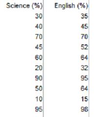
Here are the results of 10 students who took a Science and English test. Draw a scatter graph and describe the correlation. Also draw a line of best fit on you scatter graph if there is positive or negative correlation.
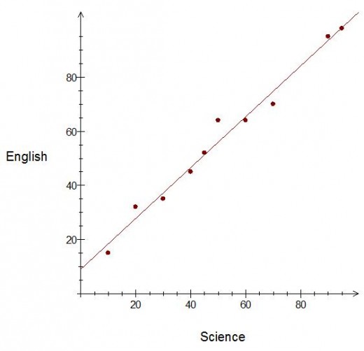
As you can see, the graph shows positive correlation (as x increases, y increases). This would mean that somebody who scores high in Science will also score high in their English test.
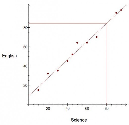
The line of best fit can now be used to predict results for students who missed one of their exams. So for example, say a student scored 80% in Science but missed their English exam, then you can use the best fit line to predict their English mark. Do this by drawing a line from 80% on your x-axis up to your line of best fit, and read off the English mark on the y axis. This should give you an English mark of around 85%.

")


